SALES / SUPPORT : +1-877-525-5646   |  


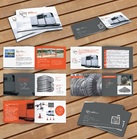
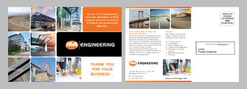
Clean Modern Civil Engineering Postcard with 4 Variations to mail throughout the year.

HMA Engineering

Contest Holder kellihale ?

Last Logged in : 2935days16hrs ago

Concepts Submitted

116

Prize Money
200
Winner(s)

1

Marketing collateral veildAll design entries are veiled from other designers till the end of the contest.
tick_gray

Live Project

tick_gray

Deciding

tick_blue

Project Finalized


Project: Clean Modern Civil Engineering Po ...
Industry: Engineering Logo
Contest Launched: Jan 06, 2016
Selected: 1 winning design from 116 concepts
Winning Design by: Achiver
Close Date: Jan 20, 2016


Clean Modern Civil Engineering Postcard with 4 Variations to mail throughout the year. - Engineering


Awarded as a winner
Project Report    

Sort by:


#91

#17


Creative Brief


Clean Modern Civil Engineering Postcard with 4 Variations to mail throughout the year.

HMA Engineering

Engineering

Corporate Audience. Federal and State Agencies.

The post cards have to be clean, precise, elegant, and have room for us to print a seasonal message on them. We prefer they have black background on the image side, with deep orange accent color. • 4 Postcard Designs to be sent to our clients throughout the year. • Have Room for us to print on them depending on the reason we are mailing.

Related Contests


Brochure for a company that caters to the marine and offshore services.
$200
Prize Money
10
Concepts
Double Sided Brochure Highlighting Business Codes and
$199
Prize Money
19
Concepts
NSTS Marketing Brochure
$250
Prize Money
14
Concepts
Brochure for Engineering firm
$501
Prize Money
64
Concepts

Discussion


Comments

  • January 11, 2016 4:27 PM
    kellihale kellihale
      Project Holder
    For best results with most products, your image or photo should be 300 dpi (dots per inch) at the final print dimensions (full bleed size when uploading an entire product design). Simply increasing the DPI setting in a graphic program does not improve the resolution. The postcards we are looking for must be 7"x5" after bleeds and marks are trimmed.

    Like Icon 0   DislikeIcon 0
  • January 11, 2016 4:09 PM
    kellihale kellihale
      Project Holder
    WE ARE WANTING TO FINIALIZE A WINNER SOON, JUST HAVENT FOUND WHAT WE ARE LOOKING FOR. WE ARE UPLOADING A COLLAGE OF A FEW EXAMPLES OF BACKGROUNDS THAT ARE NATURE IN GENERAL. WE LIKE A BLACK BACKGROUND WITH 3-4 PICTURES IN TILES FOR (2) POSTCARD VARIATIONS, POSSIBLY (2) FULL IMAGE POSTCARDS. YOU CAN ADD THE LOGO TO THE FRONT BUT KEEP THE TEXT CLEAN AND SIMPLE. WE ARE NOT WANTING ANY THANK YOU CARDS OR STATIONARY AT THIS TIME. JUST SEASONAL POSTCARDS SO WE CAN MAIL OUT ONE EVERY QUARTER. AGAIN, WE ARE LOOKING FOR PROOFS OF (4) DESIGN DEVIATIONS PER SUBMISSION. PLEASE LOOK AT FILES FOR SAMPLES.

    Like Icon 0   DislikeIcon 0
  • January 08, 2016 6:42 PM
    kellihale kellihale
      Project Holder
    Think generic and commercial. Maybe a themed group of images like nature or building engineering themes

    Like Icon 0   DislikeIcon 0
  • January 08, 2016 4:43 PM
    kellihale kellihale
      Project Holder
    These are very busy and look matchy matchy to the website. We want to be able to print on these, so a white background for the text is a must. YOu can use a placeholder of text for the mean time. We prefer a clean Generic Modern look, we feel these submission are fantastic yet VERY BUSY for our seasonal marketing.

    Like Icon 0   DislikeIcon 0
  • January 08, 2016 4:41 PM
    kellihale kellihale
      Project Holder
    Please eliminate the city landscape photo from the website. MORE GENERIC is better.

    Like Icon 0   DislikeIcon 0