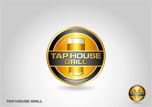
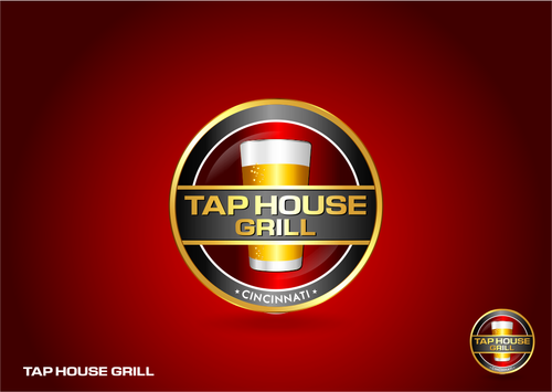
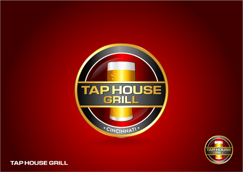
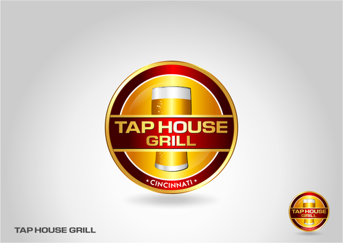
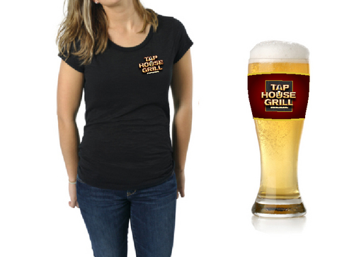
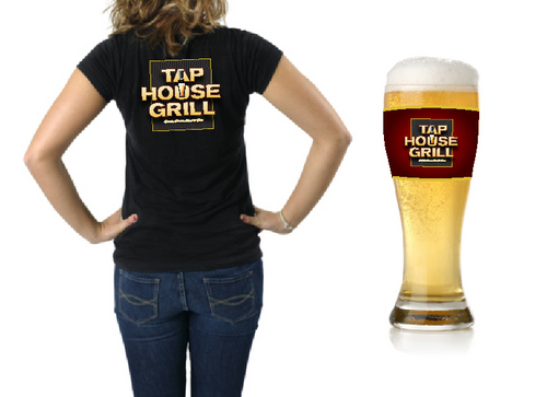
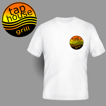
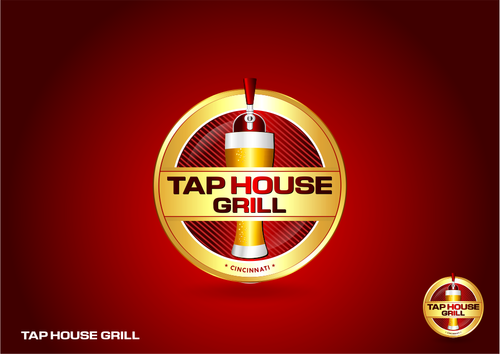
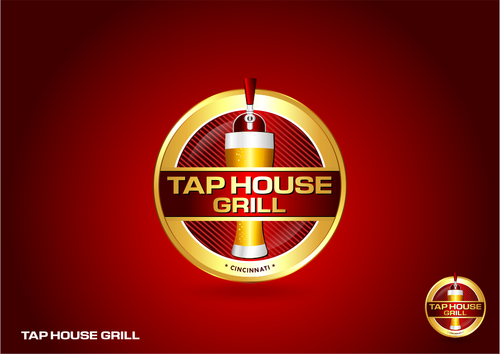
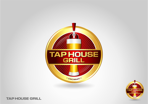
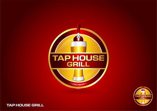
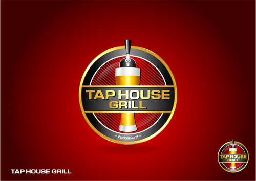
Business Restaurant/Bar Logo Tap House Grill
Tap House Grill
|
Contest Holder
taphouse
?
Last Logged in : 5089days15hrs ago |
Concepts Submitted
156 |
Guaranteed Prize
300 |
Winner(s) | A Logo, Monogram, or Icon |
|
Live Project
Deciding
Project Finalized


Creative Brief
Business Restaurant/Bar Logo Tap House Grill
Tap House Grill
No
This design is for a rebrand of a current sports bar/restaurant. We are increasing the food quality, adding a custom meal option, where the guest can configure their food just how they like it. We are making the restaurant more family friendly with healthier options and more options for kids. The last big thing we are doing is adding a new beer cooler where up to 36 beers will be on tap. We are going to feature more local brews, which will be unique to our surrounding area.
The restaurant will remain a sports restaurant and bar, seating 250 people with over 30 high definition tv's throughout the restaurant, with a circle of tv's above a large bar. We have a very open floor plan and an all updated eating area.
Food
Logo Type
![]()
Illustrative
![]()
Clean/Simple
Modern
Traditional
Local/Neighborhood
Fun
We are open to options.
not sure
We like logos with just the name as well as logos that are illustrative. We thought about having a beer tap pouring into the name, but don't want anything that looks too cartoonish. It needs to appeal to both adults and kids. We are located in a shared business building and will have a lit sign above our restaurant. We haven't discussed a tag line yet, but are open to suggestions.
Related Contests


