SALES / SUPPORT : +1-877-525-5646   |   Login


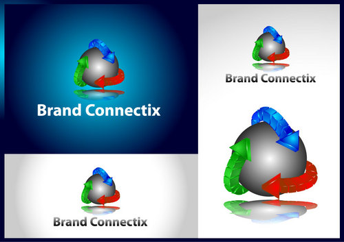
Business Logo for Marketing Consulting Firm, Brand Connectix

Brand Connectix

Contest Holder donnas ?

Last Logged in : 3958days11hrs ago

Concepts Submitted

248

Guaranteed Prize
300
Winner(s)

1

A Logo, Monogram, or Icon veildAll design entries can be viewed by other designers. Featured Featured Contest
tick_gray

Live Project

tick_gray

Deciding

tick_blue

Project Finalized


Project: Business Logo for Marketing Consu ...
Industry: Marketing Logo
Contest Launched: Jun 02, 2011
Selected: 1 winning design from 248 concepts
Winning Design by: themars
Close Date: Jun 09, 2011


Business Logo for Marketing Consulting Firm, Brand Connectix - Marketing


Awarded as a winner
Project Report    

Sort by:


#241

#240

#239

#237

#236

#235

#231

#230

#229

#228

#225

#224

#223

#220

#218

#217

#215

#214

#213

#211

#209

#208

#207

#206

#205

#204

#203


Creative Brief


Business Logo for Marketing Consulting Firm, Brand Connectix

Brand Connectix

Building Connections That Matter (does not have to be in logo)

No

New brand marketing consulting firm, specializing in connecting brands to customers, connecting brands to marketing, connecting brands to sales -- all to better build a company's business.

Description of services:
Providing full range of brand, marketing, sales, innovation and customer loyalty consulting across a variety of B2C and B2B industries.

Specializing in
* brand architecture development/refinement, including brand positioning, segmentation and value proposition;
* marketing strategy and annual operating plan development and execution;
* marketing due dilligence of prospective investments for capital investment firms
* sales strategy and execution, including offer management, lead generation and management; cross-selling and retention/'win-back;'
* customer loyalty strategy and execution.

Experience in CPG, beverage OTC, financial services, consumer durables, senior care and health care.

Marketing

Logo Type
Logo Type

Abstract Mark
Abstract Mark


Cutting-Edge
Unique/Creative
Clean/Simple
Modern

I like the blue of Intel Inside logo but am open -- just want it to be refreshing. The logo design also needs to be applied simply to business cards, logo'd shirts, etc. and translate well into a B&W application.

not sure

One of my original ideas was to somehow incorporate a graphic of arrows that showed forward progression around the name, e.g. connecting the brand to other things.
Related Contests


Verticle Leap Logo
$200
Prize Money
44
Concepts
Logo for design company
$450
Prize Money
480
Concepts
Logo for a new marketing consultancy
$200
Prize Money
146
Concepts
Logo for Marketing Consultant
$199
Prize Money
87
Concepts

Discussion


Comments

  • June 09, 2011 4:30 PM
    Martin Martin
     
    copy/paste...

    Like Icon 0   DislikeIcon 0
  • June 09, 2011 11:31 AM
    donnas donnas
      Project Holder
    I want to thank everyone who participated in my project for Brand Connectix. The creativity and commitment to delivering on my creative brief was outstanding. It was definitely a tough choice. I also appreciated the many versions the designers provided based on my feedback. I look forward to working with many of you again on future projects! Best, Donna

    Like Icon 0   DislikeIcon 0
  • June 07, 2011 10:27 AM
    donnas donnas
      Project Holder
    Regarding colors, I like what I see in combos of Blue and Grey, Blue and Black. Big gradations are not preferred for printing on smaller platforms.

    Like Icon 0   DislikeIcon 0
  • June 07, 2011 10:26 AM
    donnas donnas
      Project Holder
    Thanks to all for the refreshing designs. I still favor a symbol on the left that either incorporates and B&C of the name, or something that shows forward progression/movement of the brand. Would also be interested in a graphic that symbolizes connecting a Brand to people/customers.

    Like Icon 0   DislikeIcon 0
  • June 03, 2011 2:15 PM
    donnas donnas
      Project Holder
    Mambi - I like the integration of the B & C connecting. What is the symbol above the i? Are they mini arrows? Hard to tell

    Like Icon 0   DislikeIcon 0
  • June 03, 2011 2:14 PM
    donnas donnas
      Project Holder
    In general, I would also like to see a design that incorporated a design element of the B & C next to the full name, perhaps with arrows or swirls connecting the two letters. Like a symbol logo next to the name

    Like Icon 0   DislikeIcon 0
  • June 03, 2011 11:05 AM
    donnas donnas
      Project Holder
    #17 -- Like the improvement. Can you reverse the arrow direction, bump up the thickness of the name and perhaps skinny back the arrow thickness?

    Like Icon 0   DislikeIcon 0
  • June 03, 2011 10:52 AM
    donnas donnas
      Project Holder
    #15 & 13 - like the design a lot. I'd reverse the colors with Brand being blue; perhaps explore another color than green? Like the swirl going through the X -- does it make sense to make these more arrows? Also on #15, I'd reverse the arrow points.

    Like Icon 0   DislikeIcon 0
  • June 03, 2011 9:44 AM
    donnas donnas
      Project Holder
    #7 - I like the font and the two color design; not crazy about orange, though. The arrows depict what I was looking for, but wonder if it would look more progressive/forward motion if they were elongated, almost wrapping around the name??

    Like Icon 0   DislikeIcon 0
  • June 03, 2011 8:35 AM
    donnas donnas
      Project Holder
    #6 - I like the colors and the circles. The arrows are too harsh. Would prefer more of softer, curved approach, with one leading to the other. #3 & 4 -- Like the curved design but the ""brand" is too small -- it's the focal part of the name. Not sure I like the distint emphasis on 'tix'

    Like Icon 0   DislikeIcon 0