SALES / SUPPORT : +1-877-525-5646   |  


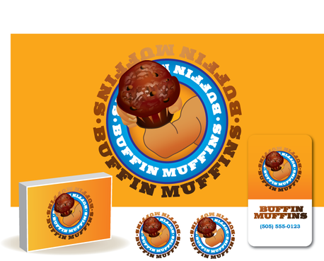
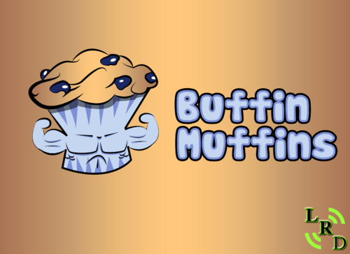
Buffin Muffins logo design

Buffin Muffins

Contest Holder jazc4 ?

Last Logged in : 4474days18hrs ago

Concepts Submitted

166

Guaranteed Prize
400
Winner(s)

1

A Logo, Monogram, or Icon veildAll design entries can be viewed by other designers. Featured Featured Contest
tick_gray

Live Project

tick_gray

Deciding

tick_blue

Project Finalized


Project: Buffin Muffins logo design
Industry: Food Logo
Contest Launched: Oct 16, 2011
Selected: 1 winning design from 166 concepts
Winning Design by: TinTownGraphics
Close Date: Oct 26, 2011


Buffin Muffins logo design - Food


Awarded as a winner
Project Report    

Sort by:


#158

#137

#128


Creative Brief


Buffin Muffins logo design

Buffin Muffins

Yes

We make muffins that are healthy. Our target market is people who work out and eat healthy as a lifestyle. Buffins will be a great choice for the person trying to eat right or for a seasoned bodybuilder.

Food

Symbolic
Symbolic

Abstract Mark
Abstract Mark

Illustrative
Illustrative

Character
Character

Web 2.0
Web 2.0


Cutting-Edge
Unique/Creative
Clean/Simple
Corporate
Modern
Outdoors/Natural
Fun
Abstract

We are totally open to color. We are really looking for creativity.

not sure

We want the designers to be as creative as they want to be, and we will be very active with feedback during the duration of the contest.
Related Contests


Logo for innovative cookie made of only two ingredients
$300
Prize Money
77
Concepts
Logo for a bakery company
$300
Prize Money
139
Concepts
Logo for Restaurant
$250
Prize Money
188
Concepts
Logo for a company that produces honey
$200
Prize Money
56
Concepts

Discussion


Comments

  • October 24, 2011 12:51 AM
    jazc4 jazc4
      Project Holder
    Another round of eliminations. We will consider new ideas though.

    Like Icon 0   DislikeIcon 0
  • October 22, 2011 11:10 AM
    jazc4 jazc4
      Project Holder
    Heavy eliminations. Later we will start getting more picky and another round of eliminations will happen.

    Like Icon 0   DislikeIcon 0
  • October 22, 2011 11:04 AM
    jazc4 jazc4
      Project Holder
    The design should have an illustration in it. I am elimination the ones that don't.

    Like Icon 0   DislikeIcon 0
  • October 22, 2011 10:58 AM
    jazc4 jazc4
      Project Holder
    We have eliminated any design that seemed feminine in any way.

    Like Icon 0   DislikeIcon 0
  • October 21, 2011 9:38 AM
    jazc4 jazc4
      Project Holder
    Our target market is people who workout, eat right, and want a tasty protein alternative. Avoid being too leafy and feminine. The bulk of our business starting off will center in the bodybuilding industry. We will branch out from there into more mainstream healthy types after we get our name established somewhat. PM if you want specific feedback about your design.

    Like Icon 0   DislikeIcon 0
  • October 18, 2011 11:54 AM
    jazc4 jazc4
      Project Holder
    I like the way the new designs are headed for the most part. I don't think using "BM" in the logo is a good idea for obvious reasons. I'm liking the brown/gold, brown/blue and brown/green color combos. I'd like to explore other combinations as well to help get the right look. I also rated the new designs to help give you an idea of what is working and what's not. That's enough rambling for now! I'll post more soon.

    Like Icon 0   DislikeIcon 0
  • October 17, 2011 2:55 PM
    jazc4 jazc4
      Project Holder
    Thus far my initial impression is that many of the designs are too feminine. I performed an initial rating of the submitted designs to give you an idea of what has caught my attention. I'll post more feedback soon.

    Like Icon 0   DislikeIcon 0