Breakfast/brunch/lunch restaurant logo
Rupert's (at the Edge) - this needs to be smaller
|
Contest Holder
coffeesnob45
?
Last Logged in : 3853days9hrs ago |
Concepts Submitted
66 |
Guaranteed Prize
275
|
Winner(s) | A Logo, Monogram, or Icon |
|
Creative Brief
Breakfast/brunch/lunch restaurant logo
Rupert's (at the Edge) - this needs to be smaller
Breakfast Brunch Lunch
Yes
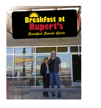
Rupert's is an existing business called Breakfast on the Edge. It is located on the edge of a lake - and in the city of Edgewater. The interior decor has a bright appearance - lots of yellows, reds and some orange. We are know for our bottomless mimosas on the weekend.
Food
Logo Type
![]()
Abstract Mark
![]()
Masculine
Feminine
Modern
Simple
Casual
Red for main text - open to ideas for the rest of the text
not sure
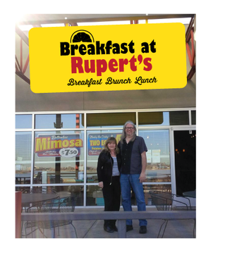
I have attached a quick logo I put together for the Employee handbook etc for when we took over the place about a month ago. We are in a sense "re-branding " this place and adding out personal touch. We hope to open at least 2 more Rupert's in the near future - thus the name Rupert's can go from place to place - with the specific location being the tag line. Just a note - the name Rupert came from my great uncle - who was a life-loving free spirit. We like the name because it is a one word name that is unique and easy to remember.









Comments
Project Holder