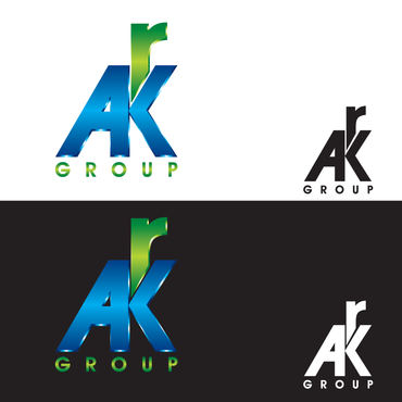
AKR Group
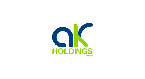
AKR Holdings
|
Contest Holder
lioneljeshu
?
Last Logged in : 4461days22hrs ago |
Concepts Submitted
116 |
Guaranteed Prize
250 |
Winner(s) | A Logo, Monogram, or Icon |
|
Live Project
Deciding
Project Finalized


Creative Brief
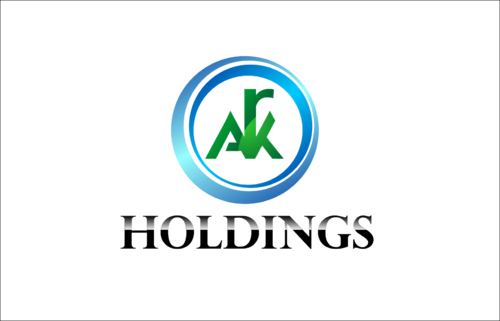
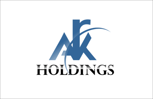
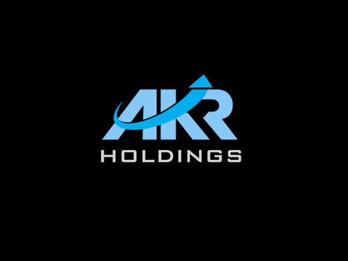
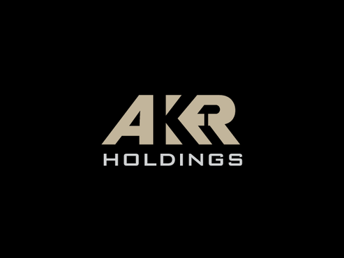
AKR Group
AKR Holdings
No
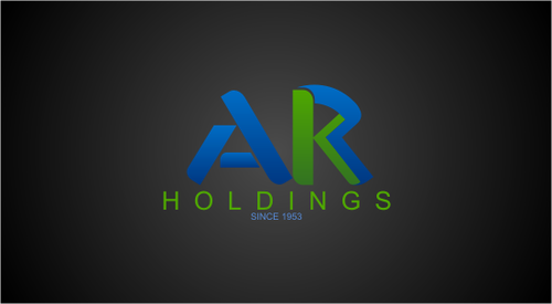
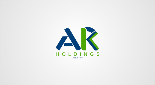
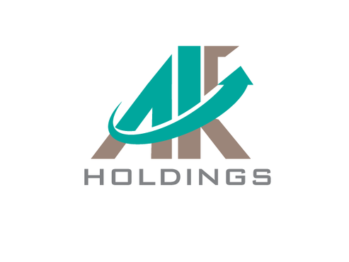
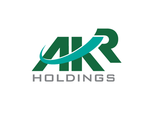
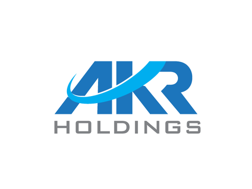
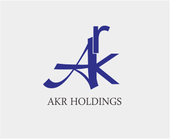
AKR Holdings is a holding company with interest in construction, steel, non-ferrous metals and power. One of the main interest for this group is sick company rehabilitation/reconstruction .The company sells these assets to different buyers to recover the money/operates the asset to produce income again. The group is in existence since 1953.
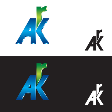
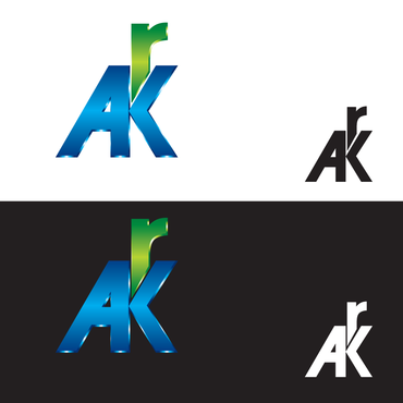
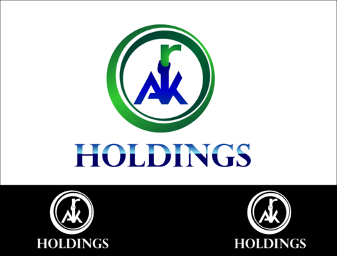
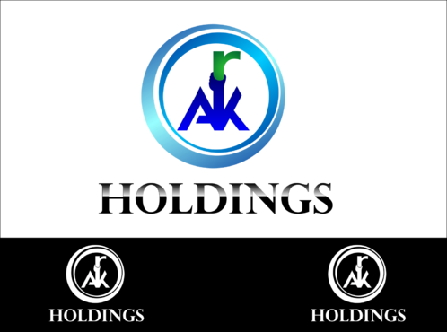
The logo should be centered around the initials AKR.
Construction
Initials
![]()
Unique/Creative
Clean/Simple
Corporate
Industry Oriented
Traditional
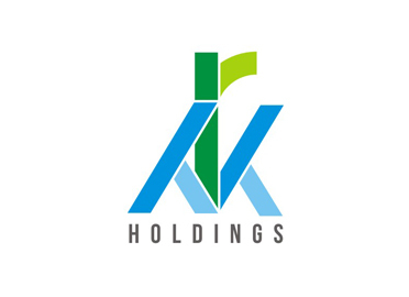
Green and Blue
not sure
Would like to see some designs similar to the file attached.
Would like to see some designs where the "r" word is on top of K and symbolizes growth. [See attached file]
Related Contests


