SALES / SUPPORT : +1-877-525-5646 |
Login
Aftermarket Parts Logo Needed
Aftermarket Parts, Hackney, Kidron
|
Contest Holder
bpeacos
?
Last Logged in : 2525days2hrs ago |
Concepts Submitted
64 |
Prize Money
300
|
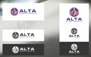
Winner(s) | A Logo, Monogram, or Icon |
|
Live Project
Deciding
Project Finalized
Project: Aftermarket Parts Logo Needed
Industry:
Manufacturing Logo
Contest Launched:
Aug 15, 2013
Selected:
1
winning design from 64 concepts
Winning Design by:
AxeDesign
Close Date:
Aug 26, 2013


Creative Brief
Aftermarket Parts Logo Needed
Aftermarket Parts, Hackney, Kidron
none
No
The logo is for the aftermarket parts division of a truck and trailer body company which carries two main brands - Hackney and Kidron. It should represent that we are the real deal, the original equipment manufacturer (OEM). Bold & masculine.
Manufacturing
Logo Type
![]()
Web 2.0
![]()
Masculine
Cutting-edge
Simple
Casual
We are completely open to all ideas.
not sure
We are an all aluminum metal truck and trailer manufacturer and we have a parts department which is what this logo is for.
The words "Aftermarket Parts" in any font needs to be the focus since this is what the logo is for. 'Aftermarket' and 'Parts' can be split or together or different sizes etc. Completely open to new ideas. This logo will be used on trucks, trailers, packing tape, websites, shirts, etc. It would be great if it were not dependant on the background like it needs multiple versions for light or dark backgrounds but if the design calls for it please include the options for black or white backgrounds.
We would like to use the Hackney and Kidron logos in the logo. Since Aftermarket Parts is generic, the Hackney and Kidron logos should be part of the design. The ONLY requirement of the Hackney and Kidron logos is the font needs to stay the same. The colors and shield (black oval and red rounded rectangle can be removed or color changed.) If you decide to keep the shields please do not alter the shapes just change the colors. I will inlcude both hackney and Kidron logos for use.
Related Contests

Comments
Project Holder
Project Holder
Project Holder
Project Holder
Project Holder
Project Holder
Project Holder
Project Holder
Project Holder
Project Holder