SALES / SUPPORT : +1-877-525-5646 |
Login
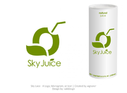
Soda Concession
The Soda Stop
|
Contest Holder
GAHBMW
?
Last Logged in : 5043days4hrs ago |
Concepts Submitted
28 |
Prize Money
250
|
Winner(s) | A Logo, Monogram, or Icon |
|
Live Project
Deciding
Project Finalized
Project: Soda Concession
Industry:
Beverages Logo
Contest Launched:
Nov 05, 2010
Selected:
1
winning design from 28 concepts
Winning Design by:
TraceyMD
Close Date:
Nov 12, 2010


Creative Brief
Soda Concession
The Soda Stop
Fresh Seltzers and Gourmet Italian Soda's
Yes
Concession business being set up at festivals, fairs, functions, etc......primarily outdoor events. The product is fresh made seltzer presented and delivered on an old fashiond style soda counter. The patron has a multitude of custom blended flavors in which to chose.
Beverages
Symbolic
![]()
Web 2.0
![]()
Unique/Creative
Industry Oriented
Retro
Playful/Cartoonish
Red, Black and White are the classic soda fountain colors. Although I am not married to any particular combination.
3
I thought possibly a stop sign themed logo with red and white letters and background would be catchy and would enhance the name. I do not want an image of a high ball glass with ice cream and a straw. That does not depict my product. This is not an ice cream business.
Related Contests
Comments
Project Holder
Project Holder
Project Holder
Project Holder
Project Holder
Project Holder
Project Holder