SALES / SUPPORT : +1-877-525-5646 |
Login
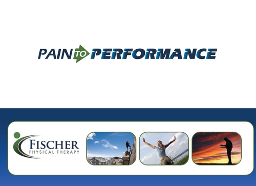
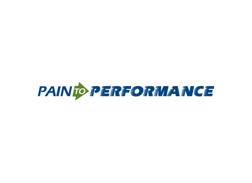
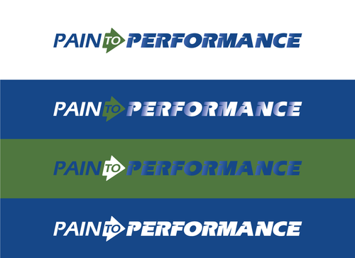
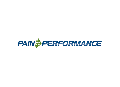
Slogan Brand Logo for Physical Therapy Clinic
Pain To Performance
|
Contest Holder
msfischer
?
Last Logged in : 2926days17hrs ago |
Concepts Submitted
114 |
Guaranteed Prize
200
|
Winner(s) | A Logo, Monogram, or Icon |
|
Live Project
Deciding
Project Finalized
Project: Slogan Brand Logo for Physical Th ...
Industry:
Health Logo
Contest Launched:
Nov 06, 2014
Selected:
1
winning design from 114 concepts
Winning Design by:
Sacril
Close Date:
Nov 17, 2014


Creative Brief
Slogan Brand Logo for Physical Therapy Clinic
Pain To Performance
No
This is the slogan (message) I want to brand ...with advertising... to convey to the public what our physical therapy clinic is all about.
Its about inspiring people who are struggling that we have the answer to get them pain free and moving again
Health
Logo Type
![]()
Masculine
Cutting-edge
Youthful
Simple
Professional
Deep green and blue
2
My thought is to have bold lettering. Maybe "PERFORMANCE" could have a little motion conveyed in it by using Italic font...pain may need to be italic as well. My vision is to have the "TO" to be within a short bold arrow (left to right). So from further away, it would look like PAIN (arrow to ) PERFORMANCE. The arrow would be more dominant than the "TO" superimposed within it. There may be a better way to do this, but it will need to be fairly simple and readable.
Related Contests


Comments
Project Holder