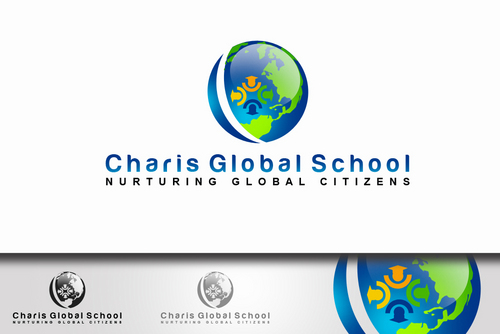
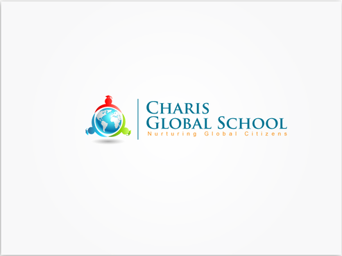
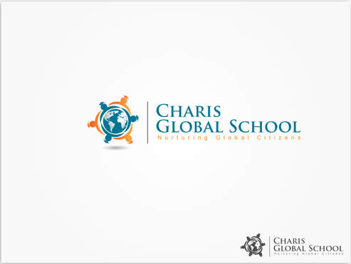
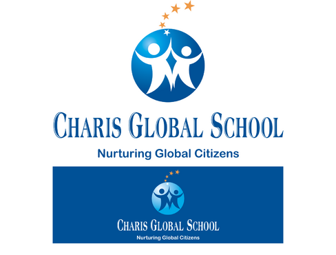
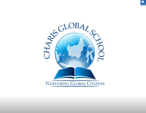
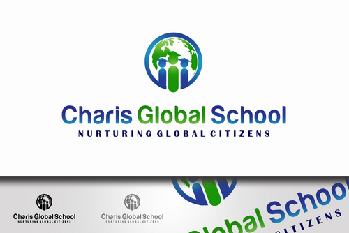
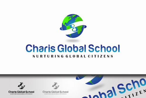
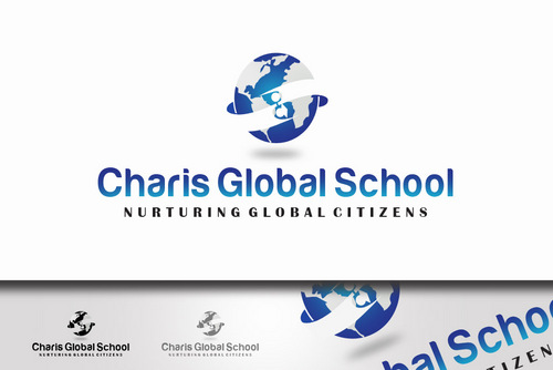
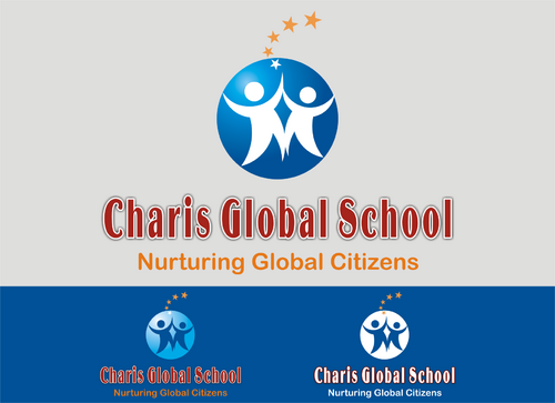
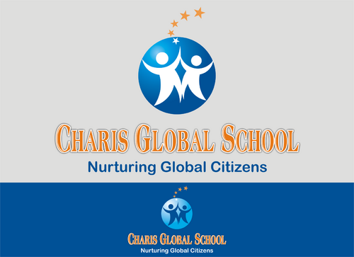
School logo
Charis Global School
|
Contest Holder
phillipe
?
Last Logged in : 4624days2hrs ago |
Concepts Submitted
50 |
Guaranteed Prize
199
|
Winner(s) | A Logo, Monogram, or Icon |
|
Live Project
Deciding
Project Finalized


Creative Brief
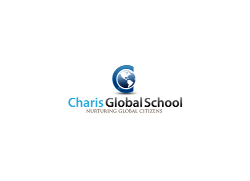
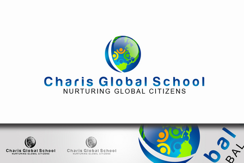
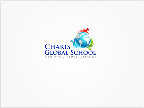
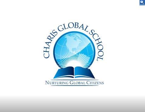
School logo
Charis Global School
Nurturing Global Citizens
Yes
This logo is designed for school starting from pre-school to primary level only.
Education
Symbolic
![]()
Abstract Mark
![]()
Unique/Creative
Modern
High Tech
Fun
Youthful
We prefer a design to include some light blue color like Skype's
not sure
Related Contests


Comments
Project Holder
Project Holder
Project Holder
Project Holder
Project Holder
Project Holder
Project Holder
Project Holder
Project Holder
Project Holder
Project Holder
Project Holder
Project Holder
Project Holder
Project Holder
Project Holder