SALES / SUPPORT : +1-877-525-5646   |  


Routes Travel Website Logo

Routes.Travel

Contest Holder ekajatik ?

Last Logged in : 4229days22hrs ago

Concepts Submitted

56

Guaranteed Prize
200
Winner(s)

1

A Logo, Monogram, or Icon veildAll design entries are veiled from other designers till the end of the contest. Featured Featured Contest
tick_gray

Live Project

tick_gray

Deciding

tick_blue

Project Finalized


Project: Routes Travel Website Logo
Industry: Travel Logo
Contest Launched: Mar 06, 2013
Selected: 1 winning design from 56 concepts
Winning Design by: cinco
Close Date: Mar 18, 2013


Routes Travel Website Logo - Travel


Awarded as a winner
Project Report    

Sort by:


#54

#53

#52

#51

#44

#43

#42

#41

#40

#29

#27

#26

#16


Creative Brief


Routes Travel Website Logo

Routes.Travel

No

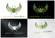
This is the brand logo of the main routes.travel website. The logo design must be flexible so that it incorporates the subdomain names such as worldheritage.routes.travel, beach.routes.travel, mountain.routes.travel etc... The logo is an enhancement of my existing logo for a previous similar project, called Heritage Traveller, and is attached to this project.

Travel


Sophisticated
Simple
Professional

Use the attached existing logo as your design foundation

I would like the existing 'Heritage Traveller' logo used as the baseline, this will be included in the project files, so no major design changes needed, just a bit of creativity to integrate subdomain words as well as the routes.travel domain name.

The following are a wide array of variations of the words for the logo:

worldheritage.routes.travel
beach.routes.travel
mountain.routes.travel
diving.routes.travel
golf.routes.travel
volcano.routes.travel
thailand.routes.travel
unitedkingdom.routes.travel
dinosaur.routes.travel
family.routes.travel
adventure.routes.travel
cycling.routes.travel

Related Contests


Logo for Parakeet Mobile Home Park
$200
Prize Money
144
Concepts
Your Exclusive Dreams
$199
Prize Money
48
Concepts
Logo for high end Custom travel company
$250
Prize Money
116
Concepts
Logo for a stylish Beach Club in a 5*Boutique Hotel
$200
Prize Money
127
Concepts

Discussion


Comments

  • March 16, 2013 8:32 PM
    ekajatik ekajatik
      Project Holder
    Thanks again designixx,nice work but its just not jumping out at me for this brand for some reason.

    Like Icon 0   DislikeIcon 0
  • March 16, 2013 8:24 PM
    ekajatik ekajatik
      Project Holder
    Thanks Cinco, can you produce a version of the worldheritage with the subdomain name the same length as the 'Routes Travel' and aligned against the left. And another version with the subdomain name 'BEACH'... again, align to the left for the horizontal style, using the same font size, and for the stacked version use the same font size but keep it centered. If you have any other creative ideas about the graphic, please try.

    Like Icon 0   DislikeIcon 0
  • March 16, 2013 8:28 AM
    ekajatik ekajatik
      Project Holder
    Thanks Cinco, can you try a version where the top of the r and bottom of the t are equal widths with the rest of the letters in the graphic? Right now the top of the r looks too thin so it's thinner than the green arm of the t... it looks like it should be the same width, but its not.

    Like Icon 0   DislikeIcon 0
  • March 15, 2013 11:56 PM
    ekajatik ekajatik
      Project Holder
    Hi Cinco, I really like #22 and #24... can you see if its possible to keep the width of the graphic characters the same, so the top of the r and the bottom of the t are the same width as the vertical bits (e.g. a bit wider). Can you also think about a version for a dark background.

    Like Icon 0   DislikeIcon 0
  • March 15, 2013 11:52 PM
    ekajatik ekajatik
      Project Holder
    Nice work designixx, really nice BUT I don;t really like the way the t overlaps the R, the text may be a little thin also.

    Like Icon 0   DislikeIcon 0
  • March 15, 2013 11:44 PM
    ekajatik ekajatik
      Project Holder
    Thanks suneeldezins, not sure I would stretch the subdomain words, and the graphics for the letters are not very elegant... maybe can try some other ideas for the graphic?

    Like Icon 0   DislikeIcon 0
  • March 15, 2013 5:36 AM
    ekajatik ekajatik
      Project Holder
    Thanks Cinco, but you have not updated the graphic which still shows 'ht' for heritage traveler, and there are no subdomain words integrated anywhere.

    Like Icon 0   DislikeIcon 0
  • March 14, 2013 8:07 AM
    ekajatik ekajatik
      Project Holder
    Update: using myfonts.com I think the font is URW Gothic Demi

    Like Icon 0   DislikeIcon 0
  • March 14, 2013 7:57 AM
    ekajatik ekajatik
      Project Holder
    I confirm that I did not receive any font files with the original design, sorry. I have uploaded the EPS however.

    Like Icon 0   DislikeIcon 0
  • March 14, 2013 7:53 AM
    ekajatik ekajatik
      Project Holder
    Hi swaroopte, I will upload all of the files I have, but I do not believe I received a font name or file when the original was created.

    Like Icon 0   DislikeIcon 0
  • March 14, 2013 7:39 AM
    swaroopte swaroopte
     
    Hi, Is it possible to provide the font name or the font file used for the base logo(Heritage Traveller), so that we can have the same font for the new logo also.

    Like Icon 0   DislikeIcon 0
  • March 13, 2013 11:48 AM
    ekajatik ekajatik
      Project Holder
    Dear Pijar. I believe the brief is quite clear, and quite adequately explains "... no major design changes needed, just a bit of creativity to integrate subdomain words as well as the routes.travel domain name." & "The following are a wide array of variations of the words for the logo: " & the list of possible words for the logo. Nothing about this is unclear surely. Its just a little unusual as its requesting the same basic design usage with different words, plus a dash of creativity to see how the subdomain word can be integrated effectively.

    Like Icon 0   DislikeIcon 0
  • March 11, 2013 1:36 PM
    pijar pijar
     
    lord let us help each other, the brief you give way too confusing, we as designers must create a new logo really new or create a new logo that can combine with your old logo? or simply with your old logo design plus text only.

    Like Icon 0   DislikeIcon 0
  • March 06, 2013 1:22 PM
    SiteAdmin SiteAdmin
     
    Attention Project Holder: Please be informed that your project is a veiled project and designers are restricted to view only their own drafts which ensure that each design has its own originality however, you being a project holder can see all the designs. Suggestion: Provide consistent feedback and star rating on designs to attract more designers towards your project. Thanks, MB/LDG/LS Team.

    Like Icon 0   DislikeIcon 0
  • March 06, 2013 1:22 PM
    SiteAdmin SiteAdmin
     
    Attention Designers!! MycroBurst permits you to submit unlimited designs with unlimited variations. However, if you are providing 2 or 3 different color versions of the same logo in one draft, please make sure that if the particular draft gets finalized, each color version should be separated before you will send the final files. Thanks, MB/LDG/LS Team

    Like Icon 0   DislikeIcon 0