SALES / SUPPORT : +1-877-525-5646   |   Login


O'Shea Fitness Innovations

O'Shea Fitness Innovations

Contest Holder 4thave ?

Last Logged in : 1256days22hrs ago

Concepts Submitted

408

Prize Money
199
Winner(s)

1

A Logo, Monogram, or Icon veildAll design entries are veiled from other designers till the end of the contest.
tick_gray

Live Project

tick_gray

Deciding

tick_blue

Project Finalized


Project: O'Shea Fitness Innovations
Industry: Sports Logo
Contest Launched: Jun 08, 2021
Selected: 1 winning design from 408 concepts
Winning Design by: Zohaibjawed
Close Date: Jun 14, 2021


O'Shea Fitness Innovations - Sports


Awarded as a winner
Project Report    

Sort by:


#57

#49

#48

#47

#46

#45

#44

#43

#42

#41

#40

#39

#34

#33

#32

#31

#30

#29

#19

#18


Creative Brief


O'Shea Fitness Innovations

O'Shea Fitness Innovations

No

Overview
OFI is run by an established Personal Trainer in its local community. Dan O'Shea is renowned for his personal and professional approach to personal training with a broad range of clientele.

This new phase of Dan's operations will allow Dan to connect with the growing number of potential clients.

At present Dan's delivery model allows customers to participate in his fitness education and training sessions in 1 on 1 and small group training sessions, this is the backbone of his offering however it limits his ability to assist and help many others interested in his services.

A new online training program has been developed to allow Dan to connect with his current clients and new clients who wish to share in his valued industry knowledge. This online training platform compliments his personal sessions allowing his clients to train his program and under his guidance with fewer face to face sessions.

Whilst Dan's current client base is diverse the target market for the online training will be (initially) targeted towards club based athletes (footballers) and time poor professionals. Dan believes that these market sectors will most benefit from the online tailored training program allowing his clients to train when it suits them and with the club based athletes it will provide a more cost effective delivery of service.

Design Brief for logo
Modern
Fresh
Engaging
Logo should have the words O'Shea Fitness Innovations in it (emphasis on O'Shea - if it works better we can remove the ' apostrophe)
Can have a symbol if it works (avoid muscle silhouettes and dumbells / weights etc)
Can use the Acronym OFI if it works
Can use a combination of an Acronym and Symbol
Appeal to Athletes
Appeal to Corporates
Examples of logos that could work are

Sports

Logo Type
Logo Type

Symbolic
Symbolic


Masculine
Modern
Youthful
Sophisticated
Simple
Professional

not sure

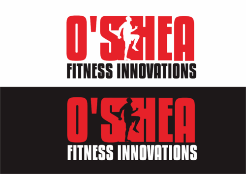
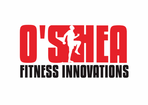
We like the idea of championing the logo with a symbol like the Jordan Logo's does however using a silhouette of dan himself - I have attached a photo that could be used to silhouette - I have attached Logos we like - not to be copied just as an example.
Related Contests


Vivint
$300
Prize Money
95
Concepts
Logo for Golf Fitness program
$200
Prize Money
113
Concepts
Icon for parachute piloting school
$200
Prize Money
68
Concepts
Logo for boys soccer team
$199
Prize Money
114
Concepts

Discussion


Comments

  • June 11, 2021 5:58 PM
    4thave 4thave
      Project Holder
    The logo designs are looking great thank you - we are wanting to see the logo in black, red and white. We also want to see it as all white on a black background and all black on a white background. At this stage we really like #210, #211, #80, #224 We are getting there

    Like Icon 1   DislikeIcon 2
  • June 10, 2021 7:24 AM
    Zohaibjawed Zohaibjawed
     
    @4THAVE Hi, Just did the changes you asked for. Let me know if you need any further changes. You can send a private comment to my designs. Just click any of my designs and on that page at the bottom you will find a comment box. Thank you.

    Like Icon 1   DislikeIcon 2
  • June 09, 2021 11:15 PM
    4thave 4thave
      Project Holder
    We really like the fonts and composition of #80, not sure if the colours are a good fit and would like to see it without a solid colour in the circle as well - (actually like the solid colour - just want to see it without). We also like how the silhouette is rotated in a forward motion.

    Like Icon 1   DislikeIcon 1
  • June 09, 2021 11:14 PM
    4thave 4thave
      Project Holder
    We really like the fonts and composition of #80, not sure if the colours are a good fit and would like to see it without a solid colour in the circle as well - (actually like the solid colour - just want to see it without). We also like how the silhouette is rotated in a forward motion.

    Like Icon 1   DislikeIcon 1
  • June 08, 2021 8:06 PM
    4thave 4thave
      Project Holder
    Thank you guys, at this stage we prefer #6 #58 #61 #61 is the most prefered however the H is not obvious enough - we do like negative space but it must also be legible. We would love to see more like these and more refined versions of these.

    Like Icon 2   DislikeIcon 1