SALES / SUPPORT : +1-877-525-5646 |
Login
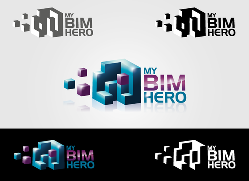
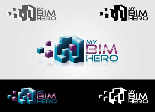
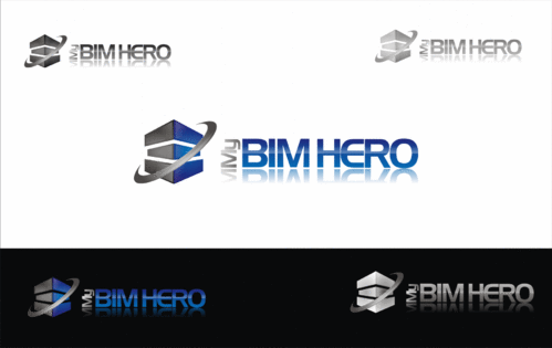
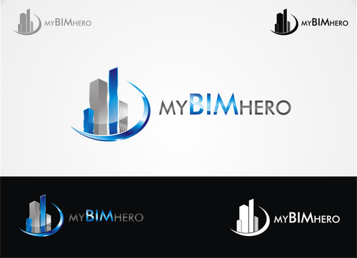
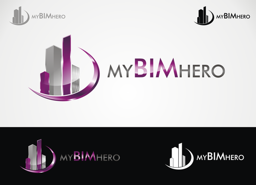
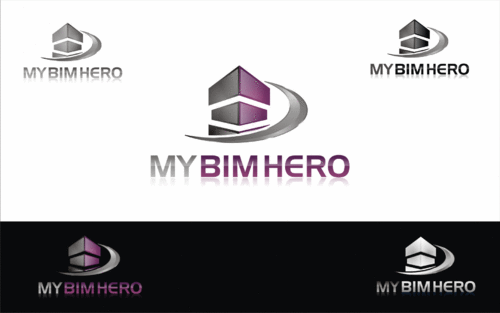
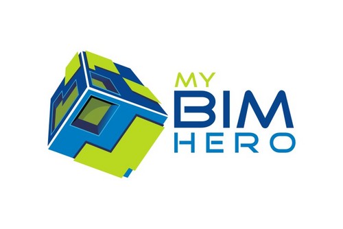
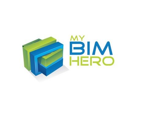
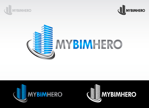
My BIM Hero Logo
My BIM Hero
|
Contest Holder
mybimhero
?
Last Logged in : 3520days14hrs ago |
Concepts Submitted
261 |
Guaranteed Prize
250
|
Winner(s) | A Logo, Monogram, or Icon |
|
Live Project
Deciding
Project Finalized
Project: My BIM Hero Logo
Industry:
Consulting Logo
Contest Launched:
Sep 23, 2011
Selected:
1
winning design from 261 concepts
Winning Design by:
hsharp
Close Date:
Oct 03, 2011


Creative Brief
My BIM Hero Logo
My BIM Hero
Yes
Building Information Modeling (BIM) is an entire new way of handling the entire lifecycle of a building. It utilizes technology to improve the collaboration and communication efforts in the design, construction, maintenance, and reuse of a building. The basis of the process is the use of a digital 3-dimensioanl model that represents the shape, size, material, color, quantity, and all the information you would ever need to construct and maintain a building. This model is accessible to all members of the team involved in design and construction throughout the world.
They each add information required for their particular expertise and extract out what they need to perform their part in the process. It is then shared with the owner for maintenance and operation of the building and will be useful in any future modifications or additions to the building. There is a zip folder called BIM Cycle which is a graphic representation of the entire process.
The primary software packages used in BIM are Revit and Navisworks which are from a company called Autodesk. They are the industry leader in 3D software for building construction, manufacturing, and entertainment.
My BIM Hero is a consulting business for the design & construction industry - architects, engineers, contractors, & owners. I help firms to implement & effectively use technology to design, build, and maintain buildings. I offer planning and implementation of Revit, Navisworks and other software along with process change, training on use of that software along with the best practices to fit it their business practice, assistance with the actual production work for a particular project, and overall maintenance & management of their BIM systems both process and technology based.
For now, I will use this logo on my business cards, web site, and social media with the possibility for thumb drives and stationary/invoices at a later time. I expect the backgrounds will be both white and light /dark grey. If you have ANY questions - please ask me. I am an architect so I understand the design cycle.
I am very excited to see what you come up with.
Thank you and good luck!!!!!
Consulting
Symbolic
![]()
Abstract Mark
![]()
Cutting-Edge
Unique/Creative
Clean/Simple
Modern
Industry Oriented
High Tech
Fun
Serious
Playful/Cartoonish
Masculine
Abstract
Geometric
The layout and colors are not set - it will most likely revolve around your logo. I am open to color ideas. If I were to do this myself I was thinking of grey and purple. Possibly green as well (think Android green). There is a jpg (Revit Navisworks Icon) of the software that I train - those symbols are green and purple.
not sure
Competitors -these are national guys and I'm just one person.
www.microdesk.com
www.ideateinc.com
www.imaginit.com
BIM - http://en.wikipedia.org/wiki/Building_information_modeling
Google Images – Building Information Modeling
Autodesk - http://usa.autodesk.com/building-information-modeling
OLD website – this is what I do - www.mybimhero.com (ignore the colors)
New color/layout IDEA - http://www.mybimhero.com/MBH.html (the hover should turn purple like the text)
Related Contests


Comments
Project Holder
Project Holder
Project Holder
Project Holder
Project Holder
Project Holder
Project Holder
Project Holder
Project Holder
Project Holder
Project Holder
Project Holder
Project Holder
Project Holder
Project Holder
Project Holder
Project Holder
Project Holder
Project Holder
Project Holder
Project Holder
Project Holder
Project Holder