Modern webpage for beauty/fitness site
Sweatandhair.com
|
Contest Holder
Sweatandhair2016
?
Last Logged in : 3095days8hrs ago |
Concepts Submitted
223 |
Prize Money
400
|
Winner(s) | Web Design |
|
Live Project
Deciding
Project Finalized

Creative Brief
Modern webpage for beauty/fitness site
Sweatandhair.com
Personal Care
Sweatandhair.com
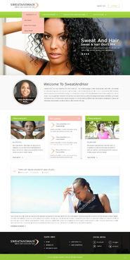
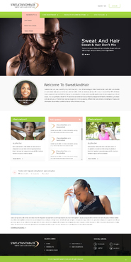
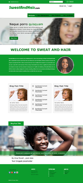
Creative Brief for SweatAndHair.com Welcome designers. This contest is for the creation of the homepage for our website, SweatAndHair.com. This interactive web based fitness app and blog is designed to display hair style friendly exercises and provide information on hair care products and hair care practices. While this contest is just for the design of the homepage, the winner will be hired with additional funds to finish the rest of the website. For this project you are expected to create just the homepage, including the theme, logo, navigation bar, placeholder images, and placeholder blog content. It is essential that you have experience with medical/fitness graphic design and web programming. Please integrate your graphics into a basic html page so we don’t run into any problems with formatting. SweatAndHair.com was created after much research about how hair care can influence exercise habits in African American women. Our research suggests that 50% of African American women have modified their hairstyle to accommodate exercise and nearly 40% avoid exercise at times owing to hair-related issues. This is a significant problem for African American women and has profound consequence for their health and wellbeing. As a web-based app, SweatAndHair.com will be accessible from mobile phones through the internet browser, but also on laptops, tablets, and other devices. Please make sure your design will format appropriately on all platforms. When users initially reach the homepage, they will be presented with featured content relevant to both dermatologic and cosmetic hair and scalp needs. Logo Starting from the top of the homepage, users will first see the logo. You need to create a logo for SweatAndHair.com that is both very captivating and at the same time descriptive. Many women will not exercise for fear that sweat will affect their hair. Your logo needs to convey this message that sweat and hair don’t mix, and our website is here to fix that. How you choose to show this is up to you. Please be creative. In the top right hand corner of the page you see buttons for About Us and Login. For now these can be standard placeholder buttons/links. Eventually they will link to different sections on the website. Navigation bar The webpage navigation bar is a very important part of this contest. You need to design a navigation bar with four sections that guide the user through the website. We would like a drop down menu to display subsections. The main sections are as follows: “Workouts” will allow users to access suggested exercise routines based on whether they are categorized as low sweat, moderate sweat, or heavy sweat . “Hair Maintenace” will suggest methods to maintain hairstyles while exercising. “Hair Products”, will allow the user to find information about product that may be useful in maintaining their hair. “Hair Conditions” will feature dermatologic and cosmetic information on maintaining the overall health of hair. The above sections will each have a drop down menu with the following links: Workouts Hair Maintenace Hair Products Hair Conditions -Low Sweat -Natural Hair -Natural Hair -Alopecia Areata -Moderate Sweat -Transitioning -Transitioning -Seborrheic Dermatitis -Heavy Sweat -Relaxed Hair -Relaxed Hair -Hypothyroidism Welcome image Below the navigation bar, there will be an image of an African American woman working out and sweating with particular emphasis on her hair. Maybe you can show someone who has put their hair up or is covering their hair. For now, you may use a stock image or choose to sketch your own cartoon image. Whatever looks better with your design. Welcome text Below the placeholder image, we need a spot for a block of text with a wraparound image of our founder. The text is as follows: SweatAndHair.com was created by Amy McMichael, M.D., chair of dermatology at Wake Forest Baptist Health after considerable research about how hair care influences exercise habits in African American women. Her research revealed that 50% of African American women have modified their hairstyle to accommodate exercise and nearly 40% avoid exercise at times owing to hair-related issues. This is a significant problem for African American women and has profound consequence for health and wellbeing. At SweatAndHair.com you will find workout routines designed to minimize sweating, different hair care products and styling techniques, and information about medical conditions that can affect the hair and scalp. Featured Blog Posts and Syndicated Content Below the text section, we would like you to create placeholders for featured blog content. On the left and right sides of the page, we would like a frame to embed a wordpress blog content (I believe using wordpress loops is the way to do this). We will need a space for the blog post title, an image placeholder, the author name, and a text snippet. This placeholder will be filled by content we designate as “featured content” by hashtags. On the left side will be #featuredpost1, on the right side will be #featuredpost2. In the center we will have a spot for syndicated content (RSS feed). Maybe structure this so we can have 3 stories with a small image to the left. If you have experience with RSS, go ahead and include placeholder RSS stories that we can change later. Most Recent Blog Post The bottom section of the page will include a full page width blog post, including a place for blog post title, an image associated with the post, the post author and post date, and finally a text snippet of the post.
Again, we would like the webpage design to also include basic HTML code for the webpage. The creator of the winning design will be hired for the completion of the website. Some website designs we like and used for inspiration include: http://blackgirlsrun.com/ http://www.curlynikki.com/ http://www.precisionnutrition.com/blog http://refinery29.com Some color and design preferences include a clean, modern design with bright colors such as green and white, however we are open to the creative freedom of the artist.
Clean/Simple
Modern
Inspirational
Feminine
green
white
salmon/peach
top
http://blackgirlsrun.com/
http://www.precisionnutrition.com/blog
http://www.curlynikki.com/
logo photographic information sent for upload to the design. Sent to frank@logodesignguru.com


Comments
Project Holder
Project Holder
Project Holder