SALES / SUPPORT : +1-877-525-5646 |
Login
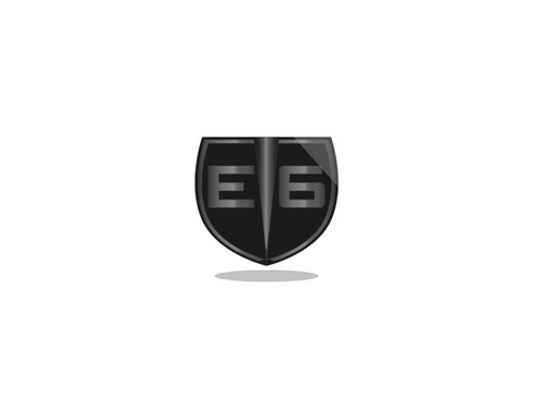
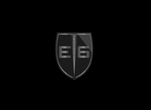
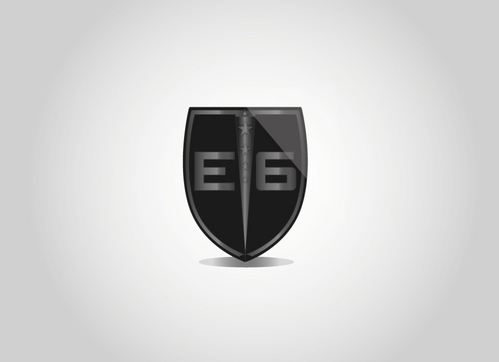
logo/symbol for "E6"
E6
|
Contest Holder
TCap15
?
Last Logged in : 4811days20hrs ago |
Concepts Submitted
63 |
Guaranteed Prize
199
|
Winner(s) | A Logo, Monogram, or Icon |
|
Live Project
Deciding
Project Finalized
Project: logo/symbol for "E6"
Industry:
Personal Logo
Contest Launched:
Sep 13, 2011
Selected:
1
winning design from 63 concepts
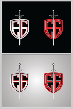
Winning Design by:
Corslu
Close Date:
Sep 20, 2011


Creative Brief
logo/symbol for "E6"
E6
No
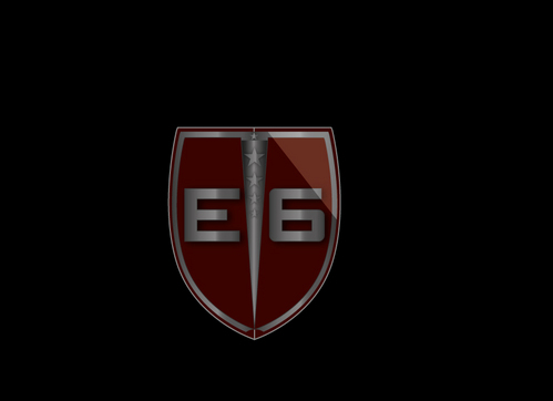
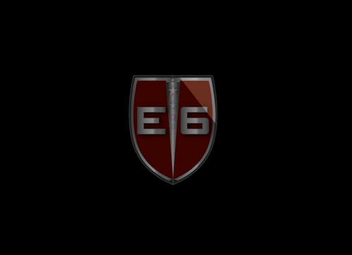
E6 is based off of the Bible's Ephesians 6: 10-18. It is about putting on the armor of God. I'm currently a personal trainer and soon to be gym owner. This verse not only represents what I believe, but what I try to live out everyday.
Originally I was thinking about just having E6. But am open to new/other ideas as well. The point is to represent the verse indirectly. It should be something that grabs people's attention, and then they should go to my website to figure out what E6 is all about. Originally I was thinking about having the "E6" be made out of claw marks with a bright light or metal armor being underneath (that shines through the clawed cloth. This design should be professional enough to put on business cards and letterheads, while maintaining an edgy appeal. A simple "E6" may be used for letterheads, whereas a different type of design may be used for shirts. These shirts will be athletic...similar to underarmour. I will be wearing these shirts to train clients in.
So...i guess the trick is in the balance of making this logo appealing to professional businesses/fitness/and an underlying christian appeal. The "armor of God" is not only about shielding yourself from the devil (hence the clawmarks) but from other things the world throws at you as well.
This logo should have some type of "warrior" feel or mentality. Some websites I like include: respectyouruniverse.com and animalpak.com
Thanks everyone!
Personal
Logo Type
![]()
Abstract Mark
![]()
Initials
![]()
Cutting-Edge
Unique/Creative
Clean/Simple
Modern
Retro
Serious
Open to color ideas. But leaning towards Black/Red/Silver? (symbolize power)
I'm looking for something unique, creative, edgy, but at the same time somewhat simple.
Related Contests

Comments
Project Holder
Project Holder
Project Holder
Project Holder
Project Holder
Project Holder
Project Holder
Project Holder
Project Holder
Project Holder
Project Holder