SALES / SUPPORT : +1-877-525-5646   |   Login


Logo for Vitamin Supplement Brand

Doc Adams Naturals

Contest Holder ginger99967 ?

Last Logged in : 1568days19hrs ago

Concepts Submitted

75

Guaranteed Prize
250
Winner(s)

1

A Logo, Monogram, or Icon veildAll design entries are veiled from other designers till the end of the contest. Featured Featured Contest
tick_gray

Live Project

tick_gray

Deciding

tick_blue

Project Finalized


Project: Logo for Vitamin Supplement Brand
Industry: Health Logo
Contest Launched: Mar 12, 2014
Selected: 1 winning design from 75 concepts
Winning Design by: vanibra84
Close Date: Mar 26, 2014


Logo for Vitamin Supplement Brand - Health


Awarded as a winner
Project Report    

Sort by:


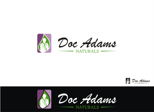
#59

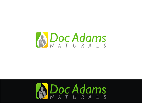
#33

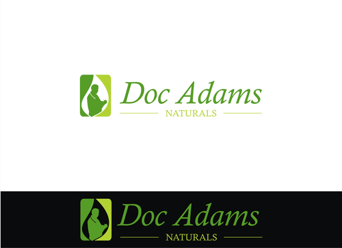
#24


Creative Brief


Logo for Vitamin Supplement Brand

Doc Adams Naturals

Yes

Need to convey nutrition, trust, value of brand

Health


Traditional
Professional

We are open to many ideas or designs which is why we use this site but we will not accept any designs which contain clip art.

We have done several contests on this site and are extremely fair. In many cases we award multiple designers.

Thanks for taking the time to consider our project!
Related Contests


Fresh, modern looking logo for Physical Therapy studio
$199
Prize Money
175
Concepts
Logo for a chiropractic health clinic
$199
Prize Money
63
Concepts
RockIt Fitness
$300
Prize Money
202
Concepts
Youth Heart Screening Company
$250
Prize Money
100
Concepts

Discussion


Comments

  • March 18, 2014 2:33 PM
    ginger99967 ginger99967
      Project Holder
    #45 Vishi - we have a different product using that same font.

    Like Icon 0   DislikeIcon 0
  • March 16, 2014 4:15 PM
    ginger99967 ginger99967
      Project Holder
    #27 - Cynderella. We like your concept. Perhaps put a doc image in the block? We have uploaded EXAMPLE images that we like...

    Like Icon 0   DislikeIcon 0
  • March 15, 2014 4:10 PM
    ginger99967 ginger99967
      Project Holder
    For vanibra84: we have a product "Adoria Skincare" that uses the same cursive font for that logo so it needs to be different. Perhaps a more traditional font?

    Like Icon 0   DislikeIcon 0
  • March 14, 2014 5:57 PM
    ginger99967 ginger99967
      Project Holder
    How about some silhouettes of a doc?

    Like Icon 0   DislikeIcon 0
  • March 14, 2014 4:00 PM
    ginger99967 ginger99967
      Project Holder
    In the USA, a "Doc" is slang for "Doctor". To us, Doc Adams Naturals should portray wise, trusting, traditional vitamins and supplements. Having "Doc" in the name communicates "coming from experience.." from someone that would know or be in an authority position. We are hoping that helps to understand the meaning of the Brand.

    Like Icon 0   DislikeIcon 0
  • March 13, 2014 12:38 PM
    ginger99967 ginger99967
      Project Holder
    Hello designers, as outlined in our brief, we will not be considering any submissions which use clip art or the likeness of "people" with circles for heads. Upon seeing the first round of submissions, we believe that a more traditional look would be best suited for this project. Again, we are looking to communicate trust, value and health within this logo/brand. Thanks everyone, we are looking forward to seeing what is brought to the table. Feel free to ask questions as you go along! Marianne

    Like Icon 0   DislikeIcon 0