SALES / SUPPORT : +1-877-525-5646   |   Login


Logo for virtual space artifact museum

The Jefferson in Space Museum

Contest Holder rjurek349 ?

Last Logged in : 5179days1hr ago

Concepts Submitted

33

Guaranteed Prize
500
Winner(s)

1

A Logo, Monogram, or Icon veildAll design entries can be viewed by other designers. Featured Featured Contest Expedite Expedite Contest
tick_gray

Live Project

tick_gray

Deciding

tick_blue

Project Finalized


Project: Logo for virtual space artifact m ...
Industry: History Logo
Contest Launched: Oct 01, 2010
Selected: 1 winning design from 33 concepts
Winning Design by: Marsonaut
Close Date: Oct 08, 2010


Logo for virtual space artifact museum - History


Awarded as a winner
Project Report    

Sort by:


#26

#24

#23

#17

#12

#22

#21

#15

#33

#32


Creative Brief


Logo for virtual space artifact museum

The Jefferson in Space Museum

No

Logo to be used for relaunch of virtual space artifact museum of the world's most complete collection of space-flown US $2 bills across the Mercury, Gemini, and Apollo space programs. See current "site" at http://jefferson-in-space.blogspot.com.

History

Illustrative
Illustrative

Character
Character


Unique/Creative
High Tech
Fun
Illustrative
Playful/Cartoonish
Youthful

4 colors are good -- logo to be used on website, and then for t-shirts, hats, coffee mugs,e tc. Think: inspiring kids to ask mom and dad for something in the gift shop! :-)

3

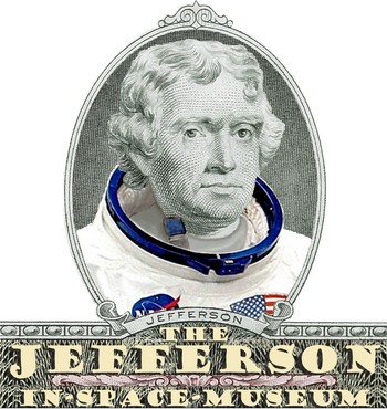
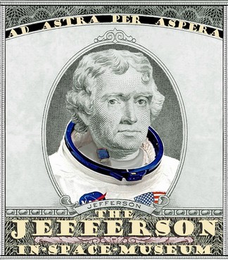
There is a neat little mocked up pic of Thomas Jefferson in an Apollo era white-space suit on the site now that I kind of like, but it is not "cartoon" enough. The site will go from a "blog" site to a true website, so we want the logo to really pop and tell a story.
Related Contests


Logo for new historical website
$220
Prize Money
117
Concepts
Logo for new orthodontic practice
$250
Prize Money
118
Concepts
New Logo for Social Community
$199
Prize Money
332
Concepts
Logo for Medical Eye Clinic
$350
Prize Money
405
Concepts

Discussion


Comments

  • October 05, 2010 2:57 PM
    rjurek349 rjurek349
      Project Holder
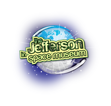
    #26 the more I look at it, Marsonaut, the more I really like this - it captures the essence of the museum in a very creative way.

    Like Icon 0   DislikeIcon 0
  • October 05, 2010 1:55 PM
    rjurek349 rjurek349
      Project Holder
    #26 Marsonaut - there is A LOT of potential in this one. Perhaps a more rectangular layout, with the two-dollar bill "rocket" swooping from under over the top. Interesting take on the subject!

    Like Icon 0   DislikeIcon 0
  • October 05, 2010 10:44 AM
    rjurek349 rjurek349
      Project Holder
    We really like the direction of Marsonaut and studelossantos, which seem to be the front runners from the internal voting of our input folks. One comment is that we might like to see something on the "serious, elegant" side -- i.e., more traditional "museum" logo. Just a thought -- if anyone ones to toss up something after researching air&space museum logos. Worth a shot. But we do want to project the message of Jefferson, space flown, and the essence of the museum. Tall order, we know. Thus the two front runners.

    Like Icon 0   DislikeIcon 0
  • October 04, 2010 9:29 AM
    rjurek349 rjurek349
      Project Holder
    Marsonaut - on #24 I REALLY like the currency colors on this one.

    Like Icon 0   DislikeIcon 0
  • October 04, 2010 9:28 AM
    rjurek349 rjurek349
      Project Holder
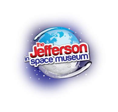
    Studelossantos - I like the earth at the center for #18 -- but would like to see the colors on the name the same red throughout. The shift to black on the bottom doesn't work, it seems to me. This is a nice, clean look.

    Like Icon 0   DislikeIcon 0
  • October 04, 2010 9:25 AM
    rjurek349 rjurek349
      Project Holder
    khorto20 - I like the use of the literal Jefferson portrait from the bill, and the typeface for the museum name. The moon behind the green portrait, though, leaves me cold. Perhaps too literal. Maybe play with orbital ideas -- ship around the portrait, or Earth/moon around it, etc.

    Like Icon 0   DislikeIcon 0
  • October 04, 2010 9:23 AM
    rjurek349 rjurek349
      Project Holder
    I really like KSCartists use of the Jefferson signature in the logo -- others might consider that, too, to see if it works with their designs.

    Like Icon 0   DislikeIcon 0
  • October 04, 2010 9:22 AM
    rjurek349 rjurek349
      Project Holder
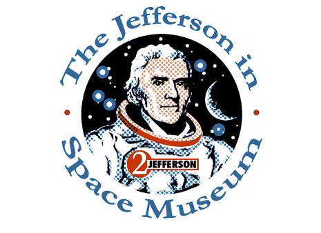
    Marsonaut - I really like the tweaks on yours - especially around the typeface and colors. The name badge is getting there, too. Any chance you could save a bit a space and just put two vertical lines throught he "2"? Just a thought.

    Like Icon 0   DislikeIcon 0
  • October 03, 2010 5:24 PM
    rjurek349 rjurek349
      Project Holder
    You all have turned this into a real competition -- keep those ideas coming!

    Like Icon 0   DislikeIcon 0
  • October 03, 2010 5:23 PM
    rjurek349 rjurek349
      Project Holder
    Marsonaut - I really like #12 and the color enhancements. I also like the number 2 mission patch. My only suggestion (and I know I asked to have you take it off as a separate patch), would be to include a small dollar sign next to the 2. Jefferson was the third president, and I don't want people to think that I am implying he was the second. But I really like the "presidential" feel that is evoked by this design.

    Like Icon 0   DislikeIcon 0
  • October 03, 2010 5:21 PM
    rjurek349 rjurek349
      Project Holder
    KAPTEC - nice use of color. Not a big fan of the eagle, though: too much of an Apollo 11 echo for me. But the triangle design is a new take that is very interesting.

    Like Icon 0   DislikeIcon 0
  • October 03, 2010 5:20 PM
    rjurek349 rjurek349
      Project Holder
    #14 & #13 -- I like these MUCH better without Jefferson in them. Very cool and clean and fun. I probably like 14 better for the balance with the swooshes.

    Like Icon 0   DislikeIcon 0
  • October 03, 2010 5:19 PM
    rjurek349 rjurek349
      Project Holder
    KSC Artist - Nice improvement on your design -- I could see that as a mission patch someday.

    Like Icon 0   DislikeIcon 0
  • October 03, 2010 5:17 PM
    rjurek349 rjurek349
      Project Holder
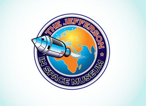
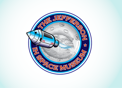
    #16 - rather than the moon in the center, this one calls out for the Earth to be in the center. Might be good to leave the $2 off on this one. But I like the basic nature of it. A nice new angle by you.

    Like Icon 0   DislikeIcon 0
  • October 03, 2010 8:38 AM
    rjurek349 rjurek349
      Project Holder
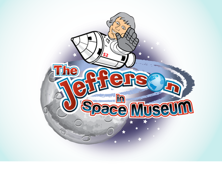
    #11 is really a giant leap forward. I love the addition of the moon and the star field in the background, and the us of the CSM as vehicle is a nice choice. Humor me: what would it look like without the smiling/handwaving Tom? Just the CSM, and all the elements the same? Perhaps add a bit of color to the CSM? Just thinking out loud. But really like this version over your others.

    Like Icon 0   DislikeIcon 0
  • October 02, 2010 9:52 PM
    rjurek349 rjurek349
      Project Holder
    #8 - cool addition having the Jefferson signature in the logo

    Like Icon 0   DislikeIcon 0
  • October 02, 2010 1:49 PM
    rjurek349 rjurek349
      Project Holder
    Marsonaut - great entry. I like the play on the Apollo WSS theme. Like the lunar feel. The red dollar sign strikes me as a bit much (perhaps too commercial of a feel), but I love the red number 2 as the mission patch on his suit. Maybe just that one, in place of the dollar sign one on his chest, to give it just that hint of red highlight? Or it could be a "$2" in red. Either way - a great entry. We got ourselves a competition!

    Like Icon 0   DislikeIcon 0
  • October 02, 2010 10:02 AM
    rjurek349 rjurek349
      Project Holder
    studelossantos -- on the space craft issue -- look at the Apollo 7 or Apollo 10 mission patch designs (you can see those on wikipedia). The Apollo Command Module can serve as an excellent choice. Just a thought.

    Like Icon 0   DislikeIcon 0
  • October 02, 2010 9:51 AM
    studelossantos studelossantos
     
    ok i am gonna change the shuttle he is riding and upload it as soon as its done! thanks!

    Like Icon 0   DislikeIcon 0
  • October 02, 2010 9:28 AM
    rjurek349 rjurek349
      Project Holder
    #6 -- I like the grey-tone (or silver tone) galactic swirl behind this one -- never mind my comment on color...perhaps make it a bit more pronounced...but very cool...

    Like Icon 0   DislikeIcon 0
  • October 02, 2010 9:27 AM
    rjurek349 rjurek349
      Project Holder
    coldkiller - haven't seen the email yet, but will go look.

    Like Icon 0   DislikeIcon 0
  • October 02, 2010 9:26 AM
    rjurek349 rjurek349
      Project Holder
    #5 & #6 - Love the direction this is taking, and the cartoon image of Jefferson. I like the idea of the color swirl behind him, but not the yellow -- perhaps a blue or a green? Although the "clean" look without is cool, too. One note: a $2 bill never flew on a space shuttle. Not sure if you can change the "rocket" he is riding -- but one flew in a Mercury, Gemini, and Apollo capsule -- and the latest addition flew all the way to the moon's surface on the Apollo 17 lunar module. It flew on a Soyuz to the International Space Station, and on Virgin Galactic's SpaceShipOne. So there are a number of capsules/rockets to choose from. (Shuttle rules do not allow currency to fly on them byt he astronauts - so the logo would be historically inaccurate.) Otherwise, REALLY liking the direction of this one. You do great work.

    Like Icon 0   DislikeIcon 0
  • October 02, 2010 9:17 AM
    rjurek349 rjurek349
      Project Holder
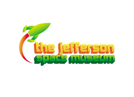
    #4 - like the rocket and the colors. Perhaps the "flame" can lick around under the title in an arc? Also - missing the idea the the museum is of Thomas Jefferson $2 bills. Still, like this as an initial draft.

    Like Icon 0   DislikeIcon 0
  • October 02, 2010 9:16 AM
    rjurek349 rjurek349
      Project Holder
    #3-interesting clean look. Like the orbital theme and colors. It is missing the Jefferson/$2 bill theme -- if you can work that in some how.

    Like Icon 0   DislikeIcon 0
  • October 02, 2010 8:57 AM
    coldkiller coldkiller
     
    @studelossantos - #6 Really liking your work... :0)

    Like Icon 0   DislikeIcon 0