SALES / SUPPORT : +1-877-525-5646 |
Login
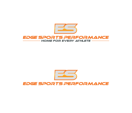
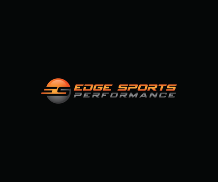
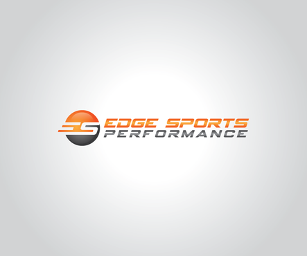
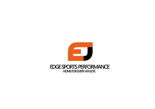
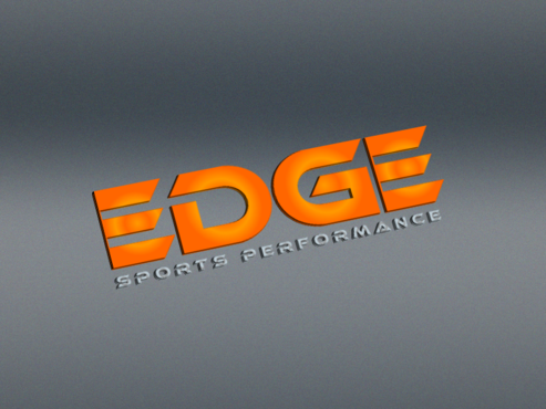
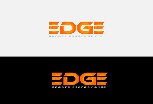
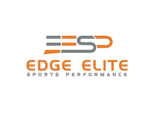
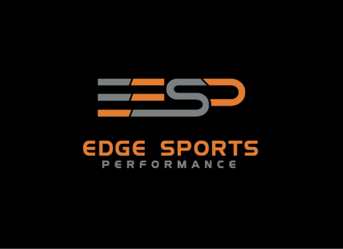
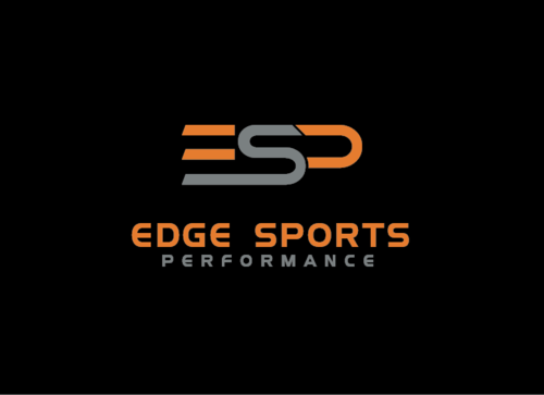
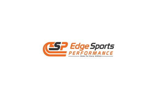
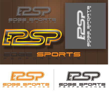
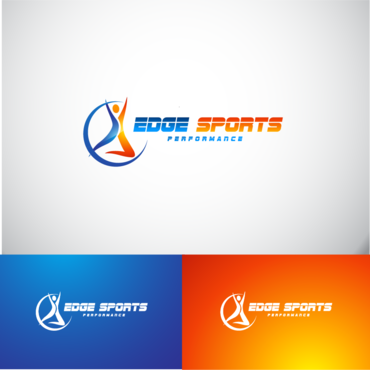
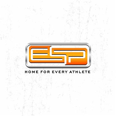
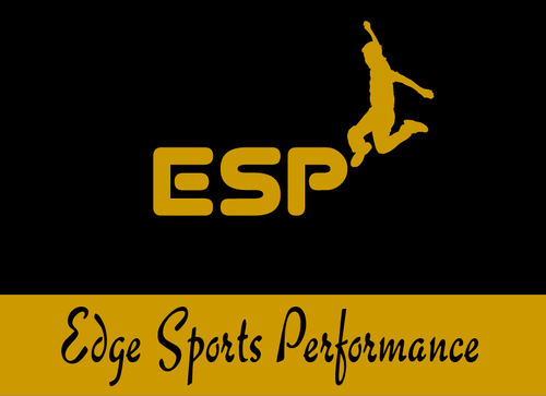
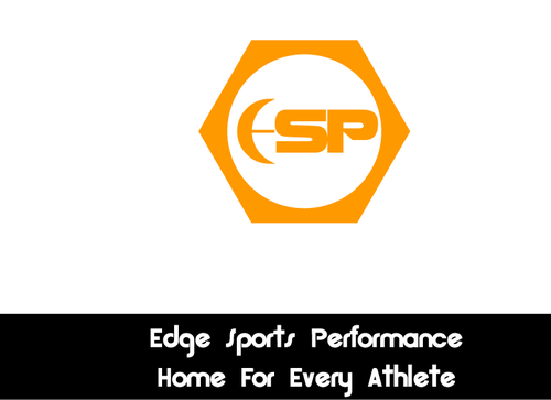
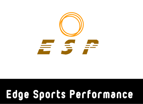
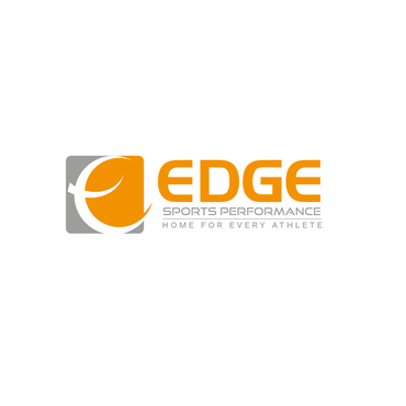
Logo for sports performance company "Edge Sports Performance"
Edge Sports Performance
|
Contest Holder
dedge123
?
Last Logged in : 1657days2hrs ago |
Concepts Submitted
335 |
Guaranteed Prize
199
|
Winner(s) | A Logo, Monogram, or Icon |
|
Live Project
Deciding
Project Finalized
Project: Logo for sports performance compa ...
Industry:
Sports Logo
Contest Launched:
Nov 07, 2015
Selected:
1
winning design from 335 concepts
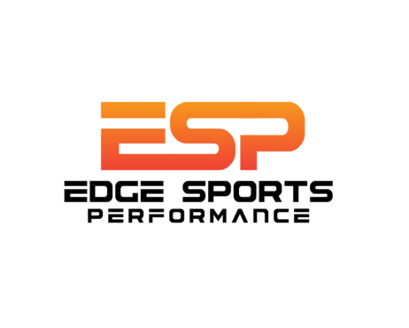
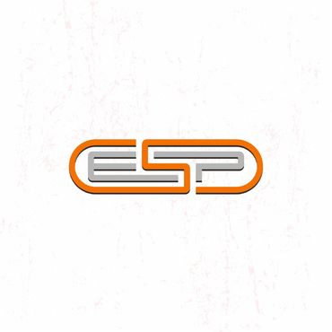
Winning Design by:
agungdesgraf
Close Date:
Nov 18, 2015

Creative Brief
Logo for sports performance company "Edge Sports Performance"
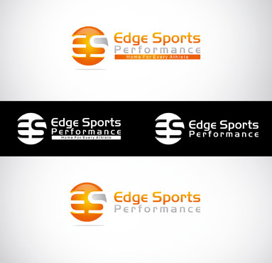
Edge Sports Performance
Home For Every Athlete
No
This logo will represent who we are as a sports performance company to train any athlete with any sport. To help them improve strength, conditioning, speed, agility...etc (guy or girl)
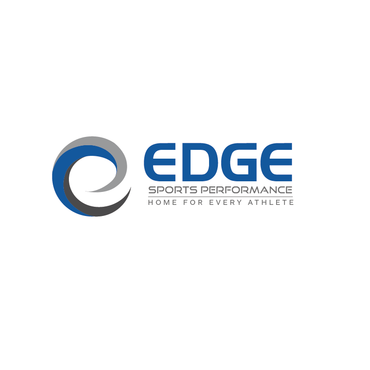
Here are my other 2 logos that i want this one to kind of fit in with to let the community know it is connected with these two companies. www.edgebodybootcamp.com & www.edgefitsportsandfitness.com
colors to use is at least orange that it is in these two logos
Sports
Abstract Mark
![]()
Modern
orange and black like my other 2 logos www.edgebodybootcamp.com www.edgefitsportsandfitness.com
2
i like to see logo with tag line and without.
Reason: i may not always use the tagline and because i may change it
i want this to show the athletes in my community we are the number 1 place to go if they want improve on any area of fitness they need for any sports.
Related Contests


Comments
Project Holder
Project Holder
Project Holder
Project Holder
Project Holder
Project Holder
Project Holder
Project Holder