SALES / SUPPORT : +1-877-525-5646 |
Login
Logo for RR Motorsports Pvt. Ltd.
RR (not necessary)
|
Contest Holder
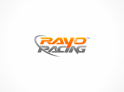
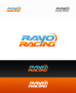
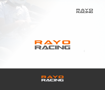
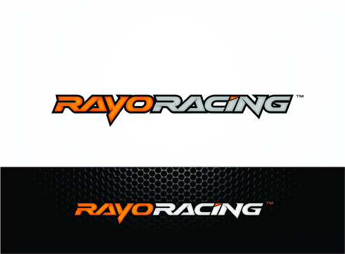
RayoRacing
?
Last Logged in : 4315days14hrs ago |
Concepts Submitted
73 |
Prize Money
199
|
Winner(s) | A Logo, Monogram, or Icon |
|
Live Project
Deciding
Project Finalized
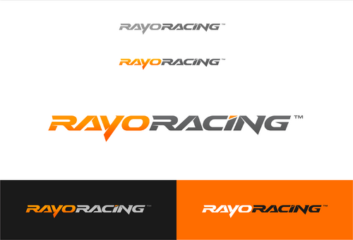
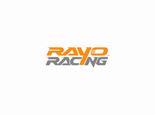
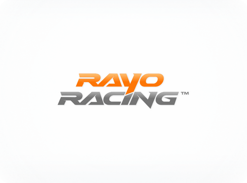
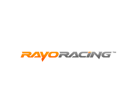
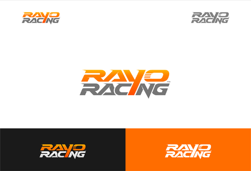
Project: Logo for RR Motorsports Pvt. Ltd.
Industry:
Automotive Logo
Contest Launched:
Apr 05, 2013
Selected:
2
winning design from 73 concepts
Winning Design by:
BIMPOP
Close Date:
Apr 19, 2013

Creative Brief
Logo for RR Motorsports Pvt. Ltd.
RR (not necessary)
No
1. The logo will appear everywhere, branding appears – Karts, Race Cars, T-shirts, banners, backdrops, etc. Therefore it is important that it is instantly recognisable on fast moving vehicles. (Even when seen on TV)
2. It should not be too complicated in design. (When photographs of cars / karts appear in newspapers, it should be recognisable even there. A complicated design might loose a lot of quality in snaps appearing in newspapers / magazines)
3. Currently ‘Rayo Racing’ is branded in 2 ways – a Long version (Rayo Racing in one line) & A stacked version (‘RAYO’ on top of ‘Racing’). The font & look can be seen on one of our karts at the location - http://www.facebook.com/photo.php?fbid=289189264515300&set=a.289188747848685.50777.117992651634963&type=3&theater
Therefore the new logo – should ‘fit in’ well, with both these variations of the brand name – Rayo Racing.
4. Logo should somehow signify ‘speed’ if possible.
5. If possible contain some relation to RR or Rayo Racing
6. Should not be something common or looked at as copying another brand’s logo.
7. Chequered flag / trophy themes are cliché.
8. Simple, classy with a deep meaning, would be ideal.
Automotive
Abstract Mark
![]()
Initials
![]()
Illustrative
![]()
Modern
Cutting-edge
Sophisticated
Simple
Professional
High Tech
Royal Blue, White, Black
not sure
Refer to "* What will this logo represent and convey?" section
Related Contests

Comments