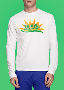
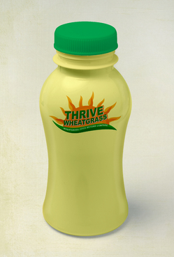
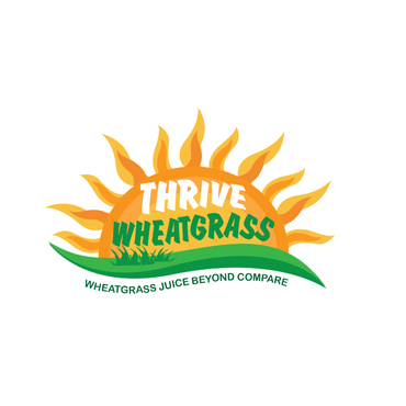
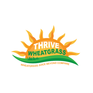
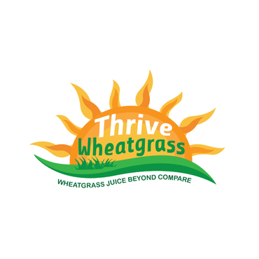
Logo for Natural Health Product company (Wheatgrass)
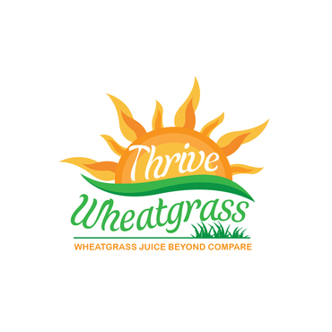
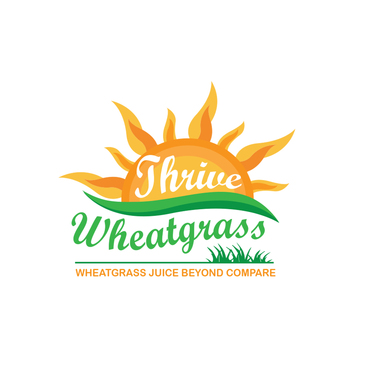
Thrive Wheatgrass OR Thrive WheatGrass OR THRIVE WHEATGRASS (whichever suits your design better)
|
Contest Holder
LGWheatgrass
?
Last Logged in : 2462days4hrs ago |
Concepts Submitted
265 |
Guaranteed Prize
370
|
Winner(s) | A Logo, Monogram, or Icon |
|
Live Project
Deciding
Project Finalized
Creative Brief
Logo for Natural Health Product company (Wheatgrass)
Thrive Wheatgrass OR Thrive WheatGrass OR THRIVE WHEATGRASS (whichever suits your design better)
Wheatgrass Juice Beyond Compare (can also be all capitals if the design allows)
No
This logo should convey energy, life, positivity, modernism and professionalism and a moderate amount of simplicity, without sacrificing graphic effect. This is for an organic wheatgrass juice company, and our vision is to be the size of coca cola one day, having our product on every retailers shelves in the world. We are in the business of delivering life saving medicinal quality natural health products, So even though we want energy and excitement, we don't want it to look like a candy companys logo lol! It needs to look professional along with all that energy! :)
Health
Logo Type
![]()
Abstract Mark
![]()
Illustrative
![]()
Character
![]()
Web 2.0
![]()
Modern
Cutting-edge
Youthful
Sophisticated
Simple
Elaborate
Professional
High Tech
Bright Orange (Think Nickelodeon, bright and deep vibrant) Deep Green, and lighter green, the logos font made out of blades of grass should be 2 toned, so the customer can see it is clearly a blade of grass, from the tone, and shape. The sun should probably be yellow and orange mix.... Additional colours are welcome if they look good in the logo! :)
3
We are looking for a unique logo with a custom font that looks like realistic but strong and thick blades of grass with light and dark green tone to them, not overly cartoony, but more modern looking. "Thrive" or "THRIVE" should be a bit bigger than "WheatGrass" or "Wheatgrass" or "WHEATGRASS" in the logo, but we want to emphasize both, almost equally. There are not any big companies doing this yet, so we would like to capitalize on the name Wheatgrass, the same way Coca Cola, has capitalized on Cola. We also want to have the Sun in our logo, we are very certain about that, as wheatgrass and the sun go hand in hand.
I did a sketch of something that I liked, I am sure someone on here can come up with something better, but I have uploaded a very rough sketch of an idea I liked. Please disregard the wording in it. We have seemed to find out that blades of grass look better in lower case, whatever suits your logo though! We are obviously looking for better ideas than something I just decided to sketch!






Comments
Project Holder
Project Holder
Project Holder
Project Holder
Project Holder
Project Holder
Project Holder
Project Holder
Project Holder
Project Holder
Project Holder
Project Holder
Project Holder
Project Holder
Project Holder
Project Holder
Project Holder
Project Holder