SALES / SUPPORT : +1-877-525-5646   |   Login


Logo for Indoor Cycling Studio

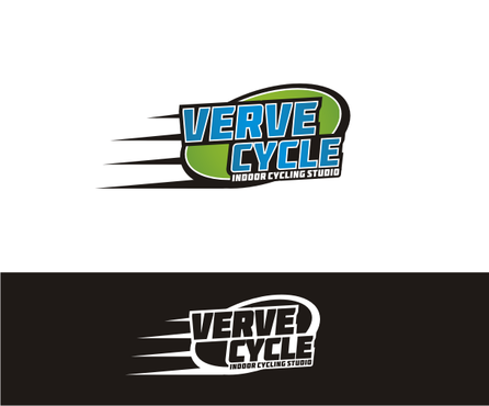
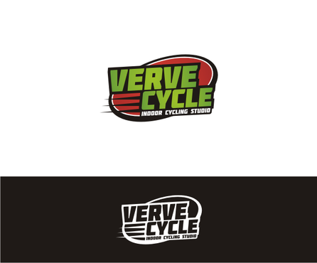
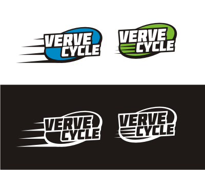
Verve Cycle

Contest Holder aliciacoombs113 ?

Last Logged in : 4049days23hrs ago

Concepts Submitted

97

Guaranteed Prize
200
Winner(s)

1

A Logo, Monogram, or Icon veildAll design entries are veiled from other designers till the end of the contest.
tick_gray

Live Project

tick_gray

Deciding

tick_blue

Project Finalized


Project: Logo for Indoor Cycling Studio
Industry: Health Logo
Contest Launched: Nov 04, 2013
Selected: 1 winning design from 97 concepts
Winning Design by: valiWORK
Close Date: Nov 18, 2013


Logo for Indoor Cycling Studio - Health


Awarded as a winner
Project Report    

Sort by:


#48

#42

#39

#29

#15

#3

#97

#96

#94

#93

#92

#81

#80

#77

#76

#75

#74

#71

#64

#56

#54

#53


Creative Brief


Logo for Indoor Cycling Studio

Verve Cycle

Indoor Cycling Studio

Yes

This logo is for an indoor cycling studio concept to be located in the Caribbean island of Grand Cayman. The logo should convey our dedication to a healthy lifestyle, vitality, perseverance of goals, and passion for living.

Health

Abstract Mark
Abstract Mark

Illustrative
Illustrative

Web 2.0
Web 2.0


Modern
Simple

I welcome your interpretation on this. However, these are the colors that come to my mind that I am more partial to (but do not have to be incorporated together in the logo) Red Electric Blue Vivid green

not sure

I've seen a few logos for studios with wheel/circular designs that I am partial to. But again, I'm open to your interpretation.
I don't want any palm trees, etc that would make it feel like it's "islandy".
A design that will inspire people to want to get on an indoor bike, work out, have fun, be healthy.
Related Contests


Inspiring Logo for fun and innovative fitness and wellness center
$199
Prize Money
159
Concepts
Fresh, modern looking logo for Physical Therapy studio
$199
Prize Money
175
Concepts
 logo for re-branding new nursing facility
$400
Prize Money
184
Concepts
Logo for Nutrition company
$200
Prize Money
182
Concepts

Discussion


Comments

  • November 06, 2013 7:53 AM
    aliciacoombs113 aliciacoombs113
      Project Holder
    No full bikes or people riding bikes in the logo - just the concept of a wheel idea - Please see these logos: www.joyridestudio.com www.spynergywellesley.com Really liking the bright green and bright blue combination.

    Like Icon 0   DislikeIcon 0
  • November 05, 2013 11:13 AM
    aliciacoombs113 aliciacoombs113
      Project Holder
    Less focus on the full bike and more on the concept of a wheel.

    Like Icon 0   DislikeIcon 0
  • November 05, 2013 7:10 AM
    aliciacoombs113 aliciacoombs113
      Project Holder
    I'm definitely liking the combination of the bright blue and bright green. I'd like to see more designs in red though to compare. Please no red and green together - it's too much like Christmas.

    Like Icon 0   DislikeIcon 0