SALES / SUPPORT : +1-877-525-5646   |   Login


Logo for a Church Ministry

The C.C.T.P Ministries

Contest Holder TheCCTPMinistries ?

Last Logged in : 2064days5hrs ago

Concepts Submitted

136

Guaranteed Prize
199
Winner(s)

1

A Logo, Monogram, or Icon veildAll design entries are veiled from other designers till the end of the contest. Featured Featured Contest
tick_gray

Live Project

tick_gray

Deciding

tick_blue

Project Finalized


Project: Logo for a Church Ministry
Contest Launched: Feb 17, 2017
Selected: 1 winning design from 136 concepts
Winning Design by: ddogg
Close Date: Apr 01, 2017


Logo for a Church Ministry - Religion and Spirituality


Awarded as a winner
Project Report    

Sort by:


#103

#102

#101

#99

#91

#90

#89

#88

#87

#86

#85

#84

#83

#82

#81

#80

#79

#78

#77

#76

#75

#74

#73


Creative Brief


Logo for a Church Ministry

The C.C.T.P Ministries

No

This logo will represent a church ministry with Pentacostal roots. The name of the church is 'The Chief Cornerstone Tabernacle of Praise Ministries'.

Religion and Spirituality

Symbolic
Symbolic


Modern
Cutting-edge
Traditional
Professional
Rustic

Burgundy White Gold

3

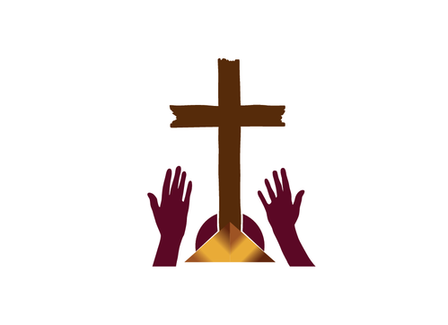
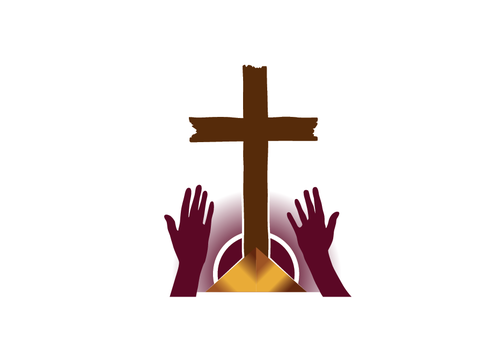
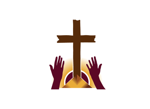
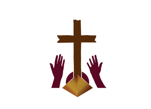
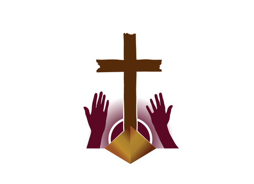
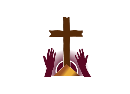
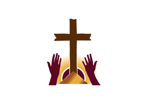
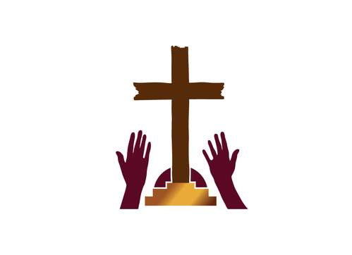
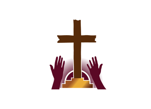
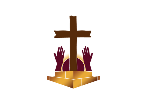
Looking to see a rugged looking cross mounted on a cornerstone. The cornerstone can straight-cut or a large stone.
Would also like two open hands facing the sky (like worshipping hands), and the image of a sun shining down on the cross.
In terms of colours, dark shade of gold should be used for the cornerstone, burgundy and white for the cross. Background should be white

Related Contests


Youth Evangelism Conference logo
$354
Prize Money
59
Concepts
Logo for a Junior High Worship Camp
$209
Prize Money
56
Concepts
Logo for a women's church ministry
$200
Prize Money
43
Concepts
Logo for young adult ministry
$265
Prize Money
46
Concepts

Discussion


Comments

  • March 06, 2017 9:26 AM
    TheCCTPMinistries TheCCTPMinistries
      Project Holder
    ddogg #134 looks great. Could you try one more, with the exact same image, but change the positions of the words in our church name so that the word 'The' is on one line, 'Chief Cornerstone Tabernacle of Praise' is on a second line, and 'Ministries' is on a third line - of course all centered? We'd appreciate it.

    Like Icon 0   DislikeIcon 0
  • March 05, 2017 4:23 PM
    TheCCTPMinistries TheCCTPMinistries
      Project Holder
    'ddogg' - Thanks for the changes. We're asking if you could, please, modify #111's design with the following changes: HANDS - Could you raise lower level of the cornerstone to cover some of the arms so that only the hands and wrists are visable. You don't need to move the hands from their current position. CORNERSTONE - Could you make the cornerstone to look like one solid stone instead of stone slabs fitted together (you can just eliminate the [4] vertical white lines). Perhaps you could show one cornerstone with 2 tiers and one cornerstone with only 1 tier. CROSS - Could you make the horizontal part of the cross a little bit longer on either side GLOW - We'd like it if you could use a little more gold glow or the same amount of gold glow as in #72. NAME - Would you please place our extended name below the image; so instead of 'The C.C.T.P Ministries' it would say 'The Chief Cornerstone Tabernacle of Praise Ministries' Thanks again.

    Like Icon 0   DislikeIcon 0
  • March 05, 2017 10:12 AM
    TheCCTPMinistries TheCCTPMinistries
      Project Holder
    To help you out, here are a couple of links to images of cornerstones. This is just to show you the aspect ratio we are looking for. https://agnesmizere80.files.wordpress.com/2014/06/cornerstone.jpg http://www.cornerstonedentalny.com/files/2016/04/Cornerstone-Dental-RGB.png

    Like Icon 0   DislikeIcon 0
  • March 04, 2017 8:51 PM
    FiddlinNita FiddlinNita
     
    Dear C.C.P.T Ministries, Please provide star ratings and private feedback (via the top right link) to help us create the best design for you.Thanks,

    Like Icon 0   DislikeIcon 0
  • March 04, 2017 9:44 AM
    FiddlinNita FiddlinNita
     
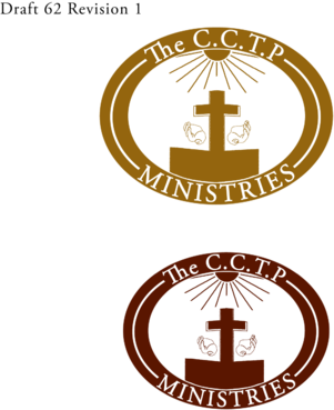
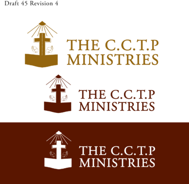
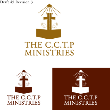
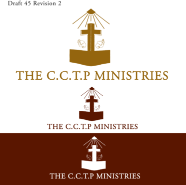
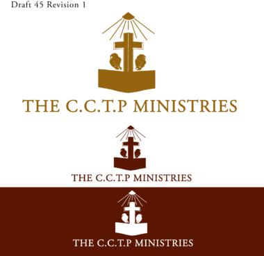
    Dear C.C.P.T Ministries, Drafts #45 & #62 are mine. I have to be out with my family this morning, and will be posting revisions this afternoon. Please wait for me! :) Thanks, Fiddlin Nita

    Like Icon 1   DislikeIcon 0
  • March 04, 2017 9:15 AM
    TheCCTPMinistries TheCCTPMinistries
      Project Holder
    Another friendly reminder: CHURCH NAME: The C.C.T.P Ministries COLOURS TO USE: Burgundy, Gold, White

    Like Icon 1   DislikeIcon 0
  • March 04, 2017 8:22 AM
    TheCCTPMinistries TheCCTPMinistries
      Project Holder
    It is important to us that a cornerstone be present in the logo. It should appear like you're standing at the corner of the base of a building, except it is only a small part of the corner in the logo, enough for the cross to stand on - If you think of a protractor, the left edge would be facing 35 degrees and the right edge facing 145 degrees, with the corner of the stone lined up with the 0 (zero) line and 90 degree point. Hopefully this helps a little more. Here's a link for the protractor. https://www.google.ca/search?q=online+protractor&rlz=1C1RNLG_enCA654CA654&tbm=isch&imgil=uWDwnHihjDC8bM%253A%253BkiKmEF02H1t3XM%253Bhttp%25253A%25252F%25252Folsassmaths4.pbworks.com%25252Fw%25252Fpage%25252F5329461%25252FAngles%2525252520-%2525252520Week%25252525203&source=iu&pf=m&fir=uWDwnHihjDC8bM%253A%252CkiKmEF02H1t3XM%252C_&usg=__Qmp4cu1A8VGRSzaFaOO7jXXS0lE%3D&biw=1366&bih=638&ved=0ahUKEwiNitTn9rzSAhXry4MKHeZeDigQyjcILg&ei=bb26WM2fMuuXjwTmvbnAAg#imgrc=uWDwnHihjDC8bM:

    Like Icon 1   DislikeIcon 0
  • March 03, 2017 10:55 AM
    TheCCTPMinistries TheCCTPMinistries
      Project Holder
    We are having a bit of difficulty choosing. To 'ddogg': we like #41. Could you make the cross more of a wood colour (brown tones), and a cornerstone a little more like #45? That would be great. Also, we'd like to see submissions with the church name independent of the image. It is read - The C.C.T.P Ministries

    Like Icon 0   DislikeIcon 0
  • March 02, 2017 2:00 PM
    TheCCTPMinistries TheCCTPMinistries
      Project Holder
    Hello, i've looked at all, and also at our previous logo which to me represented: #1) the sun, (the pic made me think of the light and the other word Son) #2) the cross (where everything for the believer began & the unsaved begins) #3) the uplifted hands (because of the sleeves on the garment) i see as the uplifted hands of CHRIST in worship to HIS Father JEHOVAH, whom we are to emulate. So i've chosen either (# 45) or (# 62) the colours being either #1 burgundy or #2 darker gold depending on whether it would be a burden to future printing/copying.

    Like Icon 1   DislikeIcon 0
  • February 23, 2017 8:05 AM
    FiddlinNita FiddlinNita
     
    Please provide star ratings and feedback (via the top right envelope icon) to help us create the best design possible for you. Thanks.

    Like Icon 1   DislikeIcon 1
  • February 20, 2017 4:15 PM
    TheCCTPMinistries TheCCTPMinistries
      Project Holder
    Some of these designs look great! However, The idea of a 'Rugged Cross' is still missing; it would be nice to see some designs display elements of a cross made from wood. Just a reminder, our colours are mainly Burgundy, White and Gold. Thanks for the designs. Keep them coming.

    Like Icon 1   DislikeIcon 0