SALES / SUPPORT : +1-877-525-5646   |  


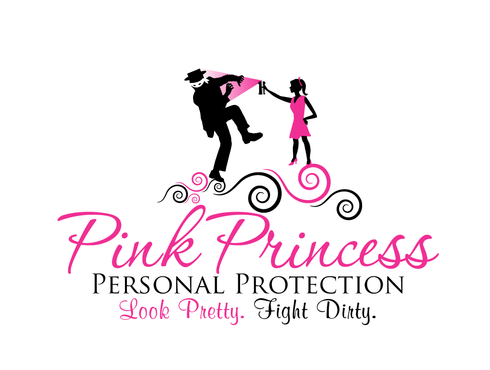
Logo design for Pink Princess Personal Protection

Pink Princess Personal Protection

Contest Holder PinkPrincessPro16 ?

Last Logged in : 4968days16hrs ago

Concepts Submitted

18

Prize Money
250
Winner(s)

1

A Logo, Monogram, or Icon veildAll design entries can be viewed by other designers.
tick_gray

Live Project

tick_gray

Deciding

tick_blue

Project Finalized


Project: Logo design for Pink Princess Per ...
Industry: Retailers Logo
Contest Launched: Mar 18, 2011
Selected: 1 winning design from 18 concepts
Winning Design by: neonlite
Close Date: Mar 25, 2011


Logo design for Pink Princess Personal Protection - Retailers


Awarded as a winner
Project Report    

Sort by:


#18

#15

#11

#10

#17

#14

#13

#12


Creative Brief


Logo design for Pink Princess Personal Protection

Pink Princess Personal Protection

Look Pretty. Fight Dirty.

Yes

Pink Princess Personal Protection is a company specializing in sales of self defense products designed with women in mind. We provide fashionable, easy to use, unassuming, non-lethal, yet effective self defense tools. The logo will be used on my website (http://www.PinkPrincessPersonalProtection.com)- (under construction), and all marketing materials. The main demographic is females ages 18 and up, who want to feel prepared to defend themselves against an assailant on the street with as little physical contact as possible and without having to carry bulky, difficult to handle weapons.

Retailers

Illustrative
Illustrative

Character
Character


Modern
Illustrative
Feminine

Warm/hot pink, black, silver and white

not sure

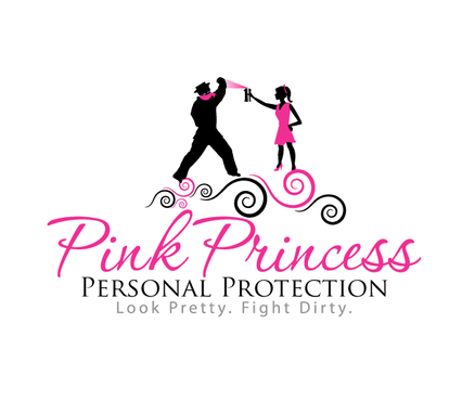
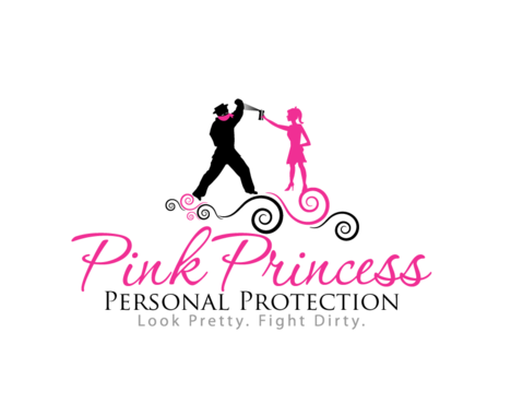
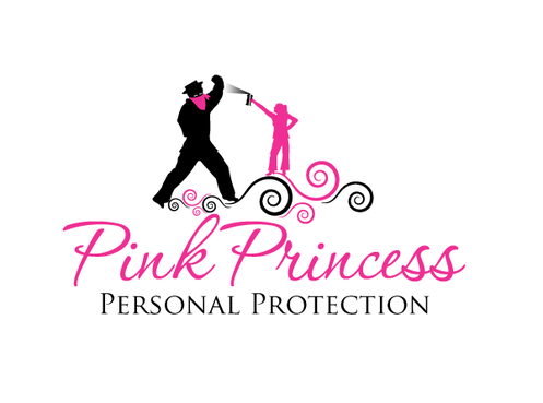
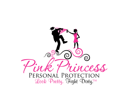
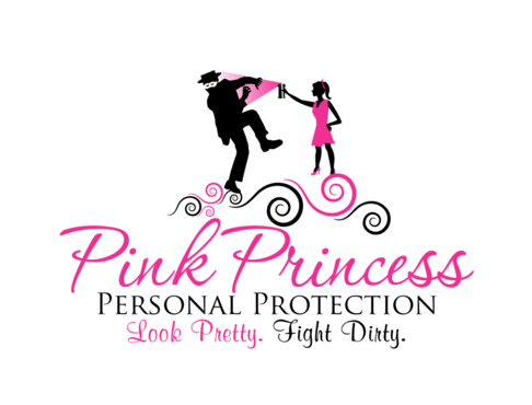
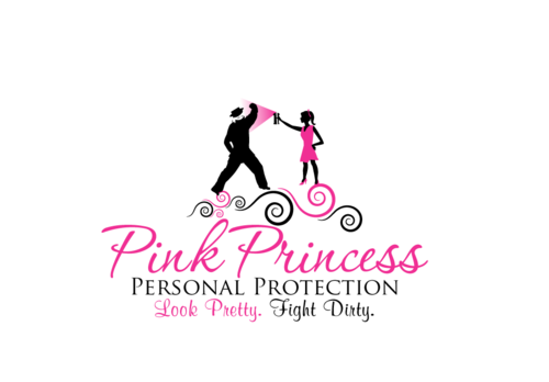
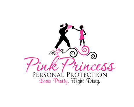
My vision for the logo is a right-side facing warm/hot pink silhouette of a young woman with a ponytail, maybe bangs, a mid-thigh length (not mini) skirt, and heels. She should be thin- not curvaceous or drawing any real attention to her body. No facial features other than the facial profile. Her right arm is fully extended as she is holding a small item (can be white, black, pink, or even a shiny or sparkly silver-gray)which is apparently spraying out some type of aerosol, liquid stream, or fumes towards a large would-be attacker. The attacker is much larger than the young lady, in black silhouette, clearly muscular, possibly with a white bandana/eyemask tied around his face with eyes visible through it. Maybe he wears a cap of some sort (not baseball). He was advancing toward her, but the pepper spray she is carrying is apparently backing him off. This may be indicated by him attempting to cover his face with one hand or a similar gesture to indicate that he needs to protect his eyes and face, or that he is somehow dazed and confused. It should be clear that her use of the product was successful.

The company name should be in a strong, but feminine font, clean lines, and no use of a tiara, or crown (despite the name "Princess"). The words "Pink Princess" may be in a more feminine or ornate font than "Personal Protection", which could be in a stronger, cleaner font. The fonts in the tag line could also be split (feminine "Look Pretty.", which might be in pink, while a cleaner/stronger/more serious "Fight Dirty." might be in black). Use your expert judgement. Despite my specific details, I am open to new ideas and suggestions.

Thank you so much for taking time to read my project!
Related Contests


Mile High Supply Co. Logo
$199
Prize Money
26
Concepts
Help create a visual identity for our gift shop!
$250
Prize Money
284
Concepts
Modern, Clean Logo for ecommerce site PuffSource.com
$250
Prize Money
273
Concepts
Logo for self defense e-commerce store.
$199
Prize Money
50
Concepts

Discussion


Comments

  • March 21, 2011 4:51 AM
    PinkPrincessPro16 PinkPrincessPro16
      Project Holder
    @neonlite, Draft #5: Thank you so much for paying attention to my brief! I like where you're going with this draft. Just a few things: 1: Please include my tagline, 2. the pink bandana around the guy's neck can go 3. I'd like to see the girl in a skirt and heels as mentioned in the brief, 4. Also, if you could define the girl's neck and head a little more so you can see her ponytail, 5. If you could also make the girl a little taller, or the guy a little shorter to kind of balance out the proportions just a bit. I still want him to be bigger than her, but he looks like a giant compared to her in the draft, plus I don't want him to be the focal point of the logo. I like the shade of pink you're using, and I love how she confidently has her hand on her hip while she's spraying him. Cute. Also, I think I like the scroll design above the name. Never thought of that before. I also love the font of "Pink Princess". Nice work. I'd love to see another draft incorporating my points above. Thanks so much again!

    Like Icon 0   DislikeIcon 0
  • March 21, 2011 2:07 AM
    PinkPrincessPro16 PinkPrincessPro16
      Project Holder
    Draft #3, Draft #4: Please refer to my brief. This does not represent anything I wanted in my logo. Please feel free to rework. Thanks.

    Like Icon 0   DislikeIcon 0
  • March 21, 2011 2:06 AM
    PinkPrincessPro16 PinkPrincessPro16
      Project Holder
    @ Mobius: Thanks for your advice, however, considering the drafts that are coming in so far, I'm glad I didn't guarantee the project, since the details in my brief are being overlooked. I'll consider it though, if I see some good work coming in.

    Like Icon 0   DislikeIcon 0
  • March 21, 2011 1:32 AM
    Mobius6 Mobius6
     
    sorry but i don't think you should expect much attention on a 250 NON-guarantied competition (= Make it guarantied and you will see entries coming in)

    Like Icon 0   DislikeIcon 0
  • March 20, 2011 11:17 PM
    PinkPrincessPro16 PinkPrincessPro16
      Project Holder
    I should mention that I do like the shade of pink used in Drafts 1 and 2. Thanks again.

    Like Icon 0   DislikeIcon 0
  • March 20, 2011 11:14 PM
    PinkPrincessPro16 PinkPrincessPro16
      Project Holder
    Draft #1 and 2: Please refer to my detailed directions as to all elements that should be included in the logo. The girl should not be spraying herself with pepper spray. Also, the girl is much too curvy, drawing attention to her figure, rather than to the product and it's results (which would be apparent if all elements were included). Thanks for the draft- please feel free to rework according to my brief. Thanks very much.

    Like Icon 0   DislikeIcon 0