SALES / SUPPORT : +1-877-525-5646 |
Login
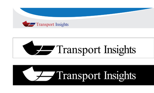
Logo design for a new transport (transportation) planning consultancy
Company name (Transport Insights) or its acronym
|
Contest Holder
cmckeon
?
Last Logged in : 4358days18hrs ago |
Concepts Submitted
133 |
Guaranteed Prize
525
|
Winner(s) | A Logo, Monogram, or Icon |
|
Live Project
Deciding
Project Finalized
Project: Logo design for a new transport ( ...
Industry:
Consulting Logo
Contest Launched:
Dec 10, 2012
Selected:
1
winning design from 133 concepts
Winning Design by:
MRyaN
Close Date:
Dec 19, 2012


Creative Brief
Logo design for a new transport (transportation) planning consultancy
Company name (Transport Insights) or its acronym
Yes
Transport Insights is a new transport planning consultancy intending to commence trading in early 2013.
Our vision is to address the transport related commercial, economic and environmental challenges of sustainable development and growth in an increasingly urbanised world.
Our values, which underpin a determination to deliver effective and deliverable advice and solutions, are as follows:
• Client focus
• Professionalism
• Innovation
• Commitment
• Integrity.
Transport Insights’ logo will feature on all company material including website, email signatures, PowerPoint presentations, stationary, business cards, newsletters and marketing material (up to trade show banner stand size).
The logo needs to:
• engage prospective clients
• encapsulate the business name and vision
• highlight our values, in particular innovation and professionalism
• be usable for and scalable to a wide range of printed and electronic material types/ sizes.
Consulting
Logo Type
![]()
Abstract Mark
![]()
Initials
![]()
Cutting-edge
Simple
Professional
Open to suggestions, but potentially one/ more of blue, brown, black or red.
2
Related Contests


Comments
Project Holder
Project Holder
Project Holder
Project Holder
Project Holder
Project Holder
Project Holder
Project Holder
Project Holder
Project Holder
Project Holder
Project Holder
Project Holder
Project Holder
Project Holder
Project Holder
Project Holder
Project Holder
Project Holder
Project Holder
Project Holder
Project Holder