SALES / SUPPORT : +1-877-525-5646 |
Login
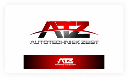
Logo design for a garage
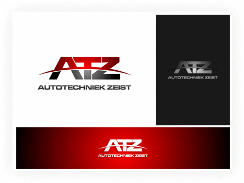
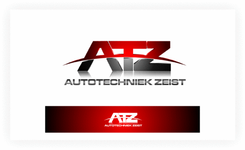
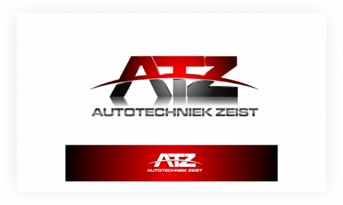
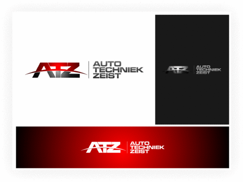
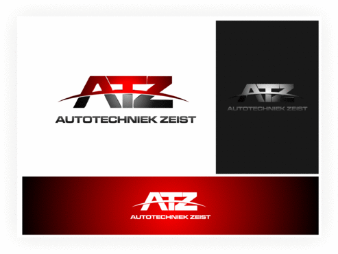
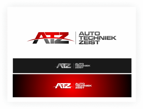
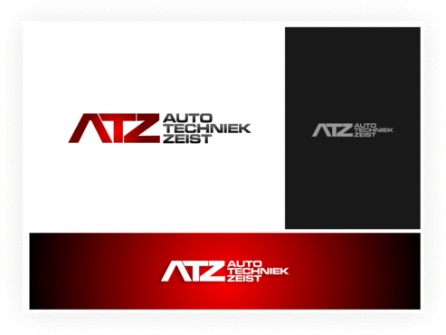
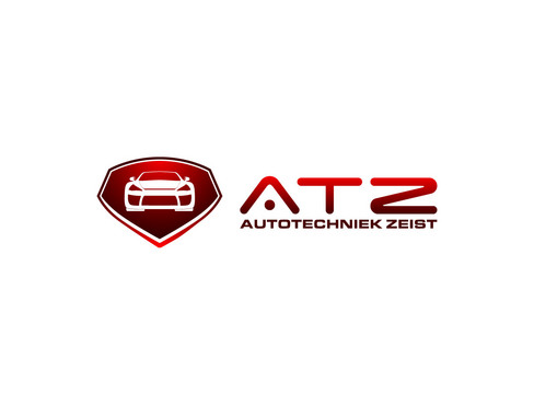
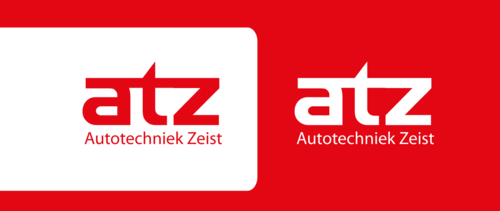
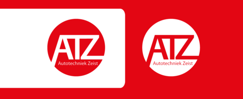
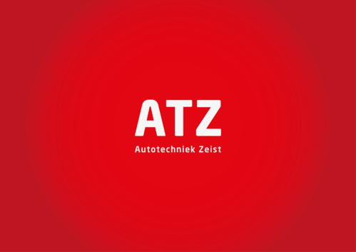
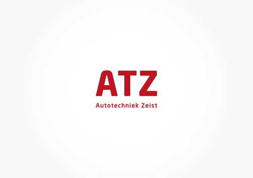
ATZ
|
Contest Holder
garageatz
?
Last Logged in : 4384days15hrs ago |
Concepts Submitted
56 |
Guaranteed Prize
199
|
Winner(s) | A Logo, Monogram, or Icon |
|
Live Project
Deciding
Project Finalized
Project: Logo design for a garage
Industry:
Automotive Logo
Contest Launched:
Jul 28, 2012
Selected:
1
winning design from 56 concepts
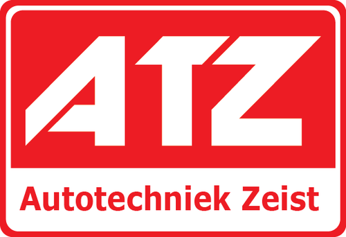
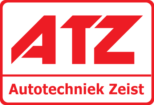
Winning Design by:
fortunato
Close Date:
Aug 10, 2012
Creative Brief
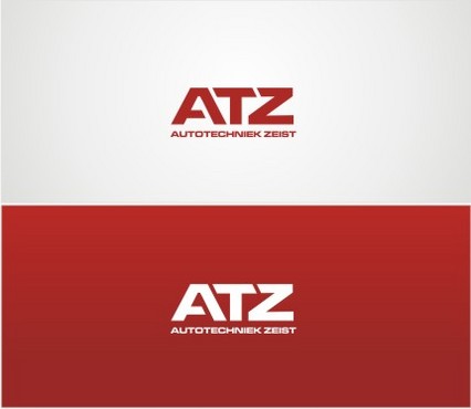
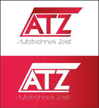
Logo design for a garage
ATZ
Autotechniek Zeist
Yes
A garage doing periodical service and repair for all brands of cars. The company is situated in the Netherlands.
Automotive
Logo Type
![]()
Abstract Mark
![]()
Initials
![]()
Unique/Creative
Clean/Simple
Corporate
Modern
red and white
2
A clean and minimal logo design is prefered. Two variations: 1. white text on red background 2. red text on white background.
Related Contests


Comments
Project Holder
Project Holder
Project Holder
Project Holder
Project Holder