SALES / SUPPORT : +1-877-525-5646 |
Login
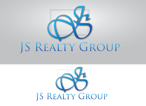
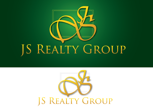
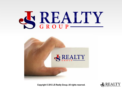
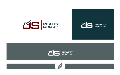
JS Realty Group Logo/Monogram
JS Realty Group
|
Contest Holder
wise65
?
Last Logged in : 4517days1hr ago |
Concepts Submitted
271 |
Guaranteed Prize
200
|
Winner(s) | A Logo, Monogram, or Icon |
|
Live Project
Deciding
Project Finalized
Project: JS Realty Group Logo/Monogram
Industry:
Real Estate Logo
Contest Launched:
Apr 30, 2012
Selected:
1
winning design from 271 concepts
Winning Design by:
monart
Close Date:
May 10, 2012


Creative Brief
JS Realty Group Logo/Monogram
JS Realty Group
Yes
JS Realty Group is a group of real estate agents and the leader is JS. JS realty group serves both residential and commercial in various price range. We will be using the logo in our markteting materials, broschures, stationary, & etc.
Our main clients are medium to upper price range home owners. We just began marketing for luxury homes. We want the logo to be simple, elegant, and eye catching. Don't want the typical real estate symbol(house/building) Try to create a creative monogram with JS if can't come up with creative symbol. Open to ideas.
Real Estate
Logo Type
![]()
Initials
![]()
Clean/Simple
Sophisticated
Traditional
Want Red and Dark Navy blue. If needed one more of an other color. But open to other color combination too. Elegant look is important--
2
We are very excited about the designs. Be creative and look forward to see many designs.
Feel free to ask any question.
Related Contests


Comments
Project Holder
Project Holder
Project Holder
Project Holder
Project Holder
Project Holder