Innovative website for online education
Must be suitable to host classes, receive homework submissions, and sell products
|
Contest Holder
Keningstonia
?
Last Logged in : 2910days22hrs ago |
Concepts Submitted
256 |
Guaranteed Prize
450
|
Winner(s) | Complete Web Design Solution |
|
Live Project
Deciding
Project Finalized

Creative Brief
Innovative website for online education
Must be suitable to host classes, receive homework submissions, and sell products
Education
signcourse.com
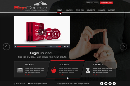
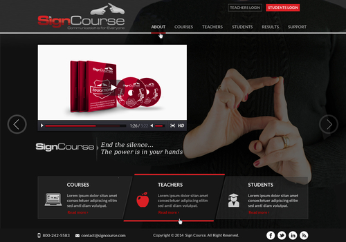
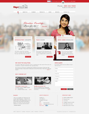
Currently, SignCourse sells a complete ASL DVD course. We are looking to update our website to appeal to universities, high schools, and families who buy our course for academic credit, certification preparation, or to communicate with friends and family. Within the year, our course will be completely rewritten and refilmed and formatted to be an online class at a university level. We will still provide a DVD course for purchase as well as supplemental materials.
University-type websites appeal to us like bju.edu, as do unique menu bars (opposed to straightforward page navigation buttons across the top or side of the website). We do not like template-looking websites with "wallpaper" on either side behind the center "content banner" like masters.edu or harvard.edu
Cutting-Edge
Sophisticated
Modern
Maroon/red (like our logo)
Silver
Gray or white
below header
http://dougaitkenthesource.com/jack-white
http://www.goldenisles.com/
http://edmundyu.com/#\Welcome
http://wallercreek.org/finalfour/ Click "Finalists" at the bottom left, I like the diagonal expanding slides. http://www.noupe.com/design/40-websites-with-unusual-navigation.html has cool ideas. We want something unique and innovative, but not "artsy." It has to look professional, not like a scrapbook. I really like sliding page navigations and slide expanding navigations! I also like diagonals, but I'm not restricted to that if something else looks better. Also, I'm not extremely set on where the navigation must be but what I absolutely don't want is a bar down the left or right side like ours currently is now. Top, bottom, above or below header, or arranged creatively around the home page, that's all fine with me.




Comments
Project Holder
Project Holder
Project Holder
Project Holder
Project Holder
Project Holder
Project Holder
Project Holder
Project Holder
Project Holder