SALES / SUPPORT : +1-877-525-5646   |   Login


infiniTEA logo

InfiniTEA Cafe' & Spice Souk

Contest Holder mikeandmary ?

Last Logged in : 5000days19hrs ago

Concepts Submitted

256

Prize Money
300
Winner(s)

1

A Logo, Monogram, or Icon veildAll design entries can be viewed by other designers.
tick_gray

Live Project

tick_gray

Deciding

tick_blue

Project Finalized


Project: infiniTEA logo
Industry: Beverages Logo
Contest Launched: Jan 15, 2011
Selected: 1 winning design from 256 concepts
Winning Design by: WeiGraz01
Close Date: Jan 28, 2011


infiniTEA logo - Beverages


Awarded as a winner
Project Report    

Sort by:


#256

#249

#247

#238

#235

#173

#201

#178

#176

#57

#28

#255

#254

#250

#248

#239

#237

#236

#234

#233

#232

#231

#191

#185

#184

#183


Creative Brief


infiniTEA logo

InfiniTEA Cafe' & Spice Souk

Yes

Tea cafe' that serves tea and light food items and sales of bulk loose leaf tea and spices.

Beverages

Logo Type
Logo Type

Abstract Mark
Abstract Mark


Cutting-Edge
Unique/Creative
Clean/Simple
Sophisticated
Modern
Industry Oriented
Local/Neighborhood
Fun

initial thoughts are green and an earth tone type color plus black

3

We have a few design concepts that we have been working with but I am unable to figure out how to attach the file to the brief. We will do that after the fact as soon as we figure it out. We have used some fractional images to designate the infinity concept rather than the standard infinity sign but are open to any thoughts.
Related Contests


logo for a brand of  ceylon tea
$200
Prize Money
82
Concepts
Mak d.o.o.
$200
Prize Money
89
Concepts
Logo for a beverage can
$400
Prize Money
333
Concepts
Crooked Can Beer Co.
$350
Prize Money
44
Concepts

Discussion


Comments

  • January 25, 2011 6:55 PM
    mikeandmary mikeandmary
      Project Holder
    Hi all designers - - due to Mike being delayed at a business meeting we are going to extend this for 3 more days, and contact each of you tomorrow or later this evening. We are fairly complete with our thoughts - - but I do not want to make the final decision without my partner. Sorry for the delay - - we love the designs. Email each of you asap. Many thanks - Mary

    Like Icon 0   DislikeIcon 0
  • January 24, 2011 6:39 PM
    mikeandmary mikeandmary
      Project Holder
    VERY IMPORTANT - FIRST We have changed the name of the company [for several reasons] to infini-T cafe' & spice souk. Could each of you please change the name in your designs accordingly. We very much appoligize for the inconvienience and hope that this change will not be to difficult [although we understand that there may be spacing considerations, etc that you need to deal with]. SECOND With about 1 day left in the contest we have gone to a 5 star, 1 star, no star system. 5 stars means that your design is awesome and is one of the designs that we will need to choose amongst to select a winner. 1 star is simply a variation on a 5 star design that we want to be able to refer to as we select a winning design for any font or color alternative, etc. No stars simply means we have not yet either assigned 5 stars to the design or eliminated it. THIRD we could change our minds on this but at this time infini is with a lower case i at the beginning so please conform your designs to this style. FOURTH Those of you that have indicated that you would send variations on your designs please do so ASAP, and FIFTH Feel free to send as many variations on your 5 star designs as you would like. THANK YOU all very much - we have a dificult decision to make . . . but thats a good thing!

    Like Icon 0   DislikeIcon 0
  • January 22, 2011 5:27 PM
    mikeandmary mikeandmary
      Project Holder
    THANKS to everyone that is participating in this project. We have some very creative alternatives to select from. For many reasons, including but limited to the fact that some really good recent submissions have not been fully developed and some of you that said you would provide some variations have not yet done so, we are extending the contest period for 3 more days. As an indication of our committment to those that have worked on this project with us from the begining we are going to increase the prize to $300. Please continue to provide variations on your designs and submit any new ideas. Of course, please send us any questions you have. THANKS!

    Like Icon 0   DislikeIcon 0
  • January 21, 2011 11:32 PM
    mikeandmary mikeandmary
      Project Holder
    WOW! Great work everyone. With just a little time left we tried to eliminate as many designs as possible so we [and you] could focus on the best of the best. All designs have their own unique elements that we like alot and in some cases the difference between a design getting 2 stars vs 4 or 5 could be a slight variation in color, font or size and placement of the image. Please provide any additional variations consistent with the feedback we have provided. We would also like to see a design that incorporates a fractal tree image or some of the other original concepts contained in the downloads attached to the brief. Again, thank you all for your great work!

    Like Icon 0   DislikeIcon 0
  • January 18, 2011 8:39 AM
    mikeandmary mikeandmary
      Project Holder
    Thanks everyone for the designs submitted so far. They are great. We will try to keep current on a star ratings. For now 2 stars means there are elements to the logo that we like but some changes need to be made, 3 stars mean we like the logo alot and would like to see variations on that theme and will probably reserve 4 and 5 stars until we get a day or 2 further into the process and can narrow down the direction we want to go. Feel free to ask general questions or questions about a specific design and we will be as responsive as possible. THANKS

    Like Icon 0   DislikeIcon 0
  • January 17, 2011 6:40 PM
    mikeandmary mikeandmary
      Project Holder
    Thanks Blueblu. We like the concepts you are posting. Please continue to provide additional designs. We like the #27 concept but we think something different needs to be done with it but im not sure we can describe what - can you try some variations? THANKS

    Like Icon 0   DislikeIcon 0
  • January 17, 2011 2:41 PM
    SiteAdmin SiteAdmin
     
    In case of any copyright issue, please email us at: report@mycroburst.com. Please do not engage in comments with each other.

    Like Icon 0   DislikeIcon 0
  • January 17, 2011 1:39 PM
    mikeandmary mikeandmary
      Project Holder
    We are not sure what happened here . . . the Koch curve is a well known fractal . . . no doubt. We are not a trademark attorneys but we thought, for example, design #10 was an original variant on that and believe the tree in #7, while also a fairly common, could be modified by puting a single small tea leaf on one of the branches to give it uniquness that would work for us. I really liked some of the designs and want an opportunity to make modifications as appropriate to come up with something that is brandable. Although we are new to logo design we would prefer for discussions that we were not involved in to not result in complete withdraw of concepts that are being explored. If not inconsistent with rules of this site that we are not inimately familiar with paulinedesign can you re post your designs and if you cannot can you get ahold of us privately so we can discuss appropriate modifications to some of the concepts we were working on?

    Like Icon 0   DislikeIcon 0
  • January 17, 2011 7:31 AM
    mikeandmary mikeandmary
      Project Holder
    Thanks Blueblu for your design #20. We like the variation on the font and like the image. A few questions . . . not being a matematician I am not always able to determine if a certain image is a fractal . . . is your image a fractal? I am not sure that our ultimate image MUST be a fractal but given a fractals mathamatical connection to infinity we incorporated that into our original concept. It so happens that your image [abstract double heart from what i can see] is interesting to us as the infinity name has a loose connection to someone close to us. Also, what is the meaning of the "e"? I can guess but thought I would just ask :) THANKS

    Like Icon 0   DislikeIcon 0
  • January 17, 2011 7:17 AM
    mikeandmary mikeandmary
      Project Holder
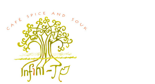
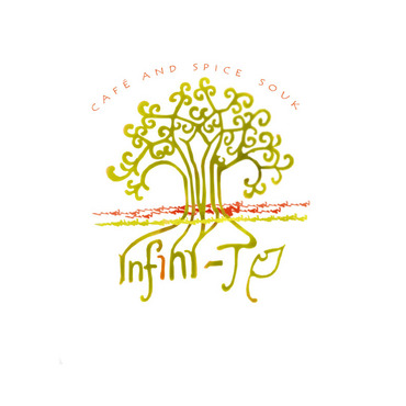
    Thanks paulinedesign for #s 15, 16, 17 and 19. The only plant/leaf that is catching our interest at this point is the one used in #7. While we like the look of #19 we think ultimately only a tea leaf will work. So as far as fractals go, we like the abstract images [#10 and #13], and the #7 tree. Please continue with iterations consistent with that theme as we see your designs have much improved on the original concept and of course if you have any thoughts that might take us in a different direction we would like to see them. THANKS

    Like Icon 0   DislikeIcon 0
  • January 16, 2011 8:59 PM
    mikeandmary mikeandmary
      Project Holder
    Thanks paulinedesign for the additional iterations on the original concept. with respect to #8-13, we REALLY like #10 and #13. Further iterations on #13 would be helpful such as a smaller #7 tree [but maybe bolder or a different color to maintain the balance] or an alternative fractal [one witha tea plant if such a thing exist!]. We are not going to stop you now on your excellent improvements to our original thoughts so keep up with that but eventually would like you to step back and provide any of your thoughts on logos that are consistent with our themes [fractals, etc] but give us another direction to consider. THANKS!

    Like Icon 0   DislikeIcon 0
  • January 16, 2011 5:33 PM
    mikeandmary mikeandmary
      Project Holder
    Thanks for your submissions paulinedesign. We will make frequent comments to guide all designers. With respect to #1-7, we like the variations to our original concepts and would encourage you [and others] to continue with variations on these themes but also would very much like to see some creative deveations from the original concepts as they were just some initial thoughts and not a template. We like the fonts in #1 and #5 but would like to see a fractal incorporated. I see the fractal in #2 and #6 but not sure I like the size of the logo with the fractal above the words. The balance in #7 is nice, but again we have some concern about the overall size of the logo with the larger fractal image. We would like to see [paulinedesign] a combination of the font for infini from #5 and the font for TEA in #1 plus a fractal image. Please respond with any questions or comments and We will try to be as responsive as possible. THANKS

    Like Icon 0   DislikeIcon 0