SALES / SUPPORT : +1-877-525-5646   |  


In Concert Entertainment Logo Design

In Concert Entertainment

Contest Holder inconcertpres ?

Last Logged in : 4470days17hrs ago

Concepts Submitted

76

Guaranteed Prize
250
Winner(s)

1

A Logo, Monogram, or Icon veildAll design entries can be viewed by other designers.
tick_gray

Live Project

tick_gray

Deciding

tick_blue

Project Finalized


Project: In Concert Entertainment Logo Des ...
Industry: Entertainment Logo
Contest Launched: Mar 29, 2012
Selected: 1 winning design from 76 concepts
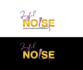
Winning Design by: veedesign
Close Date: Apr 06, 2012


In Concert Entertainment Logo Design - Entertainment


Awarded as a winner
Project Report    

Sort by:


#45

#41

#19

#43


Creative Brief


In Concert Entertainment Logo Design

In Concert Entertainment

No

In Concert Entertainment, LLC is a new startup musical booking agency. The initial focus will be on adding contemporary jazz acts to the roster but the agency will also consider various other musical genres. Website URL: www.inconcertentertainment.net. We are seeking a modern contemporary design, one that is clean, smart and bold but not too "busy". It should not use traditional fonts and a symbol/icon that stands on it's own would be great for possible future applications. While we intend to focus on jazz acts, we don't wish to limit the scope or give the perception that we are only limited to one type of musical artist. Initial uses for this logo include: website, business cards, via fax and press release materials. The logo must clearly and effectively translate in each of these uses.

Entertainment

Logo Type
Logo Type

Symbolic
Symbolic

Abstract Mark
Abstract Mark

Web 2.0
Web 2.0


Unique/Creative
Clean/Simple
Sophisticated
Modern
Abstract

Bold colors connoting strength and confidence.

not sure

Related Contests


Logo for our motion and special FX cinemas
$250
Prize Money
49
Concepts
Logo for a Digital Animation and Visual Effects Company
$200
Prize Money
115
Concepts
Sophisticated logo for a gospel choir competition
$200
Prize Money
39
Concepts
Logo for a live entertainment show
$350
Prize Money
82
Concepts

Discussion


Comments

  • April 06, 2012 8:11 PM
    inconcertpres inconcertpres
      Project Holder
    Congratulations to the designer of draft #19 who was selected as winner. Our sincere thanks to all of very talented professionals who made contributions to this project!

    Like Icon 0   DislikeIcon 0
  • April 06, 2012 3:48 PM
    inconcertpres inconcertpres
      Project Holder
    Thanks everyone for your design submissions. I am amazed at the level of creativity and regret that we can only select one concept. We expect to have a decision very soon!

    Like Icon 0   DislikeIcon 0
  • April 06, 2012 9:59 AM
    inconcertpres inconcertpres
      Project Holder
    More evaluation this morning and several drafts removed from contention. Draft #19 is favorite with #41 and #45 also being strongly considered. 19 is simple, elegant and will reproduce on printed materials in addition to online. Remaining designers in the contest should review those drafts above and submit ideas ASAP!!

    Like Icon 0   DislikeIcon 0
  • April 06, 2012 9:10 AM
    inconcertpres inconcertpres
      Project Holder
    #19 would you kindly add some red to the design and resubmit? Still like the design just an experiment...thank you.

    Like Icon 0   DislikeIcon 0
  • April 06, 2012 9:05 AM
    inconcertpres inconcertpres
      Project Holder
    Thank you for draft #53 however the team has eliminated it from consideration.

    Like Icon 0   DislikeIcon 0
  • April 05, 2012 10:52 PM
    inconcertpres inconcertpres
      Project Holder
    Thank you for designs #51 and #52....I am sorry but those versions did not work for us. #46 is pretty....could it be resubmitted using an easier to read cursive script with some colour perhaps on the guitar? We still have time to make our final selection. You are all very talented!

    Like Icon 0   DislikeIcon 0
  • April 05, 2012 10:44 PM
    inconcertpres inconcertpres
      Project Holder
    Thank you for drafts #54, #55 and #56. These are very interesting! Draft #53 is also interesting. Could you please try adding some colour to this and using a font that is easier to read? Also please note the spelling of 'Concert' and 'Entertainment'...thanks everyone.

    Like Icon 0   DislikeIcon 0
  • April 05, 2012 1:38 PM
    inconcertpres inconcertpres
      Project Holder
    Thanks for the new designs everyone.....we're looking them over now. Draft #44 would you please resubmit using the keyboard circle element used in #43? Thank you.

    Like Icon 0   DislikeIcon 0
  • April 04, 2012 2:11 PM
    inconcertpres inconcertpres
      Project Holder
    #22 would you please do for this design what you did for #41 in terms of punching up the 'Entertainment'? Thanks

    Like Icon 0   DislikeIcon 0
  • April 04, 2012 1:15 PM
    inconcertpres inconcertpres
      Project Holder
    Draft #19 could you please present the logo as black on white and lose the gray scale shading on the keyboard element. We're trying to see if this makes a difference where business cards and smaller printed items are concerned. Thank you for trying on #40. We're not as happy with that but appreciate your effort.

    Like Icon 0   DislikeIcon 0
  • April 04, 2012 11:12 AM
    inconcertpres inconcertpres
      Project Holder
    Favorite designs for us so far are #33 #22 and #19. As we get closer to making a choice, designers please take note of these approaches. Draft #25 is interesting but the concensus is that it's too 'jazzy' if that makes sense. Although we're hoping to primarily work with jazz artists, the logo needs to be flexible enough to be used for different musical styles. Thanks for #30, #34 and #36. We'd like to see if you have another idea to try as these don't quite work for us. This is going to be a very difficult choice!

    Like Icon 0   DislikeIcon 0
  • April 04, 2012 10:55 AM
    inconcertpres inconcertpres
      Project Holder
    Draft #33, thanks for the change. We like it and would like to know if there is a way to make 'Entertainment' slightly more prominent....not larger but perhaps more white? It could be my screen but it seems to get a little washed out. thanks!

    Like Icon 0   DislikeIcon 0
  • April 04, 2012 9:47 AM
    inconcertpres inconcertpres
      Project Holder
    Draft #39, thanks for the re-submission but do you have any other piano images we could try? This one isn't as appealing. Also, we like the font used for 'In Concert' in design #19 so please continue using that for the next version....thank you!

    Like Icon 0   DislikeIcon 0
  • April 03, 2012 11:31 PM
    inconcertpres inconcertpres
      Project Holder
    The amount of talent here is amazing! Thank you all for your time, effort and creativity. The tough part is that we're getting close to selecting a design and unfortunately, only design can be used. We've narrowed it down to a few options. Draft #22 please resubmit with 'In Concert' in red leaving the sax in gold. Draft #19 could you please try some other representations of a piano in place of the round keyboard element (perhaps a baby grand)? Draft #20 would it be possible to "smooth out" the sax a little? We're excited to see what the final version of our new logo will look like. Thanks!!

    Like Icon 0   DislikeIcon 0
  • April 01, 2012 8:24 PM
    inconcertpres inconcertpres
      Project Holder
    Design #3 this one makes me think theatre or opera maybe? Not sure this is the direction for us, but I LOVE that In Concert is so prominent. Please do give us some more ideas....we're only just getting started!

    Like Icon 0   DislikeIcon 0
  • April 01, 2012 8:10 PM
    inconcertpres inconcertpres
      Project Holder
    Design 1: could you please try it in black and gold and give the sax a more free form abstract approach? If it's not trouble, I'd like to see the words 'In Concert' presented in a cursive script.....just an idea. Thank you!

    Like Icon 0   DislikeIcon 0
  • April 01, 2012 8:07 PM
    inconcertpres inconcertpres
      Project Holder
    On designs #4 and #5, could you please remove the element behind the words 'In Concert' and resubmit? These seem a little hard to read at first glance. I also think perhaps one larger sax would be better.

    Like Icon 0   DislikeIcon 0
  • April 01, 2012 8:00 PM
    inconcertpres inconcertpres
      Project Holder
    We're off to a good start...thanks everyone for the time and effort being spent on this. Because we're so early in the process, it's interesting to see the different approaches being taken. I don't know if this helps you but we're going for a "corporate look" that is not cold. Our log must convey warmth and sincerity yet boldness. The main clients for our business include musical artists and their business managers. I saw a design for Hession which incorporated a rounded aspect of several keys of a piano...pretty and classy.

    Like Icon 0   DislikeIcon 0
  • April 01, 2012 10:37 AM
    inconcertpres inconcertpres
      Project Holder
    Hello and thanks so much for your submission. This is the very first version we're looking at and I wondered if you could try it in black and gold colors. The saxophone is a nice element....could it be more of a free form abstract styled version though? Thank you for your efforts!

    Like Icon 0   DislikeIcon 0