Live Project
Deciding
Project Finalized
Creative Brief
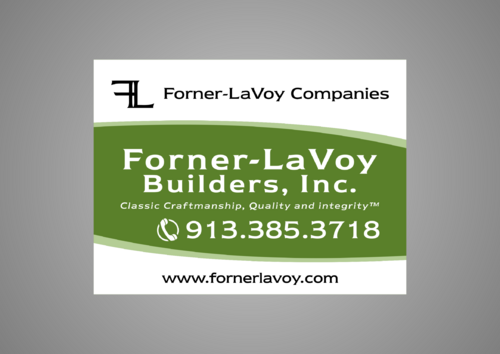
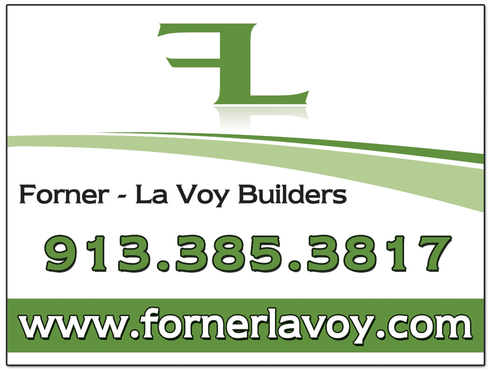
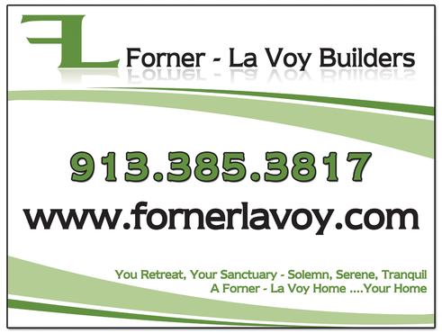
Home builder yard sign
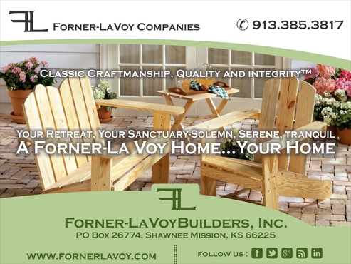
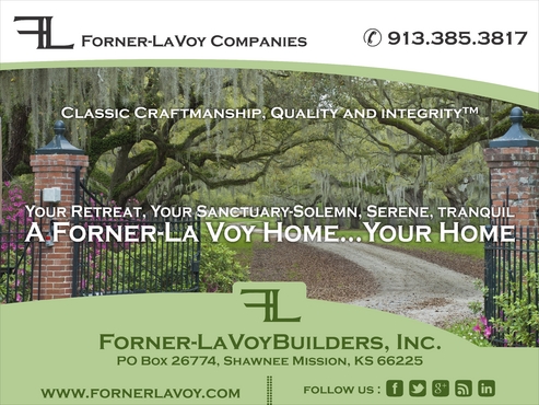
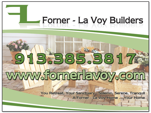
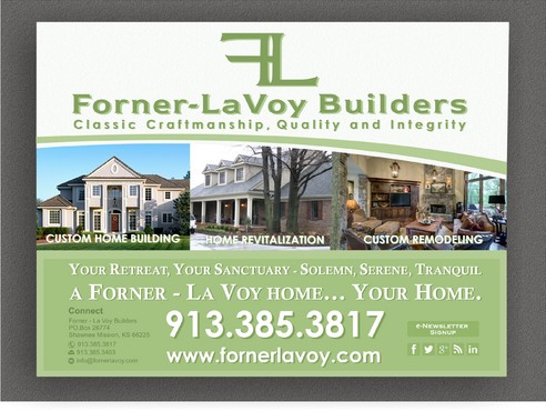
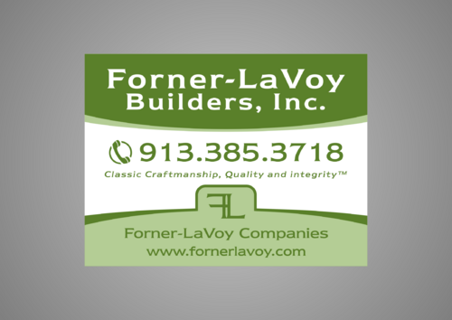
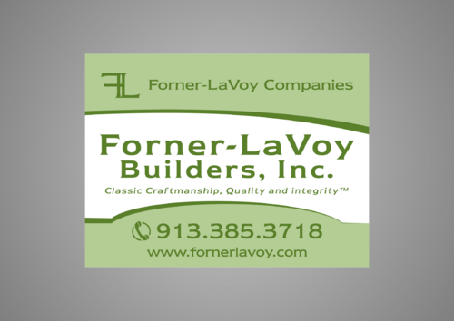
24"-wide by 18"-tall yard sign for custom home builder
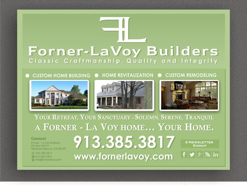
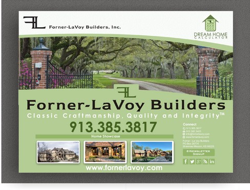
My company is in the process of updating our corporate brand. We started with updating our web site. Our new site depicts the fresher, more modern "look and feel" of our new corporate branding direct. The web site layout is new, themes and taglines are new, and colors are new. We now need to update our job site yard signs to reflect our new corporate branding campaign. Our yard signs are 24" wide by 18" tall, so the design needs to fit those dimensions properly. Our job site yard signs, in exactly the same way for-sale real estate signs are used, are placed in the ground at each of our job sites, advertising to anyone driving by our jobs that we are the builder. Our key goal is to have a design that is consistent with our new branding image, as portrayed on our web site, which is www.fornerlavoy.com.
Construction
Prospective customers who drive by our job sites.
Design must be proportional to 24" wide by 18" tall. Your design must, at a minimum, contain our logo (I'll attach a .JPG for this), our company name (our full company name is "Forner - La Voy Builders, Inc." but, as design dictates, I would be OK with you just using "Forner - La Voy" or "Forner - La Voy Builders"), our company phone number (913.385.3817), and our web site (fornerlavoy.com). Use of any other info about our company you see on our web site (like tag lines, etc.), please feel free to use as your design dictates. Your design inspiration should come from the "look and feel" of our web site: www.fornerlavoy.com. Our corporate font is ITC Newtext Demi (I am not necessarily requiring that this font be used; I just wanted to note it so, as appropriate, it can be utilized in the design). The RGB formula for the base greenish color on our web site is 180, 205, 149. Again, not a firm requirement to use it in the design but wanted to provide it in the event it makes sense to use it. And finally, I will attach a .PDF of our existing yard sign. It is NOT a requirement for you to match or imitate that sign. I just include it so you can see what we've used in the past and how different it is from our web site look and feel. It is basic and boring. We want something, again, that matches the vibrancy and clean, sharp look of our new web site.





Comments
Project Holder