SALES / SUPPORT : +1-877-525-5646 |
Login
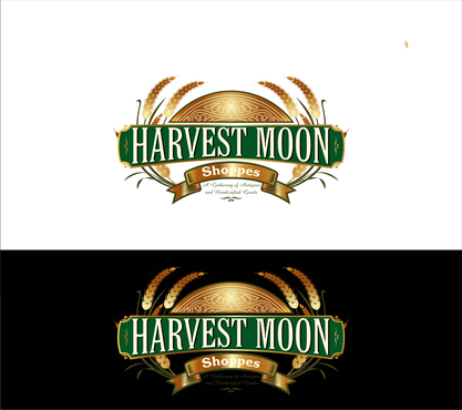
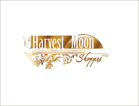
Harvest Moon Shoppes - Company Logo
Harvest Moon Shoppes
|
Contest Holder
asimpson
?
Last Logged in : 3416days45mins ago |
Concepts Submitted
60 |
Guaranteed Prize
214
|
Winner(s) | A Logo, Monogram, or Icon |
|
Live Project
Deciding
Project Finalized
Project: Harvest Moon Shoppes - Company Lo ...
Industry:
Antiques and Collectibles Logo
Contest Launched:
Oct 06, 2011
Selected:
1
winning design from 60 concepts
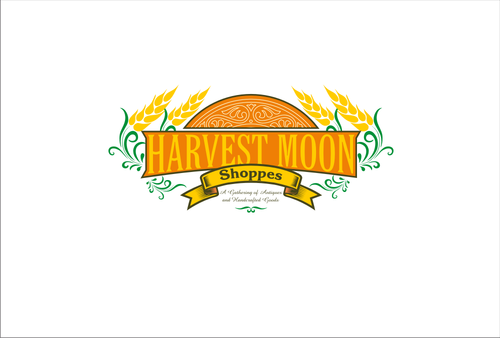
Winning Design by:
raych
Close Date:
Oct 13, 2011


Creative Brief
Harvest Moon Shoppes - Company Logo
Harvest Moon Shoppes
A Gathering of Antiques and Handcrafted Goods
Yes
Harvest Moon Shoppes is an indoor store that allows vendors to rent booths ("flea market style") to sell their antique, vintage and handcrafted goods. The logo will be used on different mediums such as our website, business cards, and hanging store sign, so the design should be adaptable to all.
Antiques and Collectibles
Abstract Mark
![]()
Illustrative
![]()
Character
![]()
Unique/Creative
Outdoors/Natural
Retro
Oranges, Browns, Golds, Greens, Yellows
not sure
We're leaving this open to interpretation, but just remember that we are outdoorsy, sorta hippys with an interest in cool shops with interesting things in them that are fun to walk around, so the design should give that feeling. "Hey look at that sign/logo, I bet that place is fun to walk around" .
Other elements that could be included is the harvest moon (full orangish moon, Google it), wheat, old architecture elements, elements drawn directly from antiques themselves like barrels or cast iron art.
Related Contests

Comments
Project Holder
Project Holder
Project Holder
Project Holder
Project Holder
Project Holder
Project Holder
Project Holder
Project Holder
Project Holder
Project Holder
Project Holder
Project Holder
Project Holder
Project Holder
Project Holder
Project Holder
Project Holder
Project Holder
Project Holder