SALES / SUPPORT : +1-877-525-5646   |   Login


Great Logo for Software Company

GlobalTrade, Software Solutions

Contest Holder citron3000 ?

Last Logged in : 4530days23hrs ago

Concepts Submitted

83

Guaranteed Prize
200
Winner(s)

1

A Logo, Monogram, or Icon veildAll design entries are veiled from other designers till the end of the contest.
tick_gray

Live Project

tick_gray

Deciding

tick_blue

Project Finalized


Project: Great Logo for Software Company
Industry: Software Logo
Contest Launched: Aug 03, 2012
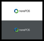
Selected: 1 winning design from 83 concepts
Winning Design by: elements
Close Date: Aug 11, 2012


Great Logo for Software Company - Software


Awarded as a winner
Project Report    

Sort by:


#83

#82

#68

#67

#66

#65

#51

#41

#31

#30


Creative Brief


Great Logo for Software Company

GlobalTrade, Software Solutions

Software Solutions

Yes

Our company provides an innovative software solution to help our clients to promote their products online, build a strong web presence and better follow up with inquiries and order.

We help our clients to expand their market, sell more and make their clients happier.

Software

Logo Type
Logo Type

Abstract Mark
Abstract Mark

Illustrative
Illustrative

Web 2.0
Web 2.0


Modern
Cutting-edge
Simple
Professional
High Tech

not sure

It should be clear it is global and it is digital.

the keywords are:

- global
- connect, reach (clients)
- digital

Related Contests


Flow State Technology Logo
$250
Prize Money
106
Concepts
Logo for software development company
$200
Prize Money
133
Concepts
Logo for a Tablet POS System/Software
$300
Prize Money
90
Concepts
Logo for software application
$200
Prize Money
309
Concepts

Discussion


Comments

  • August 05, 2012 8:35 PM
    citron3000 citron3000
      Project Holder
    #6, the colors are good. It would be better to have something more symmetrical like COG Analytics (http://orders.logodesignguru.com/drafts/display/contest/391520/draft/2424112). If the connected point don't look good, let's forget this idea. Thanks !

    Like Icon 0   DislikeIcon 0
  • August 05, 2012 5:56 PM
    citron3000 citron3000
      Project Holder
    I like #3. The orange should be darker, and only some of the points should be connected with each other, they should not come in pair like this.

    Like Icon 0   DislikeIcon 0
  • August 05, 2012 9:24 AM
    citron3000 citron3000
      Project Holder
    I like this style here and colors. A globe with pixels: http://orders.logodesignguru.com/drafts/display/contest/391520/draft/2424112 http://orders.logodesignguru.com/drafts/display/contest/391520/draft/2415029 It would be nice to do something around that. Other examples: http://orders.logodesignguru.com/drafts/display/contest/186827/draft/1383543 http://orders.logodesignguru.com/drafts/display/contest/295613/draft/2005175

    Like Icon 0   DislikeIcon 0
  • August 04, 2012 11:54 AM
    SiteAdmin SiteAdmin
     
    Attention Designers!! MycroBurst permits you to submit unlimited designs with unlimited variations. However, if you are providing 2 or 3 different color versions of the same logo in one draft, please make sure that if the particular draft gets finalized, each color version should be separated before you will send the final files. Thanks, MB/LDG/LS Team

    Like Icon 0   DislikeIcon 0