SALES / SUPPORT : +1-877-525-5646   |   Login


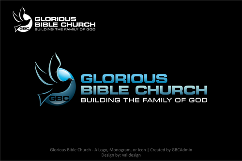
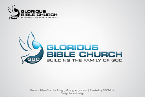
Glorious Bible Church logo redesign

Glorious Bible Church

Contest Holder GBCAdmin ?

Last Logged in : 4649days18hrs ago

Concepts Submitted

68

Guaranteed Prize
225
Winner(s)

1

A Logo, Monogram, or Icon veildAll design entries can be viewed by other designers.
tick_gray

Live Project

tick_gray

Deciding

tick_blue

Project Finalized


Project: Glorious Bible Church logo redesi ...
Contest Launched: Jan 30, 2012
Selected: 1 winning design from 68 concepts
Winning Design by: validesign
Close Date: Feb 16, 2012


Glorious Bible Church logo redesign - Religion and Spirituality


Awarded as a winner
Project Report    

Sort by:


#27

#9

#8

#3

#26

#21


Creative Brief


Glorious Bible Church logo redesign

Glorious Bible Church

Building the Family of God

Yes

Glorious Bible Church is looking an updated modern looking redesign for the logo, incorporating a more edgy look and tactile feel. The current logo can be see at the new website here: www.gloriousbiblechurch.com

Must include the dove in the new design, but with different, more abstract, ideas of what the dove looks like. The more, abstract the better.

Religion and Spirituality

Symbolic
Symbolic

Abstract Mark
Abstract Mark

Initials
Initials


Cutting-Edge
Unique/Creative
Sophisticated
Corporate
Modern
Abstract

Blues, blacks, white

not sure

Don't really want to continue the half circle layout upper of the current logo. Looking for something that will be more conducive to widescreen or wider rectangle format for display on website (which now has a dark theme, but could change to a light theme, so the logo will need to have options on different themed backgrounds) and print media.

Would like to see artistic renditions of the dove in very abstract ways (a dove "created" with a few strokes of a heavy paint brush or simply outlined with swooping strokes) and the text place in modern edgy ways around the dove or maybe even thru it....

Finally, we're not married to the idea of using the full church name. We could be persuaded to simply use the acronym, GBC, if something nice looking can incorporated with the above ideas.
Related Contests


Logo for a Hypnotherapy Company
$200
Prize Money
57
Concepts
Logo for a Junior High Worship Camp
$209
Prize Money
56
Concepts
Church Logo
$300
Prize Money
161
Concepts
New Church Logo
$250
Prize Money
90
Concepts

Discussion


Comments

  • February 09, 2012 4:13 PM
    GBCAdmin GBCAdmin
      Project Holder
    Really like drafts #65 and #66. Can we see them with some mirroring effects underneath?

    Like Icon 0   DislikeIcon 0
  • February 09, 2012 12:38 PM
    GBCAdmin GBCAdmin
      Project Holder
    Drafts #42, #43, #44, #45 are also good with exception of the dove itself being a little too generic. A more abstract, smooth or blockly brush stroked dove would make those even more appealing I think. And "Building the Family of God" should be the full width to fill out the bottom of the graphic.

    Like Icon 0   DislikeIcon 0
  • February 09, 2012 12:32 PM
    GBCAdmin GBCAdmin
      Project Holder
    I still like draft #11 most, but want a different font for the "GBC" text and a different, more abstract, dove design like draft #2 (that was unfortunately pulled to copyright infringement) or draft #4.

    Like Icon 0   DislikeIcon 0
  • February 08, 2012 8:59 PM
    GBCAdmin GBCAdmin
      Project Holder
    Would really like to see the dove from draft #4 (or something like that, but still more abstract) incorporated into the icon/picture portion of the logo in some designs. Definitely want the GBC in the icon/picture portion. Like the "Glorious Bible Church" in a multi-line stacked layout with "Building the Family of God" in one line at the bottom. I think maybe some darker blue tones could be used as well. I do like the mirror effect in some of the drafts. Just still haven't seen "the one" yet....

    Like Icon 0   DislikeIcon 0
  • February 08, 2012 12:24 AM
    GBCAdmin GBCAdmin
      Project Holder
    I think we're getting there. The squarish icon with the dove and GBC in the icon with the "Glorious Bible Church" and "Building the Family of God" to the right of the icon (as in drafts #11, #37, #16, #17) is the leading favorite layout for the church board. I'd still like to see a few more dove designs and different combinations of the elements though. Here are a couple other dove line drawings that could be incorporated (maybe not as-is, but as a design direction?): http://www.tattoodonkey.com/pics/d/o/dove-temporary-tattoo-of-a-black-in-flight--e-g-tattoodonkey.com.jpg http://www.edupics.com/photo-dove-p19488.jpg

    Like Icon 0   DislikeIcon 0
  • February 06, 2012 1:55 PM
    GBCAdmin GBCAdmin
      Project Holder
    Still looking for a more abstract/artistic representation of the dove itself. Liking the icon plus text designs (draft #'s 2 and 11) more and more. I think this allows us to brand ourselves better by leveraging the icon portion separately from the overall logo. If the GBC can be incorporated into the icon with a more abstract dove design, I think we might have something. More ideas certainly welcomed though.

    Like Icon 0   DislikeIcon 0
  • February 03, 2012 11:20 AM
    GBCAdmin GBCAdmin
      Project Holder
    Like to see some truly different ideas, concepts, and layouts. Thanks!

    Like Icon 0   DislikeIcon 0
  • February 01, 2012 10:52 AM
    GBCAdmin GBCAdmin
      Project Holder
    Designers, draft #2 has some nice things going for it. Liking the edgier font, but would like to see alternative text layouts as well. And still would like to see a more free hand looking design for the dove (even more abstract). Colors choices of draft #2 are also looking pretty good.

    Like Icon 0   DislikeIcon 0
  • January 31, 2012 11:44 AM
    GBCAdmin GBCAdmin
      Project Holder
    We're looking for something quite a bit more edgy than the design of draft #1. Thinking of the dove in black brushstrokes and lettering in blue shades with depth/shadowing. Something that may also lend itself to a negative version as well, with say the dove in white on a black background with white or silvershade text.

    Like Icon 0   DislikeIcon 0