SALES / SUPPORT : +1-877-525-5646 |
Login
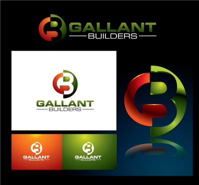
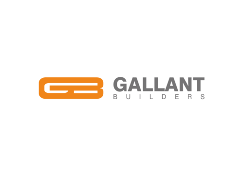
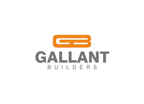
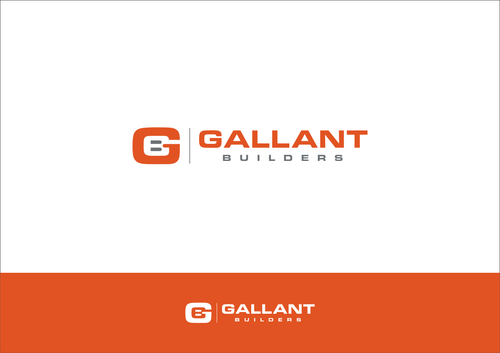
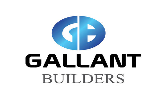
Gallant Builders Logo
Gallant Builders
|
Contest Holder
GallantBuilders
?
Last Logged in : 3689days18hrs ago |
Concepts Submitted
144 |
Guaranteed Prize
200
|
Winner(s) | A Logo, Monogram, or Icon |
|
Live Project
Deciding
Project Finalized
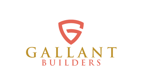
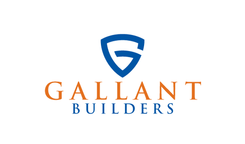
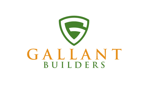
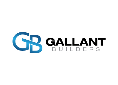
Project: Gallant Builders Logo
Industry:
Construction Logo
Contest Launched:
Jan 10, 2011
Selected:
1
winning design from 144 concepts
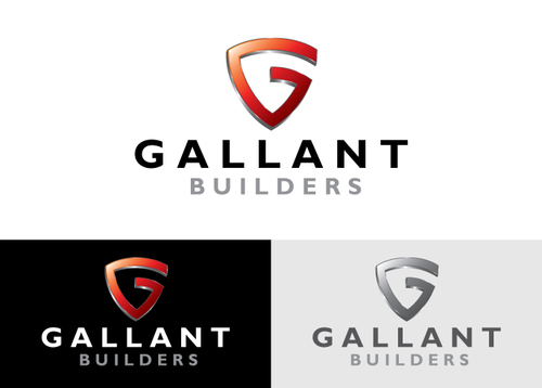
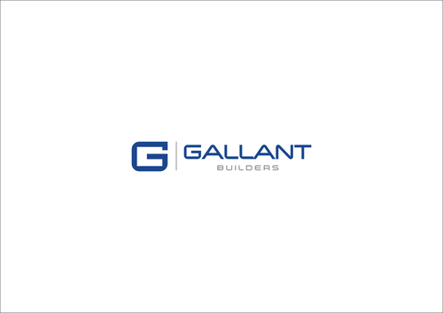
Winning Design by:
Vab23
Close Date:
Jan 17, 2011


Creative Brief
Gallant Builders Logo
Gallant Builders
No
The business is a commercial general contracting company
Construction
Logo Type
![]()
Abstract Mark
![]()
Initials
![]()
Cutting-Edge
Clean/Simple
Sophisticated
Corporate
Serious
blue and steel gray, orange and steel gray
2
A good example of a simple design
http://www.gilbaneco.com/
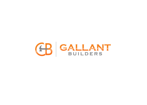
I like this one drafted by "Faster"
http://orders.logodesignguru.com/contests/general-contractor-commercial-construction-logo/users/faster
Related Contests


Comments
Project Holder
Project Holder
Project Holder
Project Holder
Project Holder
Project Holder
Project Holder
Project Holder
Project Holder
Project Holder