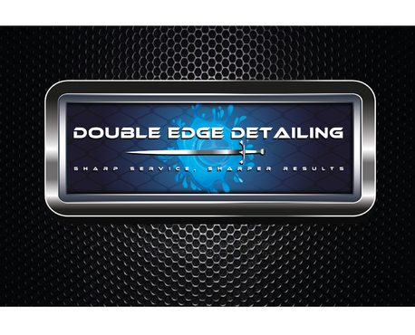
Eye catching, crisp and clean logo for mobile detailing company
Double Edge Detailing
|
Contest Holder
doubleedge27
?
Last Logged in : 3174days20hrs ago |
Concepts Submitted
40 |
Prize Money
200
|
Winner(s) | A Logo, Monogram, or Icon |
|
Live Project
Deciding
Project Finalized

Creative Brief
Eye catching, crisp and clean logo for mobile detailing company
Double Edge Detailing
Sharp Service, Sharper Results
Yes
This logo will show confidence and the appearance will draw attention. The design will convey thoughts of crisp and clean lines, with a color scheme that separates my business from the rest. It must not be too busy, yet incorporate small touches that really convey feelings of professional service and quality. The font needs to be easily readable from far away. The colors will flow together, and accent this logo with a pop in the right places. When people see my logo, they should see something that stands out and grabs their attention.
Automotive
Illustrative
![]()
Web 2.0
![]()
Modern
Cutting-edge
Sophisticated
Professional
hues of vibrant blue and turquoise silver and metallic chrome blend carbon fiber would be really neat hues of charcoal grey and black interested in accents of lime green and orange i like the look and color schemes of these links: http://www.pureind.com/wp-content/uploads/2013/12/business-cards-adams-auto-detailing.jpg http://www.jlardon.com/wp-content/uploads/2013/01/splash-car-wash-logo-300x248.jpg
3
thanks so much for your time in designing this logo!!!
I am looking for an organic, vibrant look that instantly catches the eye.
I would really like for the logo to incorporate a sword that divides the name Double Edge Detailing on a single line. Like positioned diagonally through the text and tied into the "t" in detailing. I would like for the logo to use my tagline "Sharp Service, Sharper Results" on a second line with smaller text.
I would really like to use a splash of water in the design, somehow flowing with the sword cutting it in pieces or the droplets as part of the text letters.
I want the letters to have that 3D rounded look to them.
I gave a wide variety of color preferences, but most important is that the logo is crisp and flows to the eye while being easy to read.
Being a mobile auto detailing business, i DO NOT want to include any form of the car outline, or flight badge wing look that i see many variations of.


Comments
Project Holder
Project Holder