SALES / SUPPORT : +1-877-525-5646   |   Login


Exciting logo for a vision insurance company

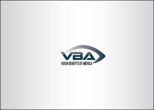
VBA Vision Benefits of America

Contest Holder jhollowood ?

Last Logged in : 3373days10hrs ago

Concepts Submitted

200

Guaranteed Prize
275
Winner(s)

1

A Logo, Monogram, or Icon veildAll design entries are veiled from other designers till the end of the contest. Featured Featured Contest
tick_gray

Live Project

tick_gray

Deciding

tick_blue

Project Finalized


Project: Exciting logo for a vision insura ...
Industry: Health Logo
Contest Launched: Apr 30, 2015
Selected: 1 winning design from 200 concepts
Winning Design by: Wahyudigital
Close Date: May 11, 2015


Exciting logo for a vision insurance company - Health


Awarded as a winner
Project Report    

Sort by:


#54

#52

#26

#24

#20

#16

#169

#163

#137

#96

#58

#17

#6

#5

#200

#199

#187

#186

#185

#184

#176


Creative Brief


Exciting logo for a vision insurance company

VBA Vision Benefits of America

No

VBA is a 50 year old vision insurance company in the process of reinventing itself. The logo should convey the company's attention to detail and forward-thinking attitude. VBA's services are focused upon providing its members with low cost eye examinations, glasses and contact lenses.

Health

Abstract Mark
Abstract Mark

Initials
Initials

Web 2.0
Web 2.0


Modern
Retro
Cutting-edge
Professional

The company's preference is to incorporate coded Pantone colors: 323 and cool gray 6.

not sure

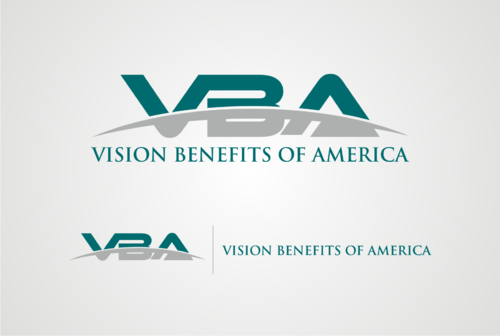
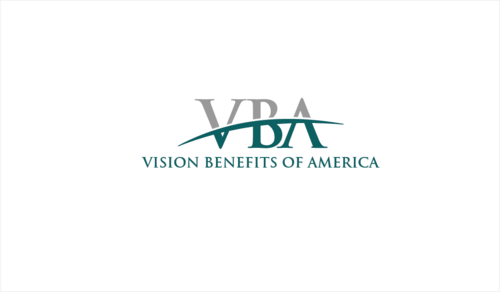
The letters "VBA" should be prominent in the design as it is the company's intent to be primarily known by this acronym in the industry. The words "Vision Benefits of America" can appear below or to the right of the design.
Related Contests


Clean & modern logo for a whole body recovery treatment center
$200
Prize Money
114
Concepts
Logo for eating disorder treatment program
$200
Prize Money
54
Concepts
 logo for re-branding new nursing facility
$400
Prize Money
184
Concepts
Logo for new Rehab company
$275
Prize Money
223
Concepts

Discussion


Comments

  • April 30, 2015 8:17 PM
    jhollowood jhollowood
      Project Holder
    In case the 2 preferred colors are too limiting, additional accent colors (like black) may be used. The company is also interested in potentially featuring an oval/ovoid shape in the design. While the oval/ovoid shapes are not necessary, if used, they should be stylized instead of plain (e.g. open ended, 3 dimensional, varying thicknesses). Thanks for submissions. JHollowood
    Like Icon 0   DislikeIcon 0
  • April 30, 2015 8:15 PM
    jhollowood jhollowood
      Project Holder
    In case the 2 preferred colors are too limiting, additional accent colors (like black) may be used. The company is also interested in potentially featuring an oval/ovoid shape in the design. While the oval/ovoid shapes are not necessary, if used, they should be stylized instead of plain (e.g. open ended, 3 dimensional, varying thicknesses). Thanks for submissions. JHollowood
    Like Icon 0   DislikeIcon 0