SALES / SUPPORT : +1-877-525-5646   |   Login


Dahlia a Florist

Dahlia a Florist

Contest Holder dahliaonline ?

Last Logged in : 3991days19hrs ago

Concepts Submitted

332

Guaranteed Prize
300
Winner(s)

1

A Logo, Monogram, or Icon veildAll design entries can be viewed by other designers. Featured Featured Contest
tick_gray

Live Project

tick_gray

Deciding

tick_blue

Project Finalized


Project: Dahlia a Florist
Industry: Retailers Logo
Contest Launched: Mar 29, 2012
Selected: 1 winning design from 332 concepts
Winning Design by: MuDiNat
Close Date: Apr 12, 2012


Dahlia a Florist - Retailers


Awarded as a winner
Project Report    

Sort by:


#142

#141

#139

#137

#131

#125

#17

#12

#11

#136

#135

#130

#120

#119

#118

#97

#94

#91

#86

#80

#77

#54


Creative Brief


Dahlia a Florist

Dahlia a Florist

fresh flowers artfully arranged

No

We are a florist that specializes in custom, artistic arrangements. I chose Dahlia as the name of the business because it isn't widely known as a flower (so people don't think that's all we sell), and it has a floral sound to it. Please google "Dahlia" to see all of the gorgeous dahlias and colors they come in.
The Dahlia Style Components that set us apart:
1. REAL flowers and REAL artists (silks aren't are game, even massed produced flowers like grocery store flowers are dead to me, and not Dahlia) We love dahlias, ranunculas, callas, hydrangeas, garden roses - anything with a lot of petals or an unusual look.
2. Part of a community - the North Main Historic District and the arts community
3. Our name: "Dahlia" is singular for a reason. Singular. Strong. Feminine. If it was called Dahlia's, that is more "ballet pirouettes", where as Dahlia is "jazz hands!":
4. European as in French-style & Swedish style design, (NOT English garden) We LOVE negative space. Our current logo font is from the Evian bottle.
5. The Dahlia Diamond : every arrangement (since we can’t sign our floral artwork) gets a touch of Bling! which is: A crystal bead woven on a blade of grass: nature coupled with dressy. (Again, I think the natural wood mixed with black and white) I LOVE the idea of a touch of silver added.
Our store is black and white stripe and checkered, but with wood floors. The colors come in from the flowers.
I would like to keep the shape of the logo round because I will turn it into my storefront sign which is a hand carved round sign that will hang from a metal sculpture a local artist is creating for me.
Dahlia is not uptight and stuffy, but we are not hippy, either. I think simple elegance. Not overdone, and not too whimsical.
Thoughts on colors probably not to use:
Green: overused by local florists in my area
Pale Turquoise/ blue: used by another florist in my area
Periwinkle or purples: too hippy
Pink: too preppy or whimsical
I like the idea of shades of corals, going into light pinks, hot pinks and yellows & oranges- where it looks more like a watercolor. (Again, anything that conveys more artist - feel, the better). Please visit our website: www.dahliaonline.com for inspiration. And, our flickr page: www.flickr.com/dahliaonline . I've been in business for 12 years. I love the idea of having something we can pull from the logo to use on shirts, stickers, letterpressed cards, etc. Such as the logo at www.ovmlove.com
Remember we are about the 4 seasons, so the logo has to go through all seasons, and not look to springy, etc.

Retailers

Logo Type
Logo Type

Symbolic
Symbolic

Abstract Mark
Abstract Mark

Illustrative
Illustrative

Character
Character

Web 2.0
Web 2.0


Unique/Creative
Clean/Simple
Sophisticated
Modern
Industry Oriented
Traditional
Local/Neighborhood
Feminine

Thoughts on colors probably not to use: Green: overused by local florists in my area Pale Turquoise/ blue: used by another florist in my area Periwinkle or purples: too hippy Pink: too preppy or whimsical I like the idea of shades of corals, going into light pinks, hot pinks and yellows & oranges- where it looks more like a watercolor. (Again, anything that conveys more artist - feel, the better).

not sure

competition logo: www.twigs.net, love the logo at www.ovmlove.com. I am interested in seeing as close to a photographic image of a dahlia as possible in the logo (maybe). I LOVE petals! The more petal-feel (fluffy and soft) without being too girly, the better. That's what's cool about the dahlia - it is a single bloom (which is dramatic), but it has lots of petals (which is soft).
Related Contests


Mile High Supply Co. Logo
$199
Prize Money
26
Concepts
Logo for a Penny Auction Website
$199
Prize Money
32
Concepts
Modern, Clean Logo for ecommerce site PuffSource.com
$250
Prize Money
273
Concepts
Logo for a country store
$200
Prize Money
105
Concepts

Discussion


Comments

  • April 12, 2012 7:50 AM
    dahliaonline dahliaonline
      Project Holder
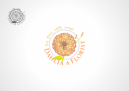
    To all designers: Please keep your designs because I may be asking for yours, too! Choosing a winner is a hard decision, because there are so many amazing entries. I chose the one I did, because I see this as a fun "emblem" to put on different things we do, and it has such a cohesive look, and the bloom really POPS off the page. For my primary logo, please go to my new contest: Dahlia Updated Logo. I'm still working on finding the perfect update to our existing logo.

    Like Icon 0   DislikeIcon 0
  • April 02, 2012 9:54 PM
    dahliaonline dahliaonline
      Project Holder
    Everyone is doing such a great job. Thank you for working so hard on this. I can't wait to choose a winner. Again, think simple. impactful. floral. Thank you!

    Like Icon 0   DislikeIcon 0
  • April 01, 2012 10:37 PM
    dahliaonline dahliaonline
      Project Holder
    Great job, everyone! Favorites: SIMPLE DESIGNS where the dahlia flower is the focal point, and the dahlia flower is life-like. NO CENTER dot in dahlia, please. Also, modern font , or simple font is great. This is going to be such a hard decision. Thank you for working with me on this.

    Like Icon 0   DislikeIcon 0
  • March 30, 2012 4:57 PM
    dahliaonline dahliaonline
      Project Holder
    Because of our previous logo, I need to make sure there's a round feel, or a round dahlia in the logo, so I'm not confusing our clients. Thank you! This is so hard, there are so many amazing designs, I can't wait to choose one.

    Like Icon 0   DislikeIcon 0
  • March 30, 2012 4:53 PM
    dahliaonline dahliaonline
      Project Holder
    draft #45 I love the colors. I think the flower looks to much like a mandala, though. Any way to give it a french feel?

    Like Icon 0   DislikeIcon 0
  • March 30, 2012 4:33 PM
    dahliaonline dahliaonline
      Project Holder
    draft #53 I really like the d and f combo, very creative. Could I please see some revisions: the large d and f in charcoal or indigo, and the dahlia more realistic with colors in shades, and lots more petals(rounded not spikey is good)? Also, incorporating the colors: reddish violet (similar to what you have), yellows and corals? Thank you!

    Like Icon 0   DislikeIcon 0
  • March 30, 2012 4:27 PM
    dahliaonline dahliaonline
      Project Holder
    draft #35, 36 37 Thank you for the revisions. I like them all.

    Like Icon 0   DislikeIcon 0
  • March 30, 2012 4:24 PM
    dahliaonline dahliaonline
      Project Holder
    draft #43, #40, #41, #37 Thank you for the revisions. I like all of them.

    Like Icon 0   DislikeIcon 0
  • March 30, 2012 4:22 PM
    dahliaonline dahliaonline
      Project Holder
    draft #54 thank you! very creative. I still like your other one better. Thank you for trying it out.

    Like Icon 0   DislikeIcon 0
  • March 30, 2012 4:17 PM
    dahliaonline dahliaonline
      Project Holder
    draft #50 Perfect dahlias, very creative! The color combination is interesting, except the green. Could "dahlia" be in pinky/coral and "a florist" in indigo blue? If so, then what color dahlias would you choose, staying in that range? Thank you!

    Like Icon 0   DislikeIcon 0
  • March 30, 2012 4:09 PM
    dahliaonline dahliaonline
      Project Holder
    draft #26 more petals on the dahlia would be amazing.

    Like Icon 0   DislikeIcon 0
  • March 30, 2012 4:06 PM
    dahliaonline dahliaonline
      Project Holder
    #19 Thank you for the colors! Love them.

    Like Icon 0   DislikeIcon 0
  • March 30, 2012 4:05 PM
    dahliaonline dahliaonline
      Project Holder
    draft #18 colors are good. The bloom is too daisy like: needs millions of petals and please no center dot. Is there any way to connect the bloom with the script, more?

    Like Icon 0   DislikeIcon 0
  • March 30, 2012 3:59 PM
    dahliaonline dahliaonline
      Project Holder
    draft #14 and #17 thank you!

    Like Icon 0   DislikeIcon 0
  • March 29, 2012 11:40 PM
    dahliaonline dahliaonline
      Project Holder
    draft #9 and draft #8 I guess, if anything, they are too delicate. I need a little weight, somehow. Any ideas? Thank you!

    Like Icon 0   DislikeIcon 0
  • March 29, 2012 11:39 PM
    dahliaonline dahliaonline
      Project Holder
    draft #4 Could the square be a circle with a heavy silver edge, and a large "D" in denim/indigo blue or black, and in script break the boundaries of the circle, and at the bottom in lower case "dahlia a florist" in denim or black? And more petals in the circle? Thank you, thank you, thank you!

    Like Icon 0   DislikeIcon 0
  • March 29, 2012 11:24 PM
    dahliaonline dahliaonline
      Project Holder
    draft #12 your color choices are really interesting, and the detail on the dahlia is so beautiful. Is there a way to add some silver to this? Thank you!

    Like Icon 0   DislikeIcon 0
  • March 29, 2012 11:21 PM
    dahliaonline dahliaonline
      Project Holder
    draft #13 and draft #11 My dahlia diamond! Thank you, thank you, thank you! A blade of grass looped through the diamond is part of the look. Would that make the design too messy, or is there a way to add the grass? I'm leaning more to #13, but scared the font is too computer techy. Is there a way to europeanize it? I love the colors! Is there a way to integrate the name with the flower more, like draft #8 and draft #9?

    Like Icon 0   DislikeIcon 0
  • March 29, 2012 11:16 PM
    dahliaonline dahliaonline
      Project Holder
    draft #10 Is there a way to integrate the name with the flower more? The look separate to me.

    Like Icon 0   DislikeIcon 0
  • March 29, 2012 11:16 PM
    dahliaonline dahliaonline
      Project Holder
    draft #10 The ribbon look of the flower is very fun, maybe too whimsical alongside the scrolly font. Is there a way to give it a little more modern european edge? Also, refer to draft #13 and draft #4 for color choices. Thank you!

    Like Icon 0   DislikeIcon 0
  • March 29, 2012 11:13 PM
    dahliaonline dahliaonline
      Project Holder
    draft #8 & draft #9 Wow, thanks for the circle enclosure! It really feels like a complete design, instead of pasting two items together. Love it and love the colors. Love the fonts. hhmmmmm. Asymmetrical is cool, too. Could I see either of these with silver incorporated, somehow? I love the lifelike quality of the flowers.

    Like Icon 0   DislikeIcon 0
  • March 29, 2012 11:07 PM
    dahliaonline dahliaonline
      Project Holder
    draft #7 I love the "a" in the middle - that's thinking outside the box. Please refer to darft #4 for colors. Can the flower look more petal-icious? No arrow, please - maybe a swoosh of paint, or scattered petals? Thank you!

    Like Icon 0   DislikeIcon 0
  • March 29, 2012 11:04 PM
    dahliaonline dahliaonline
      Project Holder
    draft #5 The colors look more Indian to me than European. Please take out the center circle. I want flowers to be all about petals! The font is too beautiful, and it doesn't look integrated with the flower. Is there a way to do that? Thank you so much!

    Like Icon 0   DislikeIcon 0
  • March 29, 2012 11:01 PM
    dahliaonline dahliaonline
      Project Holder
    draft #4 I love the colors, great job! The font may be too sophisticated, I need to see a little more of a modern surprise somehow. Also, please include "a florist", and you don't need to include the tag. Thank you! I do want this to fit on a round sign, and my business cards will be square. I hope this helps, because I like a lot of this. The outline of the flower in the box is a little too much like a common daisy - can you add more petals to look like a dahlia? I prefer no center "eye" in the flower, which makes it look like a daisy. Thank you!

    Like Icon 0   DislikeIcon 0
  • March 29, 2012 10:58 PM
    dahliaonline dahliaonline
      Project Holder
    draft #3, I would like the symbol to be more a part of the wording. Could you please try going to orangey pink, instead of yellow? Thank you. I love the shading.

    Like Icon 0   DislikeIcon 0