SALES / SUPPORT : +1-877-525-5646   |   Login


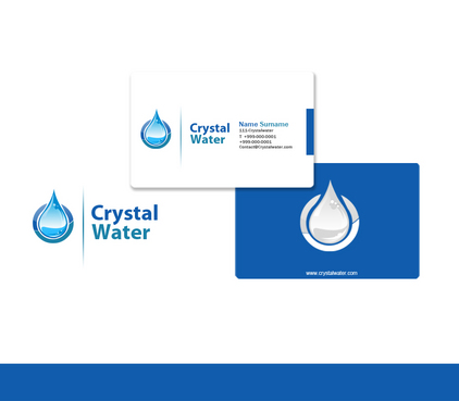
Crystal Water Logo

Crystal Water

Contest Holder mamasiga ?

Last Logged in : 3424days2hrs ago

Concepts Submitted

204

Guaranteed Prize
240
Winner(s)

1

A Logo, Monogram, or Icon veildAll design entries can be viewed by other designers. Featured Featured Contest
tick_gray

Live Project

tick_gray

Deciding

tick_blue

Project Finalized


Project: Crystal Water Logo
Industry: Health Logo
Contest Launched: Sep 09, 2010
Selected: 1 winning design from 204 concepts
Winning Design by: raindesign
Close Date: Sep 16, 2010


Crystal Water Logo - Health


Awarded as a winner
Project Report    

Sort by:


#193

#164

#191

#190

#131

#57

#203

#199

#192

#187

#180

#170

#155

#154


Creative Brief


Crystal Water Logo

Crystal Water

Profesionálna úprava vody

No

WATER PURIFICATION for better health. RESELLER of OEM WATER FILTERS under our own brand for households and companies. CUSTOM designed SOLUTIONS.

Health

Logo Type
Logo Type

Abstract Mark
Abstract Mark

Initials
Initials


Unique/Creative
Clean/Simple
Modern
Serious

Blue, Gray, White

not sure

Some products we sell for inspiration: www.crobalwater.com

Related Contests


Logo for a chiropractic health clinic
$199
Prize Money
63
Concepts
 logo for re-branding new nursing facility
$400
Prize Money
184
Concepts
Logo for Wellness Center
$200
Prize Money
239
Concepts
Fort Myers Hot Yoga Studio
$199
Prize Money
107
Concepts

Discussion


Comments

  • September 14, 2010 5:33 PM
    mamasiga mamasiga
      Project Holder
    LOGO MESSAGE: When I stick CRYSTAL WATER logo on a WATER PURIFICATION SYSTEM (usually WHITE) it should say with CLEAR VISUAL IMPACT: GOOD CHOICE!!! This WATER PURIFICATION DEVICE is PREMIUM QUALITY, made of BEST MATERIALS, WILL NEVER BREAK, and WILL ALWAYS PRODUCE CLEAN HEALTHY WATER. You will make GOOD DECISION when you'll buy it, while the COMPANY behind it is a PROFESSIONAL and RELIABLE partner... :))) Clear VISUAL IMPACT and CLEAR LOGO MESSAGE (how it would look on a device and what it says) will decide what WILL WIN! AMAZING WORK! This is the best logo designing place, I am totally amazed by your work. MANY MANY THANKS!

    Like Icon 0   DislikeIcon 0
  • September 13, 2010 4:17 PM
    mamasiga mamasiga
      Project Holder
    IMPORTANT: Company name "Crystal Water" says clearly that this company deals with water. So, water, drops or whatever-water does not need to be emphasized in the ABSTRACT MARK again. I would prefer something MORE SPECIFIC, that will connect to the COMPANY ONLY, NOT THE WATER ITSELF! #102 is SPECIFIC enough, while its not a drop only , but its something which can be ASSOCIATED with CRYSTAL WATER company ONLY! #103 & #104 - Although I do not like the drops, this one is really nicely done and is SPECIFIC enough. Thank you! #108 & #109 - Nice try, but I am looking for more SPECIFIC ABSTRACT MARK - such that will be CONNECTED WITH THE COMPANY ONLY, NOT THE WATER ITSELF - water symbols are way too common! #115 & #116 - good start of a new direction - SPECIFIC ABSTRACT MARK. Thank you litsavin. MY BIG THANKS GOES TO ALL DESIGNERS for their time and creativity. Tomas

    Like Icon 0   DislikeIcon 0
  • September 12, 2010 3:26 PM
    mamasiga mamasiga
      Project Holder
    What I am now for, is more professional, CORPORATE look. I see now 3 basic concepts: 1/ WAVES - great designs #74, #76. I think, this will be very hard to make any better... 2/ SQUARE/SQUARES - nice designs #57, #87. Here I see the biggest SPACE TO IMPROVE, while none of the "square" designes yet is 100%. 3/ DROPS - in most cases with exemption of #94 (here it looks more like circle), they look VERY CHILDISH, uprofessional. My advice: drop the drop :) unless it's really necessary. So, I would gladly see some more of square/squares designs with clean, professional looking fonts. Maybe some creativity with more squares, like in here: http://orders.logodesignguru.com/drafts/display/contest/5409/draft/98308 http://orders.logodesignguru.com/drafts/display/contest/7337/draft/98172 Remember, beside BLUE you can use also little Green too.

    Like Icon 0   DislikeIcon 0
  • September 12, 2010 9:22 AM
    centavrus centavrus
     
    i think a little green color adds more tasty and purity look to water

    Like Icon 0   DislikeIcon 0
  • September 11, 2010 5:44 PM
    mamasiga mamasiga
      Project Holder
    To give it some LIFE, you can use also other colors - I would suggest GREEN as well. Inspired by ecodomiki project: http://orders.logodesignguru.com/contests/logo-for-eco-oriented-construction

    Like Icon 0   DislikeIcon 0
  • September 11, 2010 10:42 AM
    Franklin Franklin
     
    any suggestion ? thanks

    Like Icon 0   DislikeIcon 0
  • September 11, 2010 4:07 AM
    mamasiga mamasiga
      Project Holder
    Just an idea: the fountain from 56 looks a bit like W. Maybe it could be adjusted (made more simple) and the W from CrystalWater can be made like a fountain - spreading over other letters. But please, give it more corporate look.

    Like Icon 0   DislikeIcon 0
  • September 10, 2010 1:59 PM
    mamasiga mamasiga
      Project Holder
    Please, release your fantasy and use some other shapes as abstract mark, not only water and drops. WATER and DROPS as abstract mark are TOO OBVIOUS. NO TAGLINE please, and use whole name: Crystal Water (not only CRYSTAL). Look at the squares in crobalwater.com logo, or Britta logo. I do not want it look the same, but just to give the idea that also other shapes are nice as well.
    Like Icon 0   DislikeIcon 0
  • September 10, 2010 2:05 AM
    mamasiga mamasiga
      Project Holder
    By B/W I meant GRAYSCALE. So the LOGO also needs to look nice printed GRAYSCALE.

    Like Icon 0   DislikeIcon 0
  • September 09, 2010 5:11 PM
    mamasiga mamasiga
      Project Holder
    Hello, The LOGO also needs to look nice BLACK/WHITE as well. On WHITE/DARK BACKGROUND too. Some logos I like from logodesignguru portfolio (can it help?): http://orders.logodesignguru.com/drafts/display/contest/227/draft/11465 http://orders.logodesignguru.com/drafts/display/contest/7529/draft/99284 http://orders.logodesignguru.com/drafts/display/contest/239/draft/12045 http://orders.logodesignguru.com/drafts/display/contest/71/draft/2156 http://orders.logodesignguru.com/drafts/display/contest/582/draft/30346 http://orders.logodesignguru.com/drafts/display/contest/2364/draft/80549 http://orders.logodesignguru.com/drafts/display/contest/3047/draft/86576 http://orders.logodesignguru.com/drafts/display/contest/150/draft/8195 http://orders.logodesignguru.com/drafts/display/contest/1044/draft/62184

    Like Icon 0   DislikeIcon 0
  • September 09, 2010 5:19 AM
    mamasiga mamasiga
      Project Holder
    Hi guys, As implied from the name: Crystal Water resells water filters, and provide custom solutions of water purification (cleaning, softening, de-ironing, sterilization etc.). Our LOGO as well as our WATER should be CLEAN, PURE, HEALTHY. Our services PROFESSIONAL, RELIABLE and INNOVATIVE. Audience: Health aware households, small companies I am looking forward to receive some creative designs. I wish you good luck and sunny days! Tomas

    Like Icon 0   DislikeIcon 0