SALES / SUPPORT : +1-877-525-5646   |  


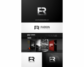
Business logo for music company within dance industry

"Keep it up" (music)

Contest Holder Keepitup ?

Last Logged in : 4528days22hrs ago

Concepts Submitted

110

Guaranteed Prize
459
Winner(s)

1

A Logo, Monogram, or Icon veildAll design entries are veiled from other designers till the end of the contest. Featured Featured Contest
tick_gray

Live Project

tick_gray

Deciding

tick_blue

Project Finalized


Project: Business logo for music company w ...
Industry: Music Logo
Contest Launched: May 27, 2012
Selected: 1 winning design from 110 concepts
Winning Design by: veedesign
Close Date: Jun 06, 2012


Business logo for music company within dance industry - Music


Awarded as a winner
Project Report    

Sort by:


#53

#84

#80

#51

#49

#40

#14

#82

#54

#50

#29

#13

#11

#90

#87

#86

#83

#66

#52

#39

#27

#12


Creative Brief


Business logo for music company within dance industry

"Keep it up" (music)

No

Keep it up music will be a record company within hard dancemusic. The label will be open and creative, determined to cross boundaries. This label will be started under it's main dj, Frontliner who is famous in its scene. www.frontliner.nl

Music

Logo Type
Logo Type

Symbolic
Symbolic

Abstract Mark
Abstract Mark


Masculine
Modern
Retro
Youthful
Simple

"bright" accent colors like this; http://www.upperplayground.com/wp-content/uploads/2010/10/GROTESK_UP_LOGO_UPPER_PLAYGROUND_UP108.jpg

not sure

The logo or elements of it must be easy usable in square avatars, merchandise of all kinds and a webpage. Preferably including something pointing up.

Related Contests


Logo for FUZION RECORDS - An exciting new EDM Record Label
$250
Prize Money
196
Concepts
Logo for an Audio Production Agency
$200
Prize Money
28
Concepts
Record Label Logo
$200
Prize Money
77
Concepts
Heavy metal band logo
$475
Prize Money
304
Concepts

Discussion


Comments

  • June 04, 2012 8:31 AM
    SiteAdmin SiteAdmin
     
    Attention Designers, MycroBurst permits you to submit unlimited designs with unlimited variations. However, if you show 2 or 3 different color versions of the same logo in one draft, please make sure that if that draft gets finalized, each color version is separated before final files are sent out. Thanks, MB/LDG Team

    Like Icon 0   DislikeIcon 0
  • May 31, 2012 5:21 AM
    Keepitup Keepitup
      Project Holder
    No music notes, guitars and people in the logo please. Remember it's a (hard) dance music label.

    Like Icon 0   DislikeIcon 0
  • May 29, 2012 9:22 AM
    Keepitup Keepitup
      Project Holder
    I like your designs #6 and #40. But I'm still would like to see the word 'UP' different. #6 is the closest and I really like the U, but the P doesn't fit the other letters in my opinion. Though I like how 'UP' looks like a usable logo icon.

    Like Icon 0   DislikeIcon 0
  • May 29, 2012 5:24 AM
    Keepitup Keepitup
      Project Holder
    I like the font of #31 a little bit, but I don't like the E's, they look like O's in my opinion. And I don't like the 'People' in the logo's.

    Like Icon 0   DislikeIcon 0
  • May 29, 2012 4:51 AM
    Keepitup Keepitup
      Project Holder
    I like the font of #6 but i think the last "P" doesnt fit well I like #26 for being compact but still clear I dont like the font of #13 but i think the idea is cool I wouldnt like to see "dancing people" in the logo i like #35 but the speaker thing has been used quite a lot already and i would like Keep it up's logo to be more original I hope these comments are usefull for you!

    Like Icon 0   DislikeIcon 0