SALES / SUPPORT : +1-877-525-5646   |   Login


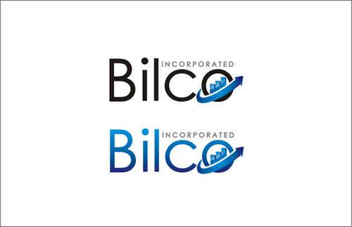
business logo, a personal monogram - Bilco Incorporated

Bilco should be the focus, A name, initial symbol is up to you.

Contest Holder bilco ?

Last Logged in : 4831days1hr ago

Concepts Submitted

396

Guaranteed Prize
300
Winner(s)

1

A Logo, Monogram, or Icon veildAll design entries can be viewed by other designers. Featured Featured Contest
tick_gray

Live Project

tick_gray

Deciding

tick_blue

Project Finalized


Project: business logo, a personal monogra ...
Contest Launched: Aug 05, 2011
Selected: 1 winning design from 396 concepts
Winning Design by: gacko
Close Date: Aug 18, 2011


business logo, a personal monogram - Bilco Incorporated - Corporate Services


Awarded as a winner
Project Report    

Sort by:


#279

#278

#276

#275

#274

#273

#272

#271

#270

#269

#268

#267

#266

#265

#263

#245

#244

#243

#240

#232

#231

#229


Creative Brief


business logo, a personal monogram - Bilco Incorporated

Bilco should be the focus, A name, initial symbol is up to you.

Business Analysis and Consulting

No

I have just incorporated my company. It is a company of just 1; me. Bilco is really a cross between my name and company or consulting. Bilco is what I really want to stand out. the Incorporated or tagline is optional.

Corporate Services

Logo Type
Logo Type

Symbolic
Symbolic

Abstract Mark
Abstract Mark

Initials
Initials

Illustrative
Illustrative


Cutting-Edge
Unique/Creative
Clean/Simple
Sophisticated
Corporate
Modern
Industry Oriented
Traditional
High Tech
Retro
Serious
Abstract

Feel Free to use your favorite colors. I ask to make the background transparent if possible; I will be using the logo on websites, business cards, invoices ect.

not sure

Feel free to get creative, you are the experts on this. I have a website I am building. www.bilco.ca. It needs a bit of work, but it might give you an idea of the feel I am going after. The color on the website is honestly not my favorite so please dont feel you need to design your colors on that. I do a lot of analysis, flow charts, logic. I dont see myself asking for a lot of modifications on this either, I am really impressed of what this community has produced. Thanks in advance all - Good luck.

Related Contests


Clean logo and business card design for a management consulting firm
$400
Prize Money
220
Concepts
logo for a Services Company
$199
Prize Money
55
Concepts
Professional, elegant logo for insurance company
$200
Prize Money
175
Concepts
858 Grow Northwest logo
$200
Prize Money
309
Concepts

Discussion


Comments

  • November 05, 2011 10:57 PM
    RichardB RichardB
     
    Check out www.DesignCage.net its pretty awesome,you can win more contests.

    Like Icon 0   DislikeIcon 0
  • August 15, 2011 10:22 AM
    bilco bilco
      Project Holder
    I am extending the project for 3 more days and id really like to encorporate the following descriptors into the design. Professional, Classy, Progress, Growth. Thank Again All. Please remember to not break any trademarks rules.

    Like Icon 0   DislikeIcon 0
  • August 11, 2011 7:08 PM
    bilco bilco
      Project Holder
    Thank You all again for your work, Truely Amazing. With only a couple days left I am going to start eliminating a few more. Can I ask if you make a symbol to also make a version where the arrow, bars, building ect is part inside the B,I,L,C and/or O. I really enjoy the designs with the arrows that seem to be sweeping in from behind the symbol. Such as in 128 and 129. I do also enjoy the bars inside the B and O as in 160 and 129 and 94. The building designs in 159, 84 and is quite good also.

    Like Icon 0   DislikeIcon 0
  • August 08, 2011 10:35 PM
    bilco bilco
      Project Holder
    I'd like to thank everyone who has uploaded some designs. This project is coming along very nicely. I would like to remind everyone that I do need a logo with a transparent background with out borders. I do appreciate it when you upload it with a background but please ensure you have a transparent background as well. I would like to make a few comments on the designs. It seems I am leaning towards the logos that have have designs with arrows, or bars or a building design over the abstract ones. Even the logos that is made from the word bilco is quite good. If you do put an arrow, or a bar graph or similar, the direction is somewhat important. In my industry a direction going up or towards the upper right (or even left to right) is usually a sign of increased productivity or a general increase in whatever we are measuring. So if you have arrows or bars or similar, id appreciate it if it would go that direction. If you sort the designs by 4 and 5 stars you can get a general idea of the colors I prefer. Generally black, blue, grey and perhaps touch of green. Please do stay creative and feel free to explore other colors. Also a few of you have starting using a gradient in your colors, I think this looks very professional. A few comments I'd like to point out, If you prefer I say these in private, please let me know. #2 - Still love the font, its one of my favorites. #37,60 - One of my favorite designs so far. I love the font and the simplicity. Is it possible to switch the direction of the bars, Also what would it look like if you made the o in bilco similar to the logo? #56 - Great color scheme #57,59 - Great designs, I love them both, I do have to say the L through me off a wee bit, it almost looks like a J, otherwise the font is great. #68,70 - Incorporating a building into the design was brilliant. Thank you for your creativity.

    Like Icon 0   DislikeIcon 0
  • August 06, 2011 11:42 PM
    bilco bilco
      Project Holder
    Thank you for all the great start; I am very pleased. I will leave some feedback, but really all entries are great. #2 - This design has really captured the feel I am going after; simple, clean stylish. I do like the lower case here. I would perhaps rather see the lines be in a more upward trend. Is there a way to tie in some significance with those lines? #7 - I really like how you came up with this symbol. This scores very well with me as the symbol has some meaning. Is there a way to 'play' with this a little bit? #9 - Great concept and I like the symbolism. I'd like to see it flow a little bit more. #10 - I like the simplicity here again. I'd be curious to see how it would look if you could raise the ilco part and put incorporated underneath so the bottom of the b and the word incorporated are flush.

    Like Icon 0   DislikeIcon 0