SALES / SUPPORT : +1-877-525-5646 |
Login
Business Logo
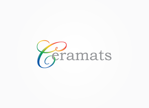
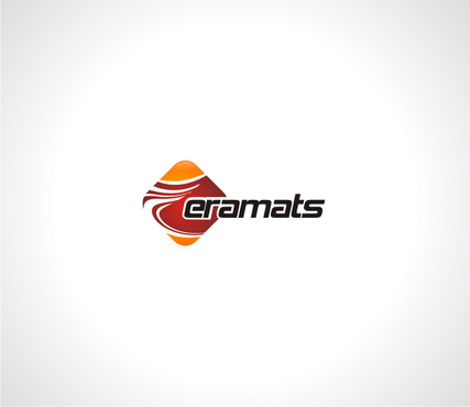
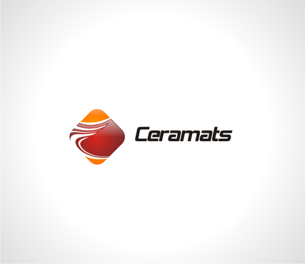
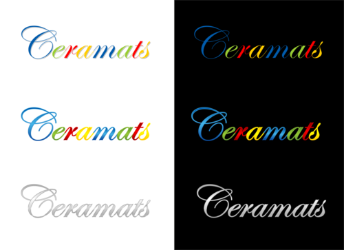
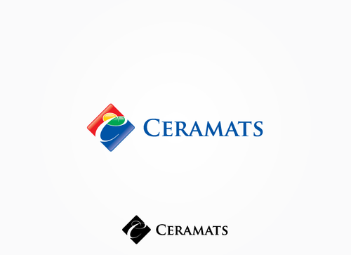
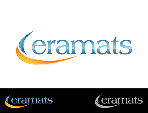
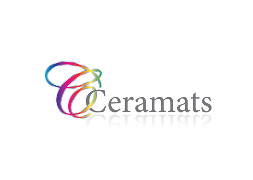
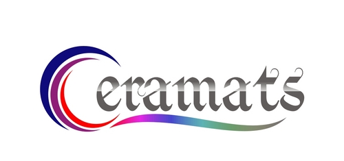
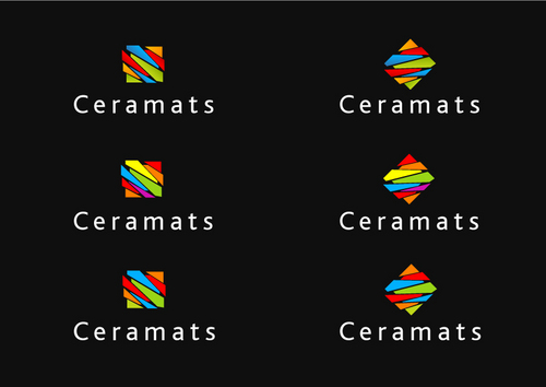
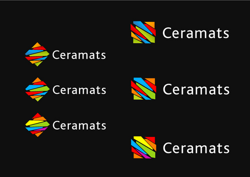
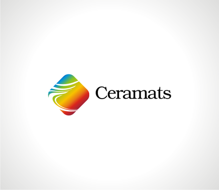
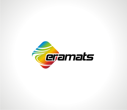
Ceramats
|
Contest Holder
Ceramats
?
Last Logged in : 3880days5hrs ago |
Concepts Submitted
85 |
Guaranteed Prize
200
|
Winner(s) | A Logo, Monogram, or Icon |
|
Live Project
Deciding
Project Finalized
Project: Business Logo
Industry:
Construction Logo
Contest Launched:
Feb 27, 2012
Selected:
1
winning design from 85 concepts
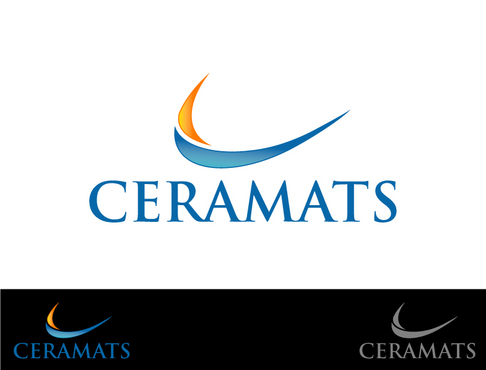
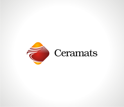
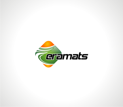
Winning Design by:
tomitod999
Close Date:
Mar 05, 2012

Creative Brief
Business Logo
Ceramats
No
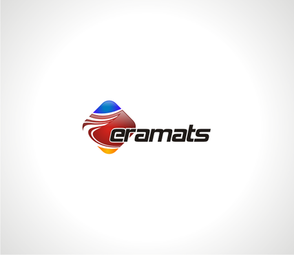
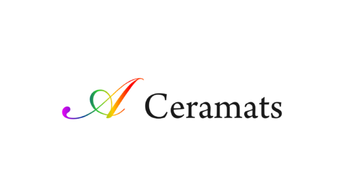
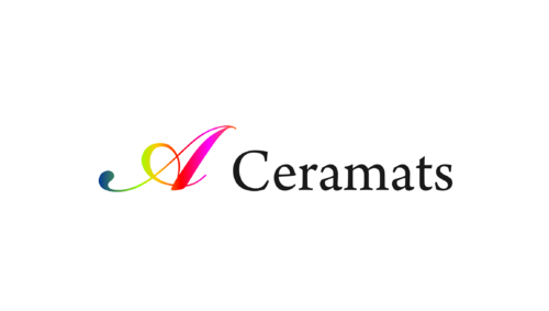
Ceramats is a manufacture of ceramic materials such as (luster, glaze stains, body stains, vetrosa and frit) used to color or brighten up tiles and sanitary ware.
These materials are produced in form of powder or tiny crystals.
High intensity coloration, brightness, glassy, shiny are the typical traits of high quaility ceramic materials.
Construction
Abstract Mark
![]()
Web 2.0
![]()
Unique/Creative
Clean/Simple
Modern
High Tech
3-4 colors max, can be any mix. Any color shade as long as it conveys the element of elegance.
not sure
What we have in mind is something alone the line of Google's design but with a logo like the check from Nike added to it.
However, if makes the logo look too busy, we rather go with a look more similar to google unless one of you creative genius can combine the 2 and make it look stunning!
Related Contests


Comments
Project Holder
Project Holder
Project Holder
Project Holder
Project Holder
Project Holder
Project Holder
Project Holder