SALES / SUPPORT : +1-877-525-5646   |  


Business Card for Start Up

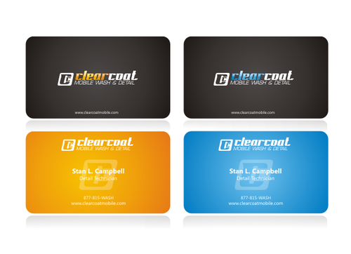
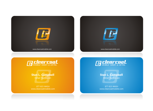
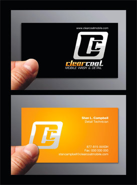
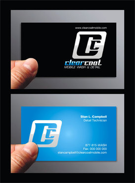
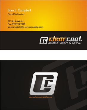
double-sided business card

Contest Holder clearcoat ?

Last Logged in : 4280days7mins ago

Concepts Submitted

47

Guaranteed Prize
100
Winner(s)

1

Business Cards and Stationery veildAll design entries can be viewed by other designers.
tick_gray

Live Project

tick_gray

Deciding

tick_blue

Project Finalized


Project: Business Card for Start Up
Industry: Logo
Contest Launched: Mar 22, 2010
Selected: 1 winning design from 47 concepts
Winning Design by: saint
Close Date: Mar 29, 2010


Business Card for Start Up -


Awarded as a winner
Project Report    

Sort by:


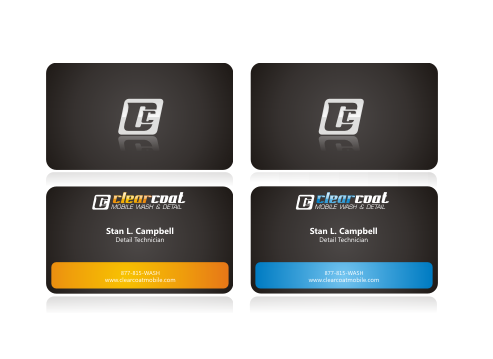
#14

#13

#1

#39

#38

#2


Creative Brief


Business Card for Start Up

double-sided business card

I need double sided standard sized Business Card [3.5" x 2"]

Use same font as used in my logo

Cutting-Edge

Modern

Professional

Stan L. Campbell

Detail Technician

[NONE]

877-815-WASH

stancampbell@clearcoatmobile.com

www.clearcoatmobile.com

We are looking for a double-sided business card that incorporates the blue version of our logo. (Please note that there are 2 versions of the blue logo; one with a black background and another with a light backgroun). Teh design will serve as the layout used for other employees. The font used for the business card does not need to match the font used in the logo. We are not adverse to seeing a layout that separates the Double C icon from the word portion of the logo.

We are open to the design creativity. However, our initial thought is that we may be leaning toward a design with the Double C icon on the back. However, we are open to considering other ideas.

Discussion


Comments

  • September 02, 2011 11:34 AM
    gopi7 gopi7
     
    i like this !!!!

    Like Icon 0   DislikeIcon 0
  • April 06, 2010 11:10 AM
    SiteAdmin SiteAdmin
     
    Good news for designers finaldesign and lovatodesign. Contest Holder has also selected your design #17 by finaldesign and #43 by lovatodesign as Winners. Thanks and great work.

    Like Icon 0   DislikeIcon 0
  • March 31, 2010 2:47 PM
    SiteAdmin SiteAdmin
     
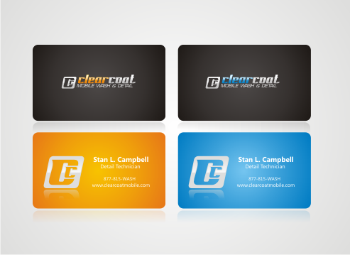
    Congratulations! saint, Contest Holder has selected your design #13 as Winner. Thanks to all the designers for their creativity and hard work. Thanks

    Like Icon 0   DislikeIcon 0
  • March 30, 2010 10:33 PM
    clearcoat clearcoat
      Project Holder
    Thanks everyone for all of the designs. We're having a bit of a hard time picking just one so we are considering multiple designs.

    Like Icon 0   DislikeIcon 0
  • March 25, 2010 3:37 PM
    clearcoat clearcoat
      Project Holder
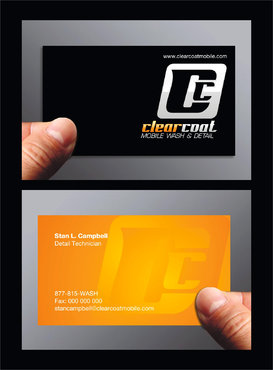
    I would like to see #13 with the orange on left side of the double C logo.

    Like Icon 0   DislikeIcon 0
  • March 23, 2010 7:16 PM
    clearcoat clearcoat
      Project Holder
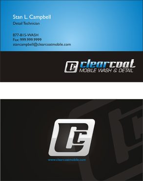
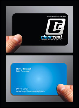
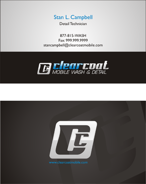
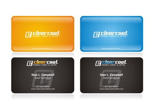
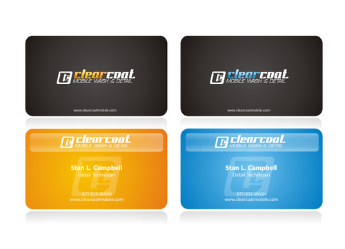
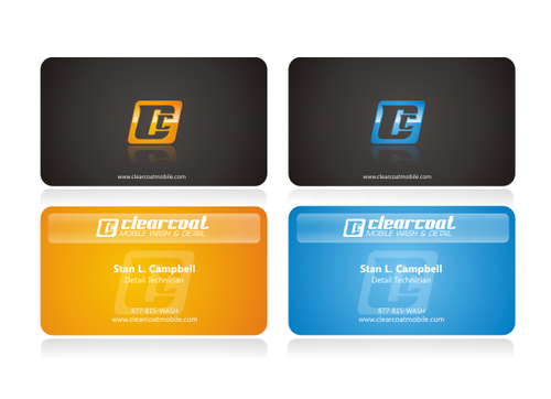
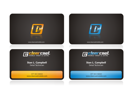
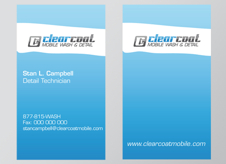
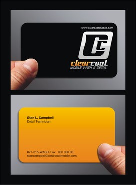
    Really like #1, #2. With #6 & #7, we really like the backside and the way the icon is featured in the background; however, we are not too wild about the front with the curved shape of the black area.

    Like Icon 0   DislikeIcon 0
  • March 22, 2010 9:03 PM
    clearcoat clearcoat
      Project Holder
    Forgot to note but there should be a placeholder for a Fax number

    Like Icon 0   DislikeIcon 0