SALES / SUPPORT : +1-877-525-5646   |   Login


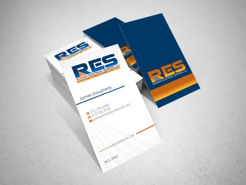
Biz Card for Electrical Contractor

Radiant Electrical Services, LLC

Contest Holder DoraSucks ?

Last Logged in : 1582days7hrs ago

Concepts Submitted

31

Prize Money
125
Winner(s)

2

Business Cards and Stationery veildAll design entries are veiled from other designers till the end of the contest.
tick_gray

Live Project

tick_gray

Deciding

tick_blue

Project Finalized


Project: Biz Card for Electrical Contracto ...
Industry: Construction Logo
Contest Launched: May 10, 2014
Selected: 2 winning design from 31 concepts
Winning Design by: sevensky
Close Date: May 11, 2014


Biz Card for Electrical Contractor - Construction


Awarded as a winner
Project Report    

Sort by:


No draft(s)


Creative Brief


Biz Card for Electrical Contractor

Radiant Electrical Services, LLC

I need double sided standard sized Business Card [3.5" x 2"]

Use same font as used in my logo

Cutting-Edge

Modern

Professional

James Dougherty

17521 Panorama Dr. Dripping Springs, TX 78620

512.294.6452

512.730.3778

james@radiantelectric.biz

www.radiantelectric.biz

TECL 29321

Please do not put address on the card

Construction

Related Contests


Business Cards and Stationery for Service Co
$75
Prize Money
290
Concepts
Construction Stationery
$100
Prize Money
173
Concepts
GFDR Biz Cards
$101
Prize Money
436
Concepts
Business Cards and Stationary for new home construction company
$125
Prize Money
275
Concepts

Discussion


Comments

  • May 11, 2014 8:17 PM
    sevensky sevensky
     
    Check your private messages!

    Like Icon 0   DislikeIcon 0
  • May 11, 2014 5:57 PM
    DoraSucks DoraSucks
      Project Holder
    And I just now noticed, I need the following to be on the card.. it is my licensing TECL 29321

    Like Icon 0   DislikeIcon 0
  • May 11, 2014 5:53 PM
    DoraSucks DoraSucks
      Project Holder
    I would also like to see something with the card in portrait vs landscape and maybe with everything being at an angle or something like that. Looking for something different, outside the box. Thanks

    Like Icon 0   DislikeIcon 0
  • May 11, 2014 5:05 PM
    DoraSucks DoraSucks
      Project Holder
    #9 can we do a light gray background and darken the words if that makes them too hard to see. Like the cards with less white so far.

    Like Icon 0   DislikeIcon 0
  • May 11, 2014 5:01 PM
    DoraSucks DoraSucks
      Project Holder
    I also uploaded another color option for the logo and would like to see some of those options. Thanks

    Like Icon 0   DislikeIcon 0
  • May 11, 2014 5:00 PM
    DoraSucks DoraSucks
      Project Holder
    #23 could we make the logo bigger on the back of the card and maybe have less white on the cards (more color..however you put it)

    Like Icon 0   DislikeIcon 0
  • May 11, 2014 4:59 PM
    DoraSucks DoraSucks
      Project Holder
    Really like the see through card on #24 would like to see other options there

    Like Icon 0   DislikeIcon 0
  • May 11, 2014 4:57 PM
    DoraSucks DoraSucks
      Project Holder
    I,like the dark background with the orange bar on draft #9. Could we see what the RES would look like in a light gray on that background.

    Like Icon 0   DislikeIcon 0
  • May 11, 2014 5:22 AM
    sevensky sevensky
     
    Star rating please...

    Like Icon 0   DislikeIcon 0
  • May 10, 2014 5:30 PM
    DoraSucks DoraSucks
      Project Holder
    No lightning bolts, plugs or outlets please

    Like Icon 0   DislikeIcon 0