SALES / SUPPORT : +1-877-525-5646 |
Login
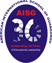
AISG 30th logo
American International School of Guangzhou Celebrating 30 years of Educational Leadership
|
Contest Holder
aisgz
?
Last Logged in : 4936days8hrs ago |
Concepts Submitted
148 |
Prize Money
500
|
Winner(s) | A Logo, Monogram, or Icon |
|
Live Project
Deciding
Project Finalized
Project: AISG 30th logo
Industry:
Education Logo
Contest Launched:
Apr 24, 2011
Selected:
1
winning design from 148 concepts
Winning Design by:
angelice
Close Date:
May 29, 2011


Creative Brief
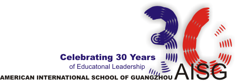
AISG 30th logo
American International School of Guangzhou Celebrating 30 years of Educational Leadership
Yes
http://www.aisgz.org/
Logo should emphasize the 30 years
School colors: navy blue & red
Non-profit international school for children ages 3-18
School Mission: Nurturing students to aspire and achieve
Largest and oldest school in the region
Multinational faculty and student body
Approximately 1000 students
Small class sizes; Average less than 20 per teacher
Strong academic program
Broad after school activity and athletic program
Committed to community service at all grades
Guangzhou is located in South China.
Education
Symbolic
![]()
Clean/Simple
Sophisticated
Traditional
Navy and red with navy blue as the dominant color
2
incorporate our Chinese context, eg calligraphy brushstrokes? Paper cutting?
Related Contests


Comments
Project Holder
Project Holder
Project Holder