SALES / SUPPORT : +1-877-525-5646   |  


360 Virtual Tours

360 Virtual Tours

Contest Holder 360vt ?

Last Logged in : 4913days13hrs ago

Concepts Submitted

44

Guaranteed Prize
200
Winner(s)

1

A Logo, Monogram, or Icon veildAll design entries can be viewed by other designers. Featured Featured Contest
tick_gray

Live Project

tick_gray

Deciding

tick_blue

Project Finalized


Project: 360 Virtual Tours
Industry: Photography Logo
Contest Launched: Mar 17, 2011
Selected: 1 winning design from 44 concepts
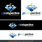
Winning Design by: kolniks
Close Date: Mar 24, 2011


360 Virtual Tours - Photography


Awarded as a winner
Project Report    

Sort by:


#44

#30

#6

#36

#35

#34

#26

#23

#22

#20

#21

#15

#12

#37

#18

#17

#9

#42

#41

#39

#38

#33

#32

#31

#29


Creative Brief


360 Virtual Tours

360 Virtual Tours

No

As the name suggests, we are a uk based virtual tour company providing high quality 360 degree virtual tours.

Our clients are large organisations, and we feel our current logo at www.360virtualtours.co.uk is looking a little dated.

First and foremost, we want to convey the fact that we are a professional company, experienced in what we do and up to date with current techniques.

Photography

Symbolic
Symbolic

Abstract Mark
Abstract Mark


Unique/Creative
Corporate
Modern
Industry Oriented
Illustrative

At the moment the site doesn't have any specific colours, apart from dark grey. It would be great if the logo could add a bit of colour to the header.

3

Related Contests


	Logo for Honua Concepts | Randy Jordan Photography
$220
Prize Money
63
Concepts
Logo for a photographer / photography company
$200
Prize Money
134
Concepts
Logo Design for wedding Photographer
$200
Prize Money
230
Concepts
Drone Photography / Video Company Logo
$200
Prize Money
103
Concepts

Discussion


Comments

  • March 18, 2011 11:18 AM
    thenyms thenyms
     
    please also rate #4

    Like Icon 0   DislikeIcon 0
  • March 18, 2011 8:53 AM
    360vt 360vt
      Project Holder
    Thanks for everyone who has entered so far. Number #44 is so far our favourite.

    Like Icon 0   DislikeIcon 0
  • March 18, 2011 7:18 AM
    360vt 360vt
      Project Holder
    #30 is great, although we can't use incorporated. In the UK we use 'Limited'. It also looks great on our site (we've been screen grabbing and overlaying the designs in PS). Is there any way we can rotate the text so that the 360 virtual tours text is near the top, so it is what people read when they see it?

    Like Icon 0   DislikeIcon 0
  • March 18, 2011 6:48 AM
    360vt 360vt
      Project Holder
    #24 doesn't really have that wow factor, we need something that looks like it has had thought gone into it.

    Like Icon 0   DislikeIcon 0
  • March 18, 2011 6:30 AM
    360vt 360vt
      Project Holder
    #23 this one seems to fit in well with our site, but the 360 in the circles looks like a bit of an afterthought? Is there any way we can get the text 360 Virtual Tours incorporated into a circular design? (think starbucks)

    Like Icon 0   DislikeIcon 0
  • March 18, 2011 6:21 AM
    360vt 360vt
      Project Holder
    #22 like this one, the 360 really stands out along with the 'virtual tours' part. Surprisingly also like the colours, the orange works with the darker elements.

    Like Icon 0   DislikeIcon 0
  • March 18, 2011 6:16 AM
    360vt 360vt
      Project Holder
    #20 spot on, i'd go as far to say the text part of this design is perfect for us. Also like the 'swish' circular graphic, maybe some more development of this is needed? maybe looking at more pointed edges to the 'swishes' rather than the current rounded edges? Also the colours are good, maybe these can be blended in together?

    Like Icon 0   DislikeIcon 0
  • March 18, 2011 5:07 AM
    360vt 360vt
      Project Holder
    #18 #17 - We don't like shaded text, and prefer it to be a solid colour (borders are ok if used well). Don't really like the 'eye' element in this one though. However we do like the circular element behind the eye part.

    Like Icon 0   DislikeIcon 0
  • March 18, 2011 5:06 AM
    360vt 360vt
      Project Holder
    #2 - Good try, although we want to have a graphical element we can use separately from the text, and the small graphical element on this design is far too small. We also want to avoid blue colours.

    Like Icon 0   DislikeIcon 0
  • March 18, 2011 5:04 AM
    360vt 360vt
      Project Holder
    Hi all, thanks for the entries so far. Some really great designs, and also some that just wouldn't work with our site. I have already eliminated some that weren't near what we're after. Some comments on the designs: #12 & #9 - the circular theme is something we like, as we would want to use the graphical element of the logo on clothing etc. The fonts however are a little too futuristic, and we want to stick to the plainer fonts such as the one used in design #6. #14 & #15 - Good that it has the spherical/circular theme, although the grey circle in the middle looks a little too structured/out of place. #6 - by far the best one yet, the circular 'swish' looks great, and we can really see it on our clothing etc. The colours are also good. Maybe try some examples of this design with the text along the side?

    Like Icon 0   DislikeIcon 0
  • March 18, 2011 12:06 AM
    thenyms thenyms
     
    please rate logos

    Like Icon 0   DislikeIcon 0