How To Design Restaurant Menus The Professional Way
Feature Image Source: iStock/juanmagarcia
Have you ever gone to a restaurant, taken a look at the menu, and wondered how on earth that design got past the development phase? Because that exact thing happens all the time!
Menus should communicate clearly what your food options are, explain a little about the ingredients or how the food is made, and, above all, make things enticing.
Your menu should make you want to order. It should not leave you scratching your head in bafflement over how unprofessional, slapdash, or just plain ugly the menu is.
There are a number of key components that require attention when it comes to designing an effective professional menu. Let’s dive right in!
Font Style
There’s a reason why this is the first on the list. Poor font choices lead to illegible food items, which leads to customers either hopelessly asking the waiter what the specials are, or putting the menu down in frustration and going somewhere else.
Image Source: iStock/LightFieldStudios
Especially if there is a lot of information to be conveyed, be careful of choosing fonts that are too ornate or flowery. Script may fit your restaurant’s theme, and may very well belong on the front of the menu, but when it comes to the dishes listed inside, consider a sans serif font with good spacing and kerning.
Image Source: Behance/Shanshan Yao
If you are dying for creativity here too then perhaps create font pairs to give an edge to the names and descriptions of the dishes. Of course, in an attempt to make words readable you cannot compromise of the design. This is the challenge you need to nail.
Image Source: Behance/Alamin Moni
Color Scheme
Color also plays a part in how decipherable your food items are and how readable your menu is as a whole. For example, if you will use red colored typeface on a green background the chances are your guests will run away unless they are ready to take the risk. You need to make sure that font colors stand out from the background colors, patterns, or images in an appealing way. For this, you need to know the basics of working with colors.
The color palette of the menu itself tells the customer a lot about the professionalism of the restaurant itself and, in turn, influences how likely they are to actually eat there, rather than just sit long enough to get a free bread basket and then walk out.
Image Source: Behance/Ramón Lechado
Restaurant consultant firm Aaron Allen and Associates says about the use of color on a menu, “you can use certain colors to conjure the feelings you’re looking for to encourage and motivate specific behaviors from your guests.” For example, “limited use of red can call attention to high-margin items you want to move. Orange stimulates the appetite, while brown communicates nature and earthy vibes.” This suggests that when picking a color for your restaurant menu , you must understand the meaning and uses of different colors.
Image Source: Behance/Alkemia Studio & Radoslaw Wesolowski
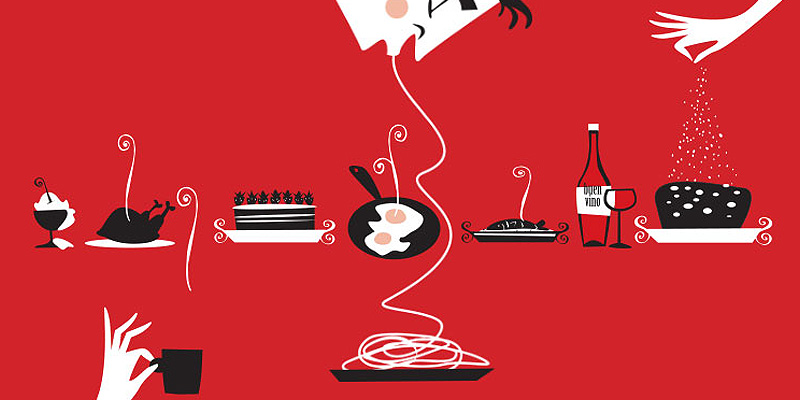
Images
This is another aspect to be cautious with. We aren’t just talking about the picture you might have on the front cover of the menu, or the logo of your restaurant.
Too many restaurant menus have inaccurate, misleading, and sometimes bogus pictures of items that they offer. When was the last time that you pointed to a picture on a menu and ordered, and then got exactly what was pictured?
If you’re like me, “the last time” was never.
Images and photos can be used judiciously in a professional menu provided what you show is what the guest will get. They should never crowd or overwhelm the page, they shouldn’t be misleading, and they must be well-printed, not grainy or misshapen.
Image Source: Behance/Oscar Parada & Gonzalo Herrera Pinto
Image Source: Behance/Lee Ching Tat
Content
It may be tempting to tell the whole story of your restaurant and how it came to be to every single customer that comes through your door. So printing it on the menu is a common way of incorporating that story into the dining experience. That’s a nice idea — it speaks to the uniqueness of your restaurant and gives it more of a personal feel.
The problem comes when the story takes up multiple pages at the beginning of a menu. I’ve seen this innumerable times over the years, and the end result is that your inspiring and/or hilarious story gets ignored completely while the customer pages through the menu, frustrated, looking for what drinks are on Happy Hour.
Image Source: iStock/senerdesign
The primary content that needs attention in your menu are the food items and the little blurb that describes them. If you’ve chosen a font that is easily legible, and you space your items out well, there should be plenty of space for a line underneath the name of each item, to let the diner know the basics of what is included or how it is prepared. With carefully-written copy, it’s a great way to continue to upsell your wares, even after the waiter has come and gone with his spiel about today’s specials.
Image Source: Behance/Adam Larson
Layout
Depending on the type of restaurant, the amount of food items on offer, and your own personal preferences, the layout of your menu could be single fold, trifold, or multi-page. Any of these can be designed well, leaving you with a professional product to hand out to your discerning clientele.
Image Source: Behance/Mukhlasur Rahman
Of chief importance in choosing your layout is knowing how much space you really need. Just because you can cram twenty food items on one sheet of paper doesn’t necessarily mean you should, unless perhaps you’re a Chinese takeaway. Avoid overcrowding. Crowded menus mean reading difficulties, which means a loss of attention, which means you may not be able to deliver to the customer exactly what they really want, because they’ve missed the option entirely.
Image Source: Behance/Emma Nelly Morgan
Justification is an important consideration within the layout. You may want the center-justified look, you may be more inclined to a left-justified page on the left and a right-justified on the right. Whatever your personal preference is, being consistent within the menu is a key aspect of keeping it professional.
Certain types of menus better suit certain types of restaurants. For a dinner restaurant with a limited menu, that could mean two menus, both bi-fold, one for appetizer and dinner items and the other for the wine list. For small restaurants that specialize in take-out orders, it would probably work better to have a menu that can be printed cheaply and be given to the customer to keep, such as a two-sided menu on a single sheet of heavy paper. For a family restaurant with lots of options and which needs lots of space, a multi-page menu would work best.
Image Source: Behance/Aleksandra Monich
Uniqueness
With all of these points to consider, don’t forget that your aim isn’t just a professional menu design: it’s a professional menu design that fits your restaurant.
For a high-class wine bar, that could be a simple bi-fold on cream paper with three items on each side. For a family friendly build-your-own-taco bar, that could mean bright, eye-catching colors and quirky line drawings. For a coffee shop aiming to become the next Starbucks, that could mean keepsake menus the size of business cards with chalkboard backgrounds and hand-drawn florals.
Image Source: Behance/Barcelona Design Shop
The possibilities are endless. So don’t feel tense to a traditional menu; feel free to be as creative as you like, as long as you keep an eye on the tips above and make your menu fit your venue.