
Is the “ugliest color” too hard for you to handle?
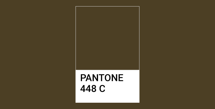
No worries, because what’s known as the ugliest color in the world, is in fact, not ugly at all! The Pantone 448C, also known as opaque couché is associated with things like tar, poop, death, dirty and sewage. However, I strongly disagree. It is a beautiful earthy shade, a mixture of green and brown, which will look absolutely stunning for corporate branding if paired with the right colors. You’ll see.
The debate whether 448C is the ugliest color or not started when the Australian Government commissioned GfK Bluemoon to develop tactics to make cigarette packaging unattractive enough to daunt people from smoking. As shared in an article by It’s Nice That, once it was concluded that over 1000 participants found Pantone 448C a discouraging color for smokers, countries like France, Ireland and United Kingdom also began using this color to reduce the demand for tobacco.
As the news spread, more people became aware of it and held varying opinions. Do you also find Pantone 448C ugly?
I discovered, I’m not alone to think that 448C is a perfectly “normal” color. Renowned graphic designers Debbie Millman and Milton Glaser elucidated their views on this subject via Fast Co. Design. Laurie Pressman, Vice President of Pantone Color Institute said, “I don’t think there’s such a thing as an ugly color at all”.
So I embarked on a journey to prove to you that 448C is not “ugly” at all!
Glaser speaks the truth. No color in this world can be judged alone. In any space or on any canvas, a color is always accompanied by the following:
I’m a fan of fairytales and colors since childhood. Thus, I created fantasy-filled color palettes for opaque couché. Envision your corporate branding with these palettes and infuse imagination and creativity in it. You want to be different, right?
This is a great way to be unique – incorporating a color into your branding that’s considered rancid. Ways in which companies belonging to different industries can use this.
When it comes to companies that decorate gardens and embellish outdoor landscapes, the Jack and the Beanstalk, and The Frog Prince color palettes are perfect. The tints and shades of green symbolize flora, while the 448C works in harmony and represents sand, tree barks, soil, wood and bricks.
Also Explore: 50 Color Palettes For Your Landscaping Company
A wedding is a cherished event for the bride and groom from eastern and western countries. People from Asia, for example, respond more to colors in the Little Red Riding Hood palette that has warm tones like orange, yellow and red. Pantone 448C adds calmness and neutrality in a vibrant scheme.
Wedding planners can use this palette to ornament physical spaces, such as of course dinners and the actual marriage day. Moreover, if you’re a local wedding planning company from let’s say China, you can use these colors to design your business card, which you can distribute to B2B and B2C clients looking for a ‘taste of the east’.
As I was composing the Snow White and the Seven Dwarfs palette as well as The Emperor’s New Clothes palette, I thought of contemporary fashion that is based on outrageous and unconventional shapes and colors.
These two 448C palettes are striking yet subdued by the Pantone shade. I’d say ‘rise to the top’ yet remain ‘down to earth’.
In the tech industry, it’s all about gadgets and electrical signals at the end of the day. Most companies, for their branding prefer to use blue, black, and gray. A touch of Pantone 448C in the fairy tale palettes The Little Mermaid, and The Ugly Duckling will give a creative edge to your website.
Corporate branding does not end on paper or on digital media – it transcends to physical spaces.
The nude color palette is the talk of the town, as you may know, if you’re into trends. It’s highly popular in the fashion and beauty industry. But you can use this The Hare and the Hedgehog palette to add color to walls and use the green and Pantone 448C for the upholstery then you can create a welcoming ambience in your office to entertain clients.
Do you remember your bed-time story Hansel and Gretel? Based on the story, this fairy tale color palette with Pantone 448C is fun and vibrant for bakeries and ice-cream parlors to design corporate stationery such as price tags, packaging, ribbons and disposable crockery.
Have you ever seen the poster of action, romance and adventure movies? The most prominent colors include brown, orange, mustard, yellow and blue – all of which are present in these two Pantone 448C fantasy palettes. One is Beauty and the Beast, and the other is Goldilocks and the Three Bears.
Also Explore: Superb Sources Of Color Inspirations To Design Your Logo
The story of imagination does not end here!
Pantone 448C is not an unfriendly color. If a color is considered disgusting within one industry (tobacco) or outright rejected by 1000 people from the 7.4 billion population of this world then you shouldn’t make it a big deal. This color is as usable as any other color in the Pantone factory.
Returning to the very first question that whether or not it’s possible to brand your company with the ugliest color – yes, you can certainly brand with opaque couché.
Are you going to use this color now?
Can you guess the first thing people notice when they visit your site? Hint: It's…
For catering businesses, hotels, and restaurants, a menu is an asset of value and importance.…
Have you ever wondered why your favorite brand has a different marketing campaign in another…
Farming is one of the most profitable industries in the US. We bet that the…
Whether you run a small brand selling cosmetics or skincare products on Instagram or have…
Video animation is not just used to entertain the audience; it can also enhance the…


